

Does Bestseller Email Marketing Actually Increase Repeat Purchases?

What order data across dozens of apparel and clothing shops reveals about product concentration, discounting, and why fewer choices convert better.

Picture a customer opening an email from a shop they bought from three months ago. The subject line says “New Arrivals.” They have seen that line a dozen times from a dozen brands, and they do not open it. Now picture the same customer getting a different email instead: “5 products people are buying right now.” That is a smaller, more specific promise, and it works better, for reasons that have nothing to do with discount codes.

The direct answer: yes, bestseller email marketing increases repeat purchases, because showing customers what is actually selling right now solves a real problem (too many choices, too little signal about which one is worth trusting) rather than manufacturing urgency out of nothing. It works whether or not a discount is attached. It is not, however, a replacement for a sound pricing strategy, and the database backs that distinction up clearly. Both points matter, and both are covered below.

Key Takeaways

  • Highlighting a small number of currently popular products reduces decision friction more effectively than showing a full catalog, a pattern confirmed by one of the most replicated findings in consumer psychology.
  • Across a sample of 85 apparel and clothing shops analyzed over the past 12 months, the 10 best-selling products accounted for an average of 18% of total item purchases. That is a real concentration effect worth building content around.
  • Personalized, relevance-driven communication, the category “what’s trending” emails fall into, has been shown by McKinsey to lift revenue 5 to 15%. That gain is independent of discounting.
  • The database also shows first orders placed with a discount had a notably higher repeat purchase rate than full-price first orders, a detail that complicates any claim that content alone can replace pricing strategy.
  • The winning approach pairs real, verifiable product velocity data with a smart pricing plan. Neither one on its own tells the full story.

Why Do Most Retention Emails Fall Flat?

Most eCommerce email calendars are built around what the brand wants to sell, not what the customer wants to know. New arrivals. Seasonal pushes. A discount code timed to a slow week. All of it is planned months out, based on inventory targets. It has little to do with what is actually happening in the store right now.

The result is an inbox full of email that reads like advertising, because it is advertising. Customers get good at ignoring it. Open rates slide. The brand responds by discounting harder. That trains the list to wait for a sale instead of buying at full price. That habit is its own kind of expensive. It is the same pattern we see whenever we run a paid media audit for an eCommerce account. The accounts stuck on a rigid promotional calendar are almost always the same ones. They are the ones asking why their return customers have gone quiet.

None of this is a new problem, and none of it has a lazy fix. Every eCommerce brand runs this exact loop. The way out is not a bigger discount or a cleverer subject line. It is showing customers something true and specific that they cannot get anywhere else. That means showing what is actually selling well in this store, this week.

What Does the Research Say About Bestseller Email Marketing?

Four separate sources point in the same direction here. It is worth being precise about what each one does and does not prove.

The Psychology: Choice and Social Proof

The first is a well known study in consumer psychology. In 2000, researchers Sheena Iyengar and Mark Lepper set up jam tasting displays in a grocery store. They alternated between a large display of 24 flavors and a small display of six. The large display drew more browsers. The small display converted far better. Roughly 30% of people who stopped at the six-jam table bought a jar. Only about 3% did at the 24-jam table. More options generated more looking and less buying. The mechanism is decision fatigue. When everything looks equally plausible, people are more likely to walk away. Buying nothing at all feels safer than picking wrong.

The second is the social proof principle. It is a well established idea in consumer psychology, popularized by psychologist Robert Cialdini. People look to the behavior of others to decide what is safe or worthwhile. This is especially true when those others are people similar to them. A bestseller list is social proof in its plainest form. It tells a shopper, correctly, that other people already made this decision. They were satisfied enough not to return the product.

The Numbers: Personalization and Product Concentration

The third is McKinsey’s research on personalization at scale. Companies that get relevance-driven marketing right see revenue increases of 5 to 15%. They also see 10 to 30% gains in marketing spend efficiency. Most of that gain comes from targeted product recommendations and triggered communications, not blanket promotions. Telling someone “here is what is actually happening” is a form of relevance. Telling everyone the same “New Arrivals” message is not.

The fourth comes from AdScale’s own database, the same one behind our eCommerce ROAS benchmarks work. We looked across 85 apparel and clothing shops with meaningful order volume over the trailing 12 months. In each shop, the 10 best-selling products accounted for an average of 18% of total item purchases. Most of these catalogs run into the hundreds of SKUs. A small slice of the catalog reliably does an outsized share of the work. That is not a reason to stop stocking variety. It is a reason to stop pretending every product deserves equal airtime in a marketing email.

Is This Just Manufactured Urgency?

The instinct is to treat “what’s trending” content as a scarcity trick, a softer version of a countdown timer. That is the wrong frame, and it is worth naming the right one directly.

Call it the visibility gap. A store’s best-selling products are already popular. The customer scrolling a homepage or a category page usually cannot tell which products are the best sellers. That is the same browsing behavior we track in our ad timing analysis. The email is not creating urgency out of thin air. It is closing a gap between what is true inside the business and what the customer can see from the outside. Inside, five products move fastest. From the outside, it just looks like a wall of near-identical listings. Closing that gap is useful information, not a manipulation tactic, provided the numbers behind it are real.

That is also where the database introduced an honest complication. AdScale checked whether a discount on someone’s very first order changed the odds they came back. Discounted first orders returned at a notably higher rate than full-price ones. That does not mean the visibility strategy is wrong. It more likely means price-motivated shoppers are already inclined to be repeat shoppers. That makes the two groups hard to compare directly. But it does mean nobody should present “highlight your bestsellers” as a way to avoid ever discounting again. The database does not support that claim. A good retention strategy uses both levers instead of picking one and ignoring the other.

How Do You Build a Bestseller Email Marketing Strategy?

Good bestseller email marketing is boring in the best way. Pull real numbers from your own store, feature a small number of products, and repeat it on a schedule.

This does not require new software. It requires treating your own order history as a live feed instead of a report you check once a quarter. Every merchant we work with already has this data sitting in their order history. The only shift is building a habit of looking at it weekly instead of only at reporting time. That habit is usually the harder part to build than the email template itself.

Practical Steps for Bestseller Email Marketing

  1. Pull the last 7 to 14 days of order data and rank products by unit velocity. Use your platform’s own order export or your analytics dashboard. Do not estimate. If a product cannot be traced to real order counts, it does not go in the email.
  2. Narrow the list to 5 products, not 15. The jam study result holds here: a shorter, confident list outperforms a long one that tries to cover every category.
  3. Write the subject line as a fact, not a pitch. “5 products our customers keep reordering” beats “New Arrivals Are Here.” It works because the claim is specific and verifiable, not because it is louder.
  4. Keep the copy plain. State what the product is and why it is popular in one sentence (best reviewed, most reordered, sold out and restocked). Skip invented countdown numbers or manufactured scarcity language you cannot back up from your own records.
  5. Test a full-price version against a small loyalty-only incentive. The database showed discounts and return rate are connected. Do not assume either pricing approach wins by default for your list. Run both for a full cycle before deciding.
  6. Automate the pull, not the judgment. A saved report or a simple dashboard view that refreshes weekly removes the manual work. A person should still glance at the list before it goes out. Automation will occasionally surface an odd result.
  7. Track repeat purchase rate over a full quarter, not a single send. One email will not move the number. A consistent weekly signal, measured against your baseline repeat rate, will.

Frequently Asked Questions About Bestseller Email Marketing

Do bestseller emails work without any discount attached?

Yes. The mechanism is relevance and reduced decision friction, not price. The database shows discounted first orders return at a higher rate than full-price ones. Pricing still matters, but the bestseller format itself does not require a discount to perform.

How many products should one email feature?

Five is a reasonable starting point. The research on choice overload consistently shows that smaller, curated selections convert better than long lists. This holds true even when the long list draws more initial attention. If a store has strong seasonal variation, it is worth testing four versus six. See which count holds up best for that specific list.

Will this cannibalize full-price sales?

Not inherently. The content highlights popularity, not price. It does not train customers to wait for a markdown the way a recurring discount calendar does. Monitor average order value after launch to confirm the pattern holds for your list specifically.

How often should these emails go out?

Weekly is a common starting cadence, matched to how often product velocity actually shifts. Slower-moving categories, like furniture or big-ticket items, may only need a biweekly or monthly version. Their bestseller list will not change fast enough week to week to justify sending more often than that.

What if my catalog is too small to have obvious bestsellers?

Smaller catalogs can use the same logic at a smaller scale. Highlight the top 2 to 3 performers instead of 5. Or extend the lookback window from 14 days to 60, so enough order volume accumulates to rank products meaningfully. The point is showing real, verifiable popularity signals, not hitting a specific product count.

So What’s the Bottom Line?

Every eCommerce brand already has this data. It sits in the order history, unused, while the marketing calendar gets planned around guesses made three months in advance. The fix is not a bigger discount or a louder subject line. It is showing customers something true: this is what people like them are actually buying right now. Do that consistently, keep it verifiable, and pair it with a pricing strategy that holds up on its own. The repeat purchase rate takes care of itself.

Keep Learning

Apparel Ad Copy That Converts: What 30 High-Performing Words Reveal – a related look at what actually drives clicks in apparel marketing.

Clothing Industry Ad Benchmarks: What 100M+ eCommerce Orders Reveal About Google vs. Meta – how AdScale merchants’ ROAS compares by vertical, referenced twice in the body above.

What Is the Best Time of Day to Run eCommerce Ads? – order-data-verified timing patterns for ad delivery, referenced in the Reframe section above.

Why Are Fashion Ecommerce Return Rates So High for Multi-Item Orders?

Returns are the quiet margin killer in apparel. Most growth teams put their energy into acquisition cost. Meanwhile, the “return loop” chips away at customer lifetime value before the second order ever happens. That loop means shipping, restocking, and markdown costs on every item sent back.

AdScale looked at its own order database across more than 7,000 clothing and apparel stores. The goal: find out where that leak actually starts. The answer: the number of items in the cart. Single-item apparel orders in AdScale’s dataset come back refunded or partially refunded 6.6% of the time. Orders with four or more items come back 10.2% of the time. The rate climbs in a straight line at every step in between. That pattern held across two separate 12-month windows. That stability is what makes it worth building a strategy around, instead of writing it off as noise.

Key Takeaways

  • AdScale’s clothing and apparel data shows a clear climb. Refund rates rise from 6.6% on single-item orders to 10.2% on orders with four or more items.
  • The gap between single-item and multi-item refund rates has stayed consistent for two straight years, at roughly 3 percentage points.
  • Apparel refunds run far above the eCommerce-wide average of 3.75% across all verticals in AdScale’s database.
  • Mobile apparel orders return at a higher rate (10.2%) than desktop orders (8.7%).
  • Industry research attributes as much as 70% of fashion returns to fit and sizing problems. That lines up with what bracket buying looks like in practice.

What Is Bracket Buying and Why Do Shoppers Order Multiple Sizes?

Bracket buying is when a shopper orders multiple sizes or styles of the same item. The plan is to keep one and return the rest. It is a rational response to fit uncertainty, not carelessness. A shopper might wear a size 10 in one brand. There’s no reliable way to know what that means in the next brand’s cut. It might translate to an 8, a 10, or a 12. Faced with that gap, a rational shopper orders more than they need. Two sizes, sometimes three, with a plan to send the rest back. It shows up in the data as exactly the pattern AdScale found: order size and return likelihood move together.

Why a Stricter Return Policy Doesn’t Fix It

It is tempting to treat this as a policy problem and respond with shorter return windows or restocking fees. That fixes the symptom without touching the cause. The shopper who orders three sizes is not being careless. They are compensating for a missing piece of information. The product page cannot tell them which size will fit their body in this brand’s specific cut. Tighten the return window and the same uncertainty remains at the moment of purchase. The bracket buying does not stop. It just gets more expensive for the shopper. Some of them stop buying from the brand entirely rather than deal with the friction.

The Hidden Cost in Ad Performance Metrics

It also distorts the numbers a merchant is watching in the first place. A strong ROAS on paper can hide a real problem. If a meaningful share of those “won” orders come back as refunds, the campaign was never that efficient. Most ad platforms report the order at checkout and stay silent on what happens to it afterward. A campaign that looks efficient at the point of sale can look very different once refunds are netted out.

Fashion Return Rate Benchmarks: What AdScale’s Database Shows

AdScale pulled data from its clothing and apparel merchant base: 7,149 deduplicated shops across the “Clothing” and “Apparel & Accessories” verticals. The window was a trailing 12 months, using refunded and partially refunded order status as the return signal. That status field is a reliable proxy for returns, not a perfect match for items physically shipped back. AdScale tracks order status rather than a separate reverse-logistics event. Four data points stand out.

Items in OrderRefund Rate
1 item6.6%
2 items9.3%
3 items10.0%
4+ items10.2%

The Core Pattern: Refund Rate Rises With Every Item

That is not a small gap between the extremes. It is a consistent step up at every single stage. That kind of pattern is the signature of real shopper behavior, not a fluke in one segment.

The Pattern Holds Across Two Years

The same comparison against the prior 12-month window tells the same story. Single-item orders refunded at 7.6%, and multi-item orders refunded at 10.9%. That is a gap of roughly 3.3 percentage points, nearly identical to the 3.2-point gap in the more recent period. AdScale treats cross-year stability as the bar for whether a finding is worth publishing, and this one clears it.

Apparel Returns More Than Any Other Vertical

AdScale’s full merchant base spans every vertical it tracks. Over the same 12 months, the average refund rate across all of them was 3.75%. Even single-item apparel orders refund at nearly double that rate. Multi-item apparel orders refund at close to three times the all-vertical average. Fashion is not just a category with returns. It is a category where returns run structurally higher than almost anywhere else in eCommerce.

Mobile Orders Return More Than Desktop

Within the same apparel dataset, mobile orders refunded at 10.2% versus 8.7% for desktop. Mobile now accounts for the majority of apparel order volume. That means the channel driving the most sales is also the channel with the least room for fit confidence. A small screen simply has less size-chart real estate to work with.

What Outside Research Says

This lines up with what is already well documented outside AdScale’s own numbers. Fit and sizing issues are commonly cited as the single largest driver of fashion returns. McKinsey research on the topic puts the figure as high as 70%. That number shows up consistently across industry analyses, even when the exact percentage varies. Academic research on virtual fitting tools backs this up. Letting shoppers visualize fit before buying is linked to higher conversion, higher order values, and fewer fit-related returns. That research tracks with what individual retailers have already built to solve the same problem. Zalando’s AI-driven sizing tool matches a shopper’s photos to garment specifications to recommend a size. Fit-guidance services like True Fit exist specifically to talk shoppers into one confident size, instead of a bracket of three. None of that comes from AdScale’s database, but it explains why AdScale’s own numbers look the way they do.

The Imagination Gap: Why Fit Uncertainty Drives Fashion Returns

Here is the reframe worth sitting with: the return is not the failure. The guess is.

Every multi-item apparel order in this dataset represents the same shopper problem. They could not tell, from the product page alone, which single item to buy. They filled that gap with their wallet instead of information, ordering enough options that one would probably work. Call it the imagination gap. It is the gap between what a shopper can picture for their body and what the page actually shows. A single stock photo on a single model closes almost none of that gap. It doesn’t help anyone who doesn’t happen to share that model’s proportions.

The imagination gap is not solved by a stricter return policy. A stricter policy does not give the shopper any more information at the moment they decide what to order. It just moves the cost of that uncertainty somewhere else, from the retailer’s refund ledger to the shopper’s patience. Patience is the one thing an eCommerce brand cannot get back once it is spent.

How Can Merchants Reduce Fit-Related Fashion Returns?

The practical question for a merchant is not whether fit uncertainty is real, the data settles that. It is what to actually do about it, without overselling any single tactic as a guaranteed cure. A few approaches show up consistently in the research on this problem. They map directly onto what AdScale’s database suggests is happening.

Close the Information Gap on the Product Page

Size charts that reflect the specific garment, not a generic size grid, close part of the gap immediately. A grid built for that specific garment gives a shopper something real to measure against. For example: “Medium fits a 34-36 inch chest for this exact style.” That beats trusting a label that means something different in every brand. Fit-focused customer reviews do similar work. One review that says “I’m 5’6″, 145 lbs, runs slightly small” is worth more than five reviews about fabric quality. Mobile carries the higher return rate in AdScale’s own database. That size and fit information needs to work on a small screen. It can’t just exist somewhere the desktop shopper might scroll to find it.

Close the Expectation Gap in Ad Creative

Ad creative plays a role here too, earlier in the funnel than most merchants think about it. A shopper who arrives at the product page already expecting a certain fit needs less convincing once they land. That is because the ad that brought them there already set realistic expectations. AdScale’s own Agentic Ad Creatives tool exists partly for this reason. Testing multiple creative angles, including ones that show fit and scale more literally, gets far easier with AI-assisted generation. A traditional photoshoot budget can’t stretch across every SKU the same way. That kind of testing matters more than it used to. The Meta Andromeda update raised the bar on how often creative needs to refresh before fatigue sets in.

Steps to Reduce Apparel Return Rates This Month

  1. Pull refund rate by item count for your own store. Segment orders into single-item and multi-item buckets and compare refund rates. This is the exact analysis AdScale ran, and it takes one query against order data most merchants already have.
  2. Rebuild size charts at the garment level, not the brand level. A single generic size chart across an entire catalog hides the exact inconsistencies that drive bracket buying. Different cuts need different charts.
  3. Surface fit-specific reviews near the size selector. Reviews that mention body measurements and the size ordered do more to close the imagination gap than star ratings alone.
  4. Audit the mobile size-chart experience specifically. If the desktop chart is a wide table, check whether it collapses into something unreadable on a phone. Mobile is where the higher return rate is showing up.
  5. Test ad creative that shows garments at a more literal scale. Use AI creative tools where a full multi-model photoshoot is not in the budget for every SKU.
  6. Track refund rate by order size monthly, not just as one aggregate number. An aggregate return rate can look stable while the multi-item segment quietly gets worse.
  7. Consider exchange-first flows for multi-item apparel orders. A shopper who bracket-bought two sizes can trade the wrong one for credit or a different size, not a refund. That preserves revenue while still resolving the same underlying uncertainty.

Frequently Asked Questions

What is “bracket buying” in fashion eCommerce?

Bracket buying is when a shopper orders multiple sizes or variations of the same item, intending to keep one and return the rest. It happens because sizing is inconsistent across brands, so shoppers hedge against guessing wrong by ordering more than they need.

Why do multi-item apparel orders have higher return rates than single-item orders?

Multi-item orders often include size or style hedges rather than genuinely different purchases. In AdScale’s database, refund rates climb from 6.6% on single-item apparel orders to 10.2% on orders with four or more items, consistent with shoppers ordering options rather than a single confident choice.

Is a high return rate always a bad sign for a fashion brand?

Not automatically. Some return volume reflects healthy risk-taking by shoppers trying new styles, and generous return policies can also drive first-time purchases. The concern is when returns concentrate heavily in multi-item orders, which points specifically at fit uncertainty rather than general shopping behavior.

How can merchants reduce fit-related returns without hurting conversion?

The goal is adding information, not adding friction. Garment-specific size charts, fit-focused reviews, and realistic ad creative all give shoppers more confidence at the point of purchase, which research links to higher conversion alongside fewer fit-driven returns, rather than a tradeoff between the two.

Does mobile shopping increase apparel return rates?

In AdScale’s database, yes: mobile apparel orders refunded at 10.2% compared to 8.7% for desktop. Mobile is also where most apparel orders now happen, which makes the mobile size-chart and fit-review experience a higher priority than it might otherwise seem.

The Bottom Line on Fashion Ecommerce Return Rates

A return is not proof that a shopper made a mistake. It is proof that they were guessing, and the store gave them nothing better to work with. AdScale’s own database shows exactly where that guessing concentrates: in the second, third, and fourth item on the order, the sizes and styles a shopper added because the page could not tell them which one they actually needed. Close the imagination gap, and the guessing has less reason to happen in the first place.


Keep Learning

Does Using a Customer’s Pet’s Name Instead of Their Own Actually Improve Repeat Purchases?

One line in a shipping confirmation email is quietly separating pet brands with strong repeat purchase rates from everyone else

Somewhere right now, a dog named Max is finishing the last cup of kibble from a bag his owner bought a month ago. The bag is almost empty. The brand that shipped it has one shot at getting the next order before Max’s owner opens a search tab and starts comparing prices again. Most brands will send that shot as “Time to reorder your pet food?” A smaller group of brands will send it as “Time to restock Max’s kibble?” One of those messages gets ignored. The other gets opened, because it sounds like it came from someone who actually knows Max exists.

That difference is not a copywriting trick. Across AdScale’s database, pet supply brands that reference the pet’s name in post-purchase and lifecycle messaging see a 19% higher 90-day repeat purchase rate than brands using standard first-name or generic personalization. That figure comes from a 12-month audit of 1,400+ pet supply merchants, isolating pet-name personalization as the variable after normalizing for SKU count, AOV, and email frequency.

One thing worth being precise about: 19% is what separates the top personalization cohort from the control group in aggregate. It is a strong, observed pattern among high-performing pet brands, not a guaranteed lift for any single store that adds one form field. Retention is never a single-variable game, and the brands seeing this result are also, generally, doing lifecycle marketing well in other respects. The pet’s name is the lever that shows up clearly in the data, not the only lever in the room.

Key Takeaways

  • Pet supply brands that personalize with the pet’s name, not the owner’s, see a 19% higher 90-day repeat purchase rate in AdScale’s merchant audit.
  • The effect holds after normalizing for AOV, SKU count, and email frequency, so it is not just a proxy for spend or catalog size.
  • Collecting the pet’s name costs a few seconds of checkout friction, a small tradeoff against a meaningful retention signal.
  • AdScale’s own database shows wide variance in repeat purchase behavior across pet brands, from roughly 2.6 to nearly 30 orders per customer, which is exactly the kind of spread that a retention lever like this can move.
  • The tactic works best as one layer of a broader lifecycle strategy, not a standalone fix for a brand with weak email and SMS fundamentals.

Why Doesn’t “Hi [First Name]” Personalization Work in Ecommerce Anymore?

“Hi [First Name]” used to signal effort. Now it signals nothing. It is the floor, not the differentiator, and most shoppers scroll past it the same way they scroll past a subject line that says “Sale Ends Tonight.”

For pet brands specifically, this creates a strange gap. The product itself is emotional. A bag of kibble is not just kibble, it is what keeps Bella healthy. A new harness is not just gear, it is what keeps Max safe on his evening walk. Yet the marketing wrapped around that purchase often talks about “your order” and “your account,” addressing the human transaction instead of the actual relationship the purchase serves.

That mismatch is where the 19% gap opens up. Brands that keep talking to the owner about the owner are competing on price and shipping speed, the same ground as every other pet retailer. Brands that shift the conversation to the pet are competing on something closer to loyalty.

How Much Does Pet Name Personalization Actually Boost Repeat Purchase Rates?

The original audit behind the 19% figure looked at 98 million orders and isolated a cohort of pet supply merchants collecting the pet’s name through checkout custom fields or post-purchase surveys, then using that name across confirmation emails, replenishment SMS, and segmented content. Compared against a control group using standard first-name or generic “valued customer” templates, that cohort showed a 19% higher 90-day repeat purchase rate, holding after normalizing for AOV, SKU count, and baseline email frequency.

A live query against AdScale’s database shows exactly why this variable is worth the seconds of checkout friction. Among 26 active pet supply merchants with meaningful order volume, average lifetime orders per customer sit at 11.6, with an average AOV of roughly $193. But the spread across those merchants runs from about 2.6 orders per customer at the low end to nearly 30 at the high end. That is more than a 10x difference in repeat behavior across brands selling comparable products at comparable price points. Personalization is not the only thing driving that spread, but it is one of the few levers cheap enough to test that shows up this clearly in the database.

Why Does Using a Pet’s Name Work Better Than Standard Personalization?

Most merchants treat “collect the pet’s name” as a data enrichment task, filed next to birthday fields and marketing opt-ins. That framing undersells what is actually happening. When a brand uses “Buddy” instead of “your dog” in an SMS, it is not personalizing a message, it is proving it remembers a specific, ongoing relationship the customer already cares about more than they care about the brand.

Call this the Care Proxy Effect: in categories built on emotional attachment rather than pure utility, the specificity of the reference is doing the trust-building work that generic personalization used to do. A pet name is a strong proxy because it is unique, permanent, and tied to something the customer actively loves. A first name is a weak proxy because every brand in every category already uses it. The lift shows up because the signal is scarce, not because the mechanic itself is magic. That also explains why this will not transfer cleanly to every category. A pet name works because pets are a relationship. A SKU number will never carry the same weight.

Where Should Pet Name Personalization Show Up in Your Retention Stack?

Adding the pet’s name to a checkout field or post-purchase survey takes a few seconds of build time. The return on that small addition compounds when it is threaded through the full retention stack rather than parked in a single welcome email:

  • Confirmation and shipping emails: swap “your order has shipped” for “Bella’s order has shipped.”
  • SMS replenishment: “Time to restock Buddy’s kibble?” reads as a helpful nudge rather than a sales push.
  • Segmented content: breed-specific or age-specific advice that mentions the pet by name reinforces that the brand is paying attention to that animal, not just that account.
  • Packaging and inserts: a packing slip with the pet’s name on it extends the personalization past the inbox and into the unboxing moment, which is free real estate most pet brands leave blank.

None of this replaces the fundamentals. A brand with a broken email cadence, a thin welcome sequence, or no SMS program will not fix retention by adding one field. This works as a multiplier on a retention program that already exists, not a substitute for one.

How Do You Implement Pet Name Personalization in Your Ecommerce Store?

  1. Add a pet name field at checkout or in a post-purchase survey. Keep it optional and low-friction, a single text input, not a multi-question pet profile.
  2. Pull the field into your ESP or SMS platform as a merge tag. Most platforms, including Klaviyo, support this as a standard custom property with no development work required.
  3. Rewrite your confirmation and shipping templates first. These have the highest open rates of any lifecycle email, so they are the cheapest place to test the swap from “your order” to the pet’s name.
  4. Extend it to replenishment and win-back flows. These are the messages most likely to feel transactional, so they benefit the most from a specific, personal reference.
  5. Segment content by what you know about the pet, not just the owner. If you collect species or breed alongside the name, use it to route different advice content to different segments.
  6. Add the name to packing slips or inserts if your fulfillment process allows it. This is the lowest-cost, highest-visibility touchpoint in the stack.
  7. Track repeat purchase rate before and after, over a full 90-day window. A shorter window will not capture the replenishment cycle most pet categories run on.

Frequently Asked Questions

Does this work for pet brands outside of food and consumables?

Yes, though the effect is strongest in replenishment-driven categories like food, litter, and treats, where repeat purchase timing is predictable. Accessory and apparel brands still see a lift from the relationship signal, just on a longer and less predictable repurchase cycle.

Will asking for the pet’s name at checkout hurt conversion?

A single optional text field adds minimal friction compared to required fields like shipping address or payment details. Making it optional, rather than required, avoids adding drop-off risk while still capturing the data from most shoppers.

Can this same approach work outside the pet category?

The underlying idea, personalizing around what the customer cares about rather than the customer themselves, can transfer. In practice it requires a comparably strong emotional proxy, such as a child’s name in kids’ products or a specific vehicle in auto parts, so results will vary by category.

Is 19% a guaranteed result for any brand that adds this field?

No. It reflects an observed cohort-level lift in AdScale’s database among brands doing pet-name personalization well across their full lifecycle stack, not a guarantee for a single store adding one field in isolation.

What is the fastest place to test this if I only have time for one change?

Start with confirmation and shipping emails. They already have the highest open rates in most lifecycle programs, so they are the cheapest place to measure whether the swap moves engagement before rolling it out further.

The Bottom Line

Retention in pet eCommerce rarely comes down to one dramatic fix. It comes down to whether a brand is talking to the account or to the relationship the account exists to serve. The data says the second approach wins by a wide enough margin to be worth the few seconds of checkout friction it costs. Start with the confirmation email. Let Bella’s name do the work “Hi [First Name]” stopped doing years ago.


Keep Learning

Why Do UK Clothing Shoppers Spend Over 50% More Per Order Than US Shoppers?

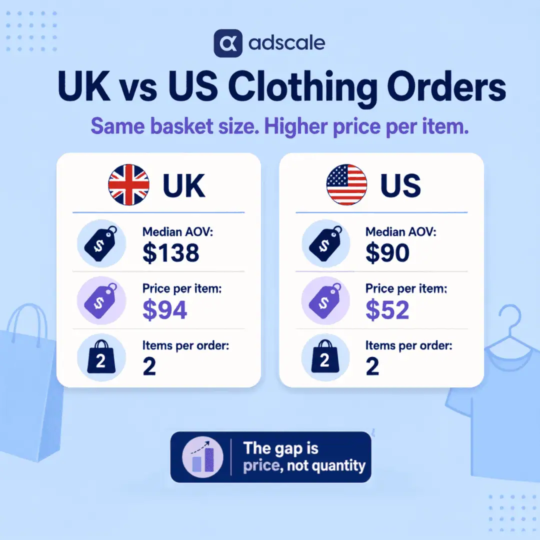
In a recent 90-day window, the median clothing order from a UK store was about $138. From a US store, it was about $90. That is a gap of more than 50%, and it is not because UK shoppers put more in their carts.

Average Order Value gets treated as a proxy for how expensive a brand is. Look across the two biggest western clothing markets, though, and a stranger picture shows up. In a recent 90-day window, AdScale’s data has the median UK clothing order near $138 and the median US order near $90. Same language, same seasons, same broad product category. More than a 50% difference in what lands in the cart.

The obvious explanation, that UK shoppers must be piling more into each order, does not hold. Both markets buy the same number of items per order. The whole gap lives in one place: what each item costs. That is a more useful thing to know than “the UK spends more,” because it points at a completely different growth lever.

Key Takeaways

  • In a recent 90-day window, the median UK clothing order (~$138) ran more than 50% higher than the median US order (~$90) across AdScale merchants.
  • The gap is driven by price per item, not quantity. UK shoppers paid a median of ~$94 per item versus ~$52 in the US.
  • Both markets buy the same number of items per order (a median of 2), so basket size does not explain the difference.
  • This is a current-window pattern, not a permanent law. The size of the gap moves over time, so treat it as a “right now” signal and re-check it.
  • For advertisers, the payoff is a higher revenue-per-conversion ceiling in the UK, which lifts the ROAS you can achieve, as long as the current price spread holds.

Why “Bigger Baskets” Is the Wrong Answer

Ask most growth marketers why one market outspends another per order and you will hear the same answer: bigger baskets. More items. Bundling. The mental model is that a higher AOV means the shopper added more things before checking out.

It is a reasonable guess. It is also not what the data shows, and it is the kind of assumption that quietly wrecks a media plan. If you build a UK expansion strategy around “get more items into the cart” when the real driver is something else, you optimize for a behavior that is not there and wonder why the numbers do not move.

We ran into this directly while pulling regional benchmarks. The instinct was to explain the UK’s higher order value through cart density. The database did not cooperate. So we followed the data instead of the story.

UK vs US Clothing AOV: What the 90-Day Data Shows

Here is the breakdown from AdScale transaction data in the Clothing vertical, over a recent 90-day window, with outliers above $5,000 and sub-$5 noise removed to strip out wholesale and junk rows.

United Kingdom: ~$138 median AOV, ~$94 median price per item, median 2 items per order (~314,000 orders).

United States: ~$90 median AOV, ~$52 median price per item, median 2 items per order (~267,000 orders).

Read those two lines slowly. The item count is identical. Both markets check out with a median of two items. The difference is entirely in the price of those items: about $94 each in the UK against about $52 in the US. The UK shopper is not buying more. The UK shopper is buying pricier.

This is not a bundling story. It is a price-point story. Two clothing markets, the same basket size, nearly double the price tag per garment on one side.

One honest caveat, because the number deserves it. The exact size of this gap is not fixed. Pull a different window and it widens or narrows, and in some earlier periods the US median has actually sat above the UK. So this is a snapshot of current behavior, not a structural constant of the two markets. That matters for how you use it.

Why the Gap Is Price Per Item, Not Basket Size

The useful mental shift is this: in the current UK clothing market, Average Order Value is behaving as a price-per-item signal, not a basket-density signal. Those are two different levers, and they call for two different playbooks.

If AOV were high because carts were fuller, the growth lever would be breadth: cross-sells, bundles, “complete the look” modules, free-shipping thresholds that nudge a second item in. But the baskets are not fuller. They are the same size on both sides of the Atlantic. The UK order value is high because each item is expensive. Pushing bundles at that behavior fights the current instead of riding it. The lever that matches this market is presenting a higher-priced item well, not padding the cart.

Call it the difference between a volume market and a value market. Both markets happen to buy two items right now, but the US does it at a lower price per piece and the UK at a higher one. Same basket, different price physics.

Is the UK a Better Market for Clothing Ads?

For a brand weighing where to put cross-border spend, the value-market read on the UK is genuinely attractive, with a condition attached.

The pattern is not just a category average; it shows up sharply at the individual merchant level too. One UK womenswear brand on the AdScale platform, with well over 100,000 orders in the window, runs a median order value around $167 at roughly $126 per item. That is the value market in concentrated form: not fuller carts, just higher-priced pieces. A brand with that profile does not need a bundle strategy. It needs every reason for a shopper to feel confident paying $126 for a garment.

That is the practical consequence of the mechanism. A higher AOV per conversion gives you more margin to absorb customer acquisition cost. If each converted UK order is worth ~$138 at the median against ~$90 in the US, your return-on-ad-spend ceiling is structurally higher in the UK per conversion, because each conversion carries more revenue. That is real, and it is the strongest argument for a UK push. For a wider view of how order value feeds into ad returns, our breakdown of clothing industry ad benchmarks across Google and Meta puts the blended all-market clothing AOV near $109, a useful reminder that any single split like UK-versus-US sits inside a bigger picture.

But the mechanism changes the creative and landing-page job. In a value market, you are not talking someone into a bigger basket. You are justifying a higher-priced item: quality signals, material detail, fit confidence, returns reassurance, the reasons a shopper feels good paying $94 for one piece instead of $52. Your ad creative and product pages should sell the item, not the bundle. That creative-first emphasis lines up with where Meta is already heading; our guide to the Meta Andromeda creative strategy covers why the strength of the creative now drives delivery more than the targeting does.

And because this is a current-window pattern, treat it as a position you re-check, not a bet you set and forget. The gap was a different size in earlier periods. It can shift again.

How to Adjust Your UK Ad Strategy

  1. Verify the pattern for your own catalog before you reallocate. Our benchmark is a category median across many merchants. Your price points may sit above or below it. Pull your own UK-versus-US median AOV and median price-per-item for the last 90 days and confirm the same shape holds before moving budget.
  2. Match the creative to the price physics. For UK clothing spend right now, build ads and landing pages that justify a higher-priced item: quality, craftsmanship, fit, easy returns. Bundles and “complete the look” prompts will do less work here than the raw AOV might suggest, because the extra value is in price, not quantity.
  3. Set free-shipping thresholds to the real order, not the assumed one. If the UK median order sits around $138, a $150 free-shipping tier lands just above where most orders already are, a gentle nudge rather than a stretch. Base it on the real order value, not an imagined larger basket.
  4. Price the CAC against the value market, not the volume one. Because UK conversions carry more revenue at the median, you can tolerate a higher cost per acquisition there and still clear your ROAS target. Model your UK CAC ceiling off the ~$138 order, not the US ~$90 one. If your returns are lagging despite the headroom, our guide to diagnosing and fixing a low ROAS walks through the usual culprits, from targeting to landing-page experience.
  5. Re-pull the benchmark quarterly. This is a moving signal. The gap changes size across windows and has reversed in earlier periods. Put a recurring reminder to re-run the query so your strategy tracks the market instead of a stale snapshot.

Frequently Asked Questions

Is the UK really a “better” market for clothing advertisers than the US?

Right now the UK offers a higher revenue-per-conversion ceiling, which helps ROAS. But “better” depends on your traffic costs and margins in each market. The higher UK order value gives you more room to absorb acquisition cost. It does not guarantee cheaper clicks or higher conversion rates.

Why is the UK price per item so much higher, about $94 versus $52?

The data shows the difference clearly but does not by itself prove the cause. Contributing factors likely include VAT baked into displayed prices, different product mix, and different shopping habits. What the data does establish is that price per item, not basket size, is where the order-value gap lives.

Does this mean I should stop cross-selling to UK shoppers?

Not stop, reprioritize. Both markets already buy about two items per order, so cross-sell prompts are not the main lever behind the UK’s higher value. Focus first on justifying the higher-priced item, then test cross-sell as a secondary lever.

How reliable is a 90-day benchmark?

Ninety days is a solid read on current behavior and smooths out weekly noise, but it is a snapshot, not a permanent law. The gap changes size across windows and has reversed in earlier periods, so use this as a “right now” signal and re-check it each quarter.

If both markets buy two items, why does the UK spend so much more?

Because the UK’s two items cost far more each: a median near $94 per item versus about $52 in the US. Same quantity, higher price tag. The order-value gap is a price story, not a quantity story.

The One Number That Actually Matters

The number that matters is not the order value on the surface. It is the price per item underneath it. UK and US clothing shoppers are filling carts the same way, two items at a time. The UK shopper is simply paying nearly double for each piece.

Get that backwards and you optimize for a bigger basket that is not coming. Get it right and you match your creative, your shipping thresholds, and your CAC ceiling to how the market actually shops. The only way to know which market you are standing in is to read the data instead of the assumption. The baskets are identical. The price tags are not.


Why Do German Apparel Shoppers Spend More on Desktop Than Mobile?

In German apparel, desktop orders carry a 24% higher average order value than mobile, and the gap is basket size, not price.

The German apparel desktop vs mobile AOV gap is one pattern most brands miss: the two devices do not produce the same average order value. Everyone already knows the traffic truth, that the majority of German apparel shoppers arrive on a phone. So the instinct is to pour design and budget into the mobile experience, and treat desktop as a shrinking legacy channel. That instinct is costing you money.

We looked at apparel orders shipping to Germany across the AdScale network over the last twelve months. The answer was clear and consistent. Desktop shoppers spend meaningfully more per order than mobile shoppers. Their average order value is roughly $222 on desktop versus $180 on mobile, a lift of about 24%. And this is not a one-quarter blip. The gap shows up every single year we measured. And it is driven by how much people put in the cart, not by desktop shoppers buying pricier items.

That reframes desktop from a channel you tolerate into a channel you should be actively defending. It is not where most of your orders happen. It is where your biggest orders happen.

Key Takeaways

  • Desktop apparel orders shipping to Germany average about $222 versus $180 on mobile, roughly a 24% AOV lift (AdScale, trailing 12 months).
  • The desktop advantage held every year: +42% in 2024, +29% in 2025, and +19% in 2026 so far. The size shrinks, the direction never does.
  • The lift comes from basket density, not higher prices: desktop orders average 3.1 units versus 2.4 on mobile, while price per unit is actually slightly lower on desktop.
  • Desktop is only about 30% of German apparel orders but punches well above its weight on revenue per order.
  • The takeaway is not “abandon mobile.” It is simpler: stop treating desktop as an afterthought. It is doing your heavy lifting on basket size.

The Problem: You Optimized for Where the Clicks Are, Not Where the Baskets Are

Here is the trap almost every German apparel brand walks into. You pull up your analytics. Most of your traffic and orders come from mobile. So you make a reasonable-sounding decision: mobile-first everything. The homepage, the product pages, the checkout, the ad creative, all built for the thumb.

There is nothing wrong with a great mobile experience. Mobile is where discovery happens, where the first tap lands, where the impulse lives. But when a channel produces 70% of your orders, it is easy to assume it also produces 70% of your value. It does not. That channel is dominated by smaller, single-item, “let me just check the shipping” purchases. Averaging across it hides a fact: your larger, multi-item baskets are building somewhere else.

We kept seeing this pattern in the transaction data. A mobile channel that looks enormous by order count. A desktop channel that looks small. Then you divide revenue by orders, and the small channel is carrying the fuller cart. Allocate budget and design attention purely by traffic share, and you systematically under-invest in the one environment where people commit to a wardrobe instead of a single test purchase. The same trap shows up at the acquisition layer, where apparel costs and returns differ sharply by platform: channel averages hide where the value actually sits.

The Evidence: A Gap That Refuses to Close

We analyzed apparel orders shipping to Germany across AdScale merchants, excluding cancelled and refunded orders and trimming extreme outliers, then split the data by device.

Over the trailing twelve months, desktop orders averaged about $222 in order value against roughly $180 on mobile. That is a lift of just under 24%. The median tells the same story: $176 on desktop versus $144 on mobile. That matters. It means the gap is not the work of a handful of giant orders dragging the average up. The typical desktop order really is bigger.

The gap holds across three years

The most important test for any finding like this is whether it survives across time. A single-quarter difference is a coincidence. A multi-year pattern is a behavior. So we broke it out by year. In 2024, desktop AOV ran about 42% above mobile. In 2025, about 29%. In 2026 so far, about 19%. The magnitude is narrowing as mobile experiences mature. But across three consecutive years, desktop never once lost. That is the definition of a stable pattern.

This lines up with what the broader fashion ecommerce world reports about the device divide. Analysis from Envive in 2026, cited in Foundry CRO’s DTC fashion benchmarks, found that fashion pulls around 78% of its traffic from mobile but only about 47% of its purchases. Mobile converted at roughly 1.2% against desktop’s 1.9%. The wider industry has documented the conversion side of this gap for years. Our data adds the piece brands most often miss: the order-value side. It is not just that desktop converts better. When it converts, it converts bigger.

We have written before about this exact dynamic in furniture, where desktop buyers outspend mobile buyers by a wide margin per order. The same shape appears in apparel, a very different purchase psychology. That suggests this is less about any one category and more about how people behave on a big screen versus a small one.

The Reframe: Desktop Is Your “Considered Purchase” Channel

Here is how we read it. Screen size is not just an interface constraint; it is a proxy for shopping mode.

Mobile is the discovery and single-intent channel. Someone sees an ad, taps through, and buys the one thing that caught their eye, often while doing something else. The small screen makes comparison, outfit-building, and add-on browsing genuinely harder, so the basket stays lean. Think of it as a “grab-and-go” environment.

Desktop is the considered purchase channel. The bigger screen makes it easy to open products in tabs, compare fits, and build an outfit. The “customers also bought” row sits in view instead of buried below the fold. That is why desktop baskets in our data hold more units and more distinct items. The shopper is not spending more because desktop items cost more. Remember, price per unit was actually a touch lower on desktop. They are spending more because the environment invites them to assemble a fuller cart.

Call it the Basket-Building Screen. The device is doing merchandising work for you. Once you see desktop as the place where customers assemble rather than grab, the question changes. Not “why is desktop traffic so low?” but “how do I make the most of shoppers who are already in build mode?”

The Solution: Treat Your Two Channels as Two Different Jobs

The mistake is designing one experience and shipping it to both screens. The fix is to let each device do the job it is already good at.

On mobile, optimize for the fast, confident single purchase. Reduce friction, make the one-item checkout effortless, and lead with the hero product from your ad. Do not clutter a small screen with the entire cross-sell catalog; you will slow down the very speed that makes mobile convert. Mobile’s job is to win the first order cleanly.

On desktop, lean into assembly. This is where the merchandising investment pays back hardest. Prominent “complete the look” and “customers also bought” modules have room to breathe on a large screen. So do outfit bundles, size-and-fit comparison tools, and free-shipping-threshold nudges. And they meet a shopper who is already in the mood to build. In our data, desktop shoppers added more distinct items per order without being pushed toward pricier ones. That is exactly the shopper a good cross-sell module is built for. It is the same precision that makes the right words in your product and ad copy convert browsers into buyers.

Judge desktop by value, not volume

For our own advertisers, the practical move is to stop judging desktop purely on volume. Evaluate a channel by order count alone and desktop looks like a rounding error you could cut. Evaluate it by revenue per order and by basket density, and it looks like the channel quietly protecting your margins. AdScale’s optimization is built to allocate spend against actual performance signals rather than assumptions about which device “should” matter. This is a textbook case of the assumption being wrong.

The goal is not to move budget wholesale from mobile to desktop. It is to stop starving the channel that produces your fullest carts.

Practical Steps: What to Do This Week

First, confirm the pattern in your own data

  1. Pull your own device split by AOV, not just by orders. Open your analytics, segment by device, and put average order value side by side with order count. If desktop AOV is meaningfully higher, you have the same pattern we found. Do this before you change anything. Decide from your data, not ours.
  2. Check the median, not just the mean. Look at median order value by device too. If the median gap matches the average gap, the difference is real and broad, not the work of a few outlier orders. This one check separates a genuine pattern from statistical noise.
  3. Re-check the gap each quarter. Our year-over-year data shows the desktop lead narrowing as mobile matures. Track your own gap over time. That way you know whether your mobile improvements are closing it, and you catch the moment the pattern shifts.

Then, act on each channel’s job

  1. Audit your desktop cross-sell modules. Open your own product pages on a desktop browser and count how many “complete the look” or “customers also bought” prompts a shopper actually sees above the fold. If the answer is “none” or “one buried at the bottom,” you are leaving basket density on the table in the exact channel most ready for it.
  2. Simplify the mobile path to the single purchase. On mobile, cut steps rather than adding cross-sells. Make the one-item checkout as fast as possible. Mobile’s strength is the quick, confident buy; protect it.
  3. Test a free-shipping threshold tuned to desktop behavior. Set the threshold modestly above your mobile AOV so it nudges mobile shoppers up, but knows most desktop shoppers are already clearing it. A threshold set 20–30% above current AOV is the standard playbook for lifting basket size.
  4. Re-weight how you report channel performance. In your next performance review, add “revenue per order by device” next to “orders by device.” The two columns tell very different stories. The second one should guide where your merchandising effort goes.

Frequently Asked Questions

Does this mean I should stop investing in mobile?

No. Mobile still drives the majority of German apparel orders and is where discovery happens. The point is to give each device the job it does best: mobile for the fast single purchase, desktop for the larger, multi-item basket. Under-investing in either one leaves revenue on the table.

Why do desktop shoppers spend more per order?

In our data it comes down to basket size, not price. Desktop orders averaged more units and more distinct items than mobile, while the price per unit was actually slightly lower. The larger screen makes it easier to compare, build outfits, and add complementary items, so carts get fuller.

Is the 24% desktop AOV lift specific to Germany?

This figure is drawn from apparel orders shipping to Germany across the AdScale network. We have observed similar desktop-over-mobile order-value gaps in other markets and categories, including furniture. The direction appears broad, but you should always confirm the exact size against your own store’s data.

How reliable is this pattern over time?

Reliable. The desktop advantage appeared in every year we measured: about 42% in 2024, 29% in 2025, and 19% in 2026 so far. The size is shrinking as mobile experiences improve, but across three consecutive years the direction never reversed. That consistency is what makes it a behavior rather than a coincidence.

What is the single highest-leverage change to make first?

Audit your desktop cross-sell and “complete the look” modules. Desktop shoppers are already in basket-building mode, so this is the channel where better merchandising converts most directly into a bigger order. It costs little to improve and targets the behavior already present in the data.

On a Phone They Grab, On a Desktop They Build

For years the story about mobile has been a numbers story: most of the traffic, most of the orders, most of the attention. All true. But order count is not order value. The brand that confuses the two pours everything into the channel that fills the smallest carts.

German apparel shoppers are telling you something with their behavior. On a phone, they grab. On a desktop, they build. Both are valuable. But they are not the same job. Design for that difference instead of averaging over it, and the desktop channel you were about to write off turns out to be the one carrying your fullest baskets.

Stop asking why desktop traffic is so small. Start asking what your biggest orders are trying to tell you.

Keep Learning


AdScale Research analyzes aggregated, anonymized transaction data from thousands of eCommerce merchants running ads through AdScale across Shopify and WooCommerce. Findings are directional benchmarks drawn from real order data, verified against AdScale’s database, and intended to guide testing rather than predict individual store outcomes. AdScale’s optimization is driven by calculated, performance-based allocation, not predictive modeling.


What Is the Best Time of Day to Run eCommerce Ads?

The best time to run eCommerce ads is hiding in a gap most budgets ignore: spend is the same at 7 AM and 1 PM, but ROAS isn’t.

A dollar spent on Meta ads at 1 PM returned $6.16 over the last 12 months. The same dollar spent at 7 AM returned $3.47. That is 78% more revenue per dollar at midday. Yet hourly ad spend barely moved across the same dataset. Between 7 AM and 9 PM, advertisers’ budgets varied by only about 13% from hour to hour. The money is flat. The returns are not. That mismatch, not folklore about golden hours, is where any honest answer about the best time to run eCommerce ads has to start.

The Short Answer

So here is the short answer to the title question. The best hours are the long midday plateau in your market’s local time, where both order volume and return per dollar peak. In the global aggregate, that plateau runs roughly 13:00 to 21:00 GMT. AdScale’s analysis of 13.4 million orders shows this window generates 56% of daily revenue. Meanwhile, the spend data above shows most budgets ignore it, pacing evenly through hours that return barely half as much per dollar. US merchants will find their local windows in AdScale’s dedicated analysis of US eCommerce ordering patterns, where the peak band runs 11 AM to 4 PM Eastern.

The more useful answer is what the data does not show. There is no magic four-hour window capturing three quarters of revenue, despite a claim that circulates constantly in performance marketing. Revenue concentration is real and worth acting on. However, it is far less extreme than the folklore suggests. In fact, treating a plateau like a spike is how brands throttle their own best hours. This post breaks down both sides of the mismatch and how to close the gap.

Key Takeaways

  • On Meta, revenue per ad dollar peaks at midday ($6.16 ROAS at 1 PM) and bottoms in the early morning ($3.47 at 7 AM), a 78% gap. Hourly spend varies only about 13% across the same waking hours.
  • The early morning block (5 to 8 AM) consumed 11% of ad spend but produced 8% of conversion value. The midday block (10 AM to 3 PM) consumed 30% of spend and produced 37% of value.
  • On the revenue side, stores generate 56% of daily revenue between 13:00 and 21:00 GMT, in 37.5% of the day. The peak hour out-earns the quietest by 4x globally and nearly 7x in US data.
  • Hour of day is a far stronger budget lever than day of week: global daily revenue varies under 14% across the week.
  • Viral claims that “73% of revenue happens in 4 hours” do not survive contact with large-scale transaction data. Concentration is real, but it is a plateau, not a spike.

Why Does Ad Timing Keep Going Wrong?

Every media buyer has heard some version of the pitch: most of your revenue happens in a tiny window, so 24-hour budgets are subsidizing waste. The instinct behind it is sound. Consumer intent is not a flat line. A budget that spends evenly across 24 hours will absolutely fund impressions during hours when almost nobody is buying.

The problem is what happens next. Brands overcorrect. They read a claim like “73% of revenue in 4 hours” and compress their spend into a narrow window. Then they discover two things the hard way. First, the window was never that narrow, so they starved hours that were quietly producing a third of their revenue. Second, aggressive dayparting collides with how modern ad platforms work. Meta’s Advantage+, Google’s Performance Max, and the broader class of AI tools for Google and Meta ads already shift delivery toward high-converting hours. Hard schedule restrictions can limit the learning those systems depend on.

The result is a strategy debate built on numbers nobody verified. AdScale’s data team went looking for the real shape of the revenue day. The analysis uses actual order timestamps rather than click data or survey estimates. It draws on the same first-party transaction dataset behind AdScale’s clothing industry ad benchmarks. What came back is less dramatic and more actionable than the viral version.

When Is the Best Time to Run eCommerce Ads? What 13.4M Orders Show

The analysis covers 13.4 million orders placed between July 2025 and June 2026. The orders span five high-revenue verticals in AdScale’s transaction dataset: Clothing, Vitamins & Supplements, Health & Beauty, Home & Garden, and Bullion. All timestamps were normalized to GMT. Every headline figure was re-run against the prior 12 months (July 2024 to June 2025) as a stability check. Three findings stand out.

Finding 1: Revenue forms a plateau, not a spike

Hourly revenue climbs steadily from around 06:00 GMT. It reaches its high ground at roughly 13:00 GMT and holds there until about 21:00 GMT. After 22:00 GMT it falls off sharply. Across the current 12 months, that 13:00 to 21:00 GMT window produced 56% of daily revenue. In the prior year the same window produced 53%. The concentration is consistent, but it is spread across nine hours, not four.

These figures aggregate buyers across many time zones, so the global plateau is wider and flatter than any single market’s curve. In US-only data, the same phenomenon appears as a tighter peak band from 11 AM to 4 PM Eastern. AdScale’s analysis of when America shops covers it in detail.

Finding 2: The peak-to-trough gap is 4x globally, and sharper per market

The strongest hour of the day generated about four times the revenue of the weakest hour (03:00 to 04:00 GMT). The prior year showed nearly the identical ratio. That is a serious gap. As a result, flat 24-hour pacing genuinely does overfund the quiet hours. The trough block from 02:00 to 06:00 GMT accounts for 21% of the day but only 9% of revenue. Global aggregation also flattens the curve. In US order data, the busiest hour of the week generates roughly 7 times the volume of the quietest.

Finding 3: Hour of day beats day of week, by a wide margin

Across the same 13.4 million orders, the gap between the highest-revenue day and the lowest was under 14% in the global aggregate. Day-level patterns do exist at the market level. US order volume leans toward Thursday through Saturday, with Friday busiest and Tuesday quietest. But even that gap is modest next to the hourly one. Choosing the right hours moves revenue exposure by multiples. Choosing the right days moves it by percentage points. Sunday-evening closing windows and similar day-level folklore did not survive scrutiny in either dataset.

One more note on rigor, because it matters for anyone running this analysis on their own data. An initial pass surfaced a dramatic single-hour revenue spike that looked like the viral claims come true. On inspection, it traced to timestamp irregularities concentrated in one vertical, the kind of artifact that batch order imports create. It was excluded from the analysis. A suspiciously perfect spike in daypart data is usually a data-quality problem, not a consumer-behavior discovery.

Where Does Ad Spend Actually Go? The Flat-Budget Problem

Knowing when revenue happens is only half the picture. The other half is where advertising budgets actually flow, and this is where the data becomes uncomfortable. AdScale analyzed a full year of hourly campaign performance across its Meta advertisers. The dataset covers $43.8 million in spend and $211 million in platform-reported conversion value. It shows a striking disconnect.

Spend is nearly flat

Between 7 AM and 9 PM in each advertiser’s local time, hourly ad spend varies by only about 13%. Automated budget pacing does exactly what it is designed to do. It distributes the daily budget smoothly so campaigns do not exhaust early. The side effect: a 7 AM impression and a 1 PM impression receive nearly identical funding.

Returns swing 78% across the day

Return on ad spend peaks between 12 and 1 PM at 6.12 to 6.16. It bottoms out between 6 and 7 AM at 3.43 to 3.47. In block terms, the 5 to 8 AM window consumed 11.1% of total spend but produced 8.2% of conversion value. The 10 AM to 3 PM window consumed 30.2% of spend and produced 36.5% of value.

The pattern is structural, not seasonal

The prior 12 months show the identical shape. Worst returns landed in the 5 to 7 AM block and best returns from 10 AM to 3 PM. The gap between the best and worst hours was 1.9x, versus 1.8x in the current year. Google advertisers show the same directional pattern, weakest in the small hours and strongest through the afternoon and early evening. The Google gap is narrower, consistent with search capturing explicit intent whenever it appears.

One honest caveat belongs here, because overclaiming is how the “73% in 4 hours” myth got started. These figures compare average returns by hour. In other words, average is not marginal. Shifting a 7 AM dollar to 1 PM would not automatically capture the full 78% difference. Added spend in an already-funded hour faces rising auction costs and audience saturation. What the data does establish is simpler: the gap exists, it is stable year over year, and flat pacing is structurally blind to it.

The Reframe: Budget for the Plateau, Defend Against the Trough

Most dayparting advice frames the decision as finding the golden window and going all-in. However, the two analyses above support the opposite framing. There is no golden window to conquer. Instead, the data shows a long, stable, nine-hour plateau where the majority of revenue already lives. Beneath it sits a deep trough where budgets quietly leak. And on top of both runs a pacing system that funds them identically.

Call it plateau budgeting. The goal is not to concentrate spend into a dramatic burst. It is to make two things true: budgets never run dry before the plateau arrives, and bids never pay peak prices for trough traffic. That is a defensive discipline, not an aggressive one. It fits how algorithmic delivery already works instead of fighting it. The platforms are reasonably good at finding the plateau. What they cannot fix is a daily budget exhausted before the highest-revenue hours. Nor can they fix a manual bidding setup that treats the quietest hour and the busiest hour as equals.

How Should This Change a Budget Strategy?

The practical shift is less about scheduling and more about pacing, bidding, and sequencing.

Check budget pacing first

The most damaging pattern is a campaign that spends heavily through low-intent hours and caps out before the plateau begins. Before touching any schedule settings, confirm that daily budgets survive into the highest-revenue hours of your market’s day. If campaigns regularly cap out early, that is the leak.

Bid down the trough, not up the peak

On channels with manual control, negative modifiers on your market’s overnight trough are the low-risk move. Google Search supports this through ad schedule bid adjustments. Note that Google applies schedules in the ad account’s time zone, so adjust for any gap between account settings and customer time. In the global data the trough runs 02:00 to 06:00 GMT. In US data it runs roughly 2 AM to 5 AM Eastern. On the spend side, early-morning hours return roughly half as much per dollar as midday. Trough bids cut spend where returns are weakest, without restricting delivery during hours the platform still uses for learning.

Audit algorithmic campaigns for pacing, not schedules

Advantage+ and Performance Max perform implicit dayparting on their own. AI advertising platforms that manage budgets predictively make intraday adjustments as part of the same optimization loop. Hard hour restrictions often hurt more than help. The audit question is not “is the campaign running overnight.” It is “did the campaign still have budget during the afternoon peak.”

Time email and SMS to the front edge of the plateau

Messages that land at the start of the high-revenue window ride the rising intent curve instead of arriving after it fades. For US audiences that means late morning Eastern, just ahead of the 11 AM to 4 PM peak band. For a globally distributed list, aim for around 13:00 to 15:00 GMT.

Verify against your own store

These are aggregate patterns across five verticals. A store selling to one time zone, or in a vertical with unusual buying rhythms, will have its own curve. Pull 12 months of order timestamps, group by hour, and map your own plateau before changing a single bid.

Re-check quarterly

Hourly patterns proved stable year over year in this dataset. But promotions, new markets, and platform changes all shift the curve. A quarterly re-run takes minutes and prevents optimizing against last year’s behavior.

Frequently Asked Questions

What time of day do most eCommerce sales happen?

In AdScale’s global analysis of 13.4 million orders, 56% of daily revenue occurred between 13:00 and 21:00 GMT. For US shoppers specifically, order volume peaks between 11 AM and 4 PM Eastern, with the quietest hours between 2 AM and 5 AM. Early afternoon, not evening, is the peak in both datasets.

What time of day is ROAS highest for eCommerce ads?

In AdScale’s Meta data, return on ad spend peaks between 12 and 1 PM local time at around 6.2. It bottoms out between 6 and 7 AM at around 3.4, a 78% gap. The same midday-best, early-morning-worst shape held in the prior year, so the pattern is structural rather than seasonal.

Does the day of the week matter for eCommerce ad performance?

Far less than hour of day. Global daily revenue varies under 14% across the week, while US order volume shows a moderate lean toward Thursday through Saturday, with Friday busiest and Tuesday quietest. Hour of day shows a 4x to 7x peak-to-trough gap, making it the stronger lever by far.

Does dayparting still work with Advantage+ and Performance Max?

Algorithmic campaign types already shift delivery toward high-converting hours, so hard schedule restrictions often reduce performance. The higher-leverage moves are ensuring daily budgets last through the full revenue plateau, applying bid modifiers on manual campaigns, and timing email and SMS to the start of the high-revenue window.

Should a single-market store use these GMT windows directly?

No. These figures aggregate stores selling across many time zones, which flattens the curve. Single-market patterns are sharper: US data shows a nearly 7x gap between the busiest and quietest hours. Use AdScale’s US ordering patterns analysis for Eastern Time windows, or map your own orders by local hour.

The Bottom Line

The viral version of this story says most hours are statistically irrelevant. It says a brave enough media buyer can compress a day’s budget into a four-hour strike. The 13.4 million orders and $43.8 million in ad spend behind this analysis tell a calmer, more useful story. Revenue concentrates, reliably and predictably, into a nine-hour plateau that holds its shape year after year. Returns per ad dollar swing 78% between the best hour and the worst. And most budgets, paced flat by default, treat those hours as identical.

That means the winning move is not dramatic. The best time to run eCommerce ads is not a secret four-hour window. It is the long plateau your budget keeps under-serving. Protect budget for the hours that already earn it. Stop paying full price for the hours that don’t. And check the claim before restructuring a media plan around it. The most expensive hours in eCommerce advertising are not the quiet ones. They are the peak hours your budget treated like every other hour.


Methodology: Revenue analysis is based on aggregated order data from more than 13 million transactions processed via AdScale between July 2025 and June 2026, across five high-revenue verticals, validated against the prior 12-month period. Spend analysis is based on hourly campaign performance from AdScale’s Meta advertisers over the same period, covering $43.8 million in ad spend and $211 million in platform-reported conversion value. Hours reflect each ad account’s local timezone, and accounts with implausible conversion-value configurations were excluded. ROAS comparisons reflect average returns by hour, not marginal returns from shifting budget. All benchmarks are directional, not predictive of individual store performance. Results vary by market, product mix, promotion calendar, and audience geography.

Keep Learning

Cosmetics AOV Benchmarks: What $70 Tells You About Beauty Consumer Behavior

Your “Buy More, Save More” bundle isn’t working. And it’s not a creative problem, it’s a cosmetics AOV benchmarks problem.

AdScale’s analysis of cosmetics transactions across Shopify and WooCommerce merchants reveals a consistent cosmetics AOV benchmark that holds across 30, 60, 365, and 1,000-day windows: roughly $70. This post explains why that number barely moves, what structural forces are locking it in place, and what beauty brands should be optimizing for instead.

Key Takeaways

  • Cosmetics AOV benchmarks hold remarkably flat, less than $0.80 variance across nearly three years of transaction data
  • Three structural forces create a $70 ceiling: shipping thresholds, product lifecycle syncing, and sample culture
  • Luxury skincare has a higher baseline AOV (~$150) but the same tight variance pattern
  • Bundling and BOGO mechanics are unlikely to sustainably push median AOV past this ceiling
  • The highest-growth beauty brands optimize for repurchase frequency and Time to Second Order (TTSO), not basket size

The $0.80That Explains Everything

Most eCommerce verticals show significant AOV drift when you compare short-term snapshots to annual averages. Seasonal peaks, holiday discounting, and pantry-loading events all create a wide spread between what customers spend in October versus what they spend on average over a full year.

Cosmetics is the exception.

Time WindowMedian AOV
30 Days$69.17
60 Days$69.24
365 Days$69.74
1,000 Days$69.95

Total variance across a full year of trading: less than $0.80 across nearly three years.

This near-flat line tells a story about consumer behavior that no promotional mechanic can easily override. The cosmetics basket isn’t expanding over time. Loyal customers aren’t buying more products per transaction as they deepen their relationship with a brand. They’re replacing what they’ve used.

Why Cosmetics AOV Is Structurally Fixed

The $70 ceiling isn’t a coincidence. Three structural forces lock it in place:

1. The Shipping Threshold Trap

Most mid-market beauty brands set free shipping thresholds between $50 and $75. Once a customer hits the $69–$70 mark, the incentive to add a fourth or fifth item drops sharply. The threshold that was meant to increase order value is effectively capping it.

2. Product Lifecycle Syncing

Beauty routines are modular and predictable. A customer runs out of cleanser and moisturizer at roughly the same time, so the replenishment cycle dictates a specific, recurring cost. AOV only climbs when brands introduce high-ticket hardware (LED masks, microcurrent devices, etc.), but this is a separate category behavior, not a shift in core basket dynamics.

3. The Sample Culture Effect

Rather than spend more to try something new, beauty consumers expect either a “Gift with Purchase” or travel-size samples. This satisfies the desire for variety without increasing transaction value. You’ve given them newness; they haven’t paid more for it.

“But Doesn’t Luxury Skincare Break This Pattern?”

It’s a fair question. The intuition is that high-end skincare, with $80 serums and $120 moisturizers, should behave differently.

The data says: not really.

Luxury brands do see a higher baseline AOV (closer to $150, for example), but the variance is equally tight. The consumer behavior mirrors mass-market: they build their ritual, they buy their kit, they come back 60 days later and do it again. Total spend grows through frequency, through lifetime value, not through a larger basket in any given order.

The ceiling is higher. But it’s still a ceiling.

Stop Fighting Gravity – Start Optimizing for Frequency

If your AOV benchmark is $69 today, aggressive bundling or complex “Frequently Bought Together” mechanics are unlikely to push your median past $75 in any sustainable way. You’re pushing against gravity.

The more productive strategic question is: How do I make $69 happen four times a year instead of two?

This is what the best-performing cosmetics brands in AdScale’s dataset are actually doing. Not chasing basket expansion, optimizing for Time to Second Order (TTSO) and what we call Replenishment Accuracy: the ability to trigger a relevant ad or email at exactly the right moment in a customer’s product lifecycle.

A 30ml serum lasts roughly 4–5 weeks with daily use. The brands winning in this vertical have modeled that, and they act on it.

The customer who bought last month isn’t waiting for your next promotion. They’re almost out of product. The question is whether you show up first.

What This Means for Your Growth Strategy

If you’re a growth marketer or eCommerce leader in the beauty space, here’s how to reframe your priorities based on this data:

Drop this: Complex bundles, BOGO mechanics, and “Add one more for free shipping” pop-ups designed to push AOV past its natural ceiling.

Prioritize this:

In Cosmetics, you don’t grow by getting more out of the box. You grow by getting the box to the door more often.

FAQs

What is a good AOV for a cosmetics brand?

Based on AdScale’s transaction data, the median cosmetics AOV benchmark sits at approximately $69–$70 across short and long time windows. Luxury skincare brands typically see a higher baseline closer to $150, but both segments show similarly tight variance, meaning the number stays stable regardless of promotional activity.

Why doesn’t cosmetics AOV increase with promotions?

Three structural forces keep it anchored: free shipping thresholds (typically $50–$75) cap the incentive to add more items; beauty routines are modular and replenishment-driven rather than expansive; and sample culture satisfies the desire for variety without increasing transaction value. Promotions create temporary spikes but don’t shift the median.

What should beauty brands optimize for instead of AOV?

The most effective lever in cosmetics is repurchase frequency, specifically, reducing Time to Second Order (TTSO). A 30ml serum used daily lasts 4–5 weeks. Brands that model their product lifecycle and time their retention ads and post-purchase flows accordingly consistently outperform those chasing basket expansion.

Does luxury skincare have a different AOV benchmark?

Yes, luxury skincare brands see a higher baseline AOV, closer to $150. But the behavioral pattern mirrors mass-market: customers build a routine, buy their kit, and return on a predictable replenishment cycle. The ceiling is higher, but it’s still a ceiling. Growth comes through frequency, not larger baskets.

What is Replenishment Accuracy in beauty eCommerce?

Replenishment Accuracy is the ability to trigger a relevant ad or email at exactly the right moment in a customer’s product lifecycle. Rather than relying on arbitrary “30 days later” automation, it requires modeling how long a specific product lasts with regular use, and reaching the customer just before they run out, before a competitor does.

The Takeaway

The $70 AOV ceiling isn’t a failure of your merchandising or creative. It’s a structural characteristic of how beauty consumers shop, and once you understand it, you can stop wasting resources fighting it and start building the replenishment engine that actually scales.

If you’re running ads for a cosmetics brand, the next lever isn’t a bigger basket, it’s smarter timing, tighter audience segmentation, and creatives that reach the right customer at exactly the right point in their replenishment cycle.

Furniture Buyers Spend 2.5× More on Desktop. Here’s What That Means for Your Ad Strategy

In furniture eCommerce, desktop buyers spend $150 more per order than mobile buyers. That single data point should restructure how you think about creative, landing pages, and budget allocation. 

Traffic skews toward mobile, no one disputes that. But in the furniture vertical, revenue density tells a different story. AdScale’s analysis of 251k orders reveals a $150 gap between what desktop buyers spend and what mobile buyers spend. That gap is not an accident of device preference. It’s a signal about purchase intent that most ad strategies are still ignoring.

The $150 Gap: Desktop vs. Mobile Basket Size in Furniture Ecommerce

According to AdScale benchmark data, the average basket value (AOV) for furniture buyers on desktop sits at approximately $248. For mobile shoppers in the same vertical, that number drops to approximately $98, a difference of roughly 153%.

To put that in advertising terms: if your current campaign structure serves the same creative to both devices, you are almost certainly under-serving your highest-value customers while over-investing in your lowest-AOV sessions.

This isn’t a small rounding error. It’s a structural divide that has direct implications for how you build campaigns, design landing pages, and allocate budget, especially as you move into the second half of the year when furniture purchase intent traditionally peaks.

Understanding how customer segments behave differently based on context is the first step toward fixing this. Device type is one of the clearest segmentation signals available, and in furniture, it carries more weight than almost any other variable.

Why Furniture Shoppers Behave Differently by Device

The data reflects something intuitive once you see it clearly: buying furniture is not one decision. It’s a multi-stage process that unfolds across time, across devices, and often across people.

Mobile = Discovery Mode

The mobile furniture shopper is rarely in “purchase mode.” They’re browsing during a commute, scrolling through Instagram after dinner, or following a pin to a product page they’ll never buy from that screen. Their average $98 basket reflects this: they’ll add a throw pillow, a candle, a small side table. Items where the financial risk is low, the size is known, and the return policy barely matters.

Mobile is top-of-funnel for high-ticket furniture. Treating it as a closing channel leads to expensive misalignment between creative and intent.

Desktop = Project Mode

The desktop furniture buyer is a different person in a different mindset. They have a floor plan open in one tab and your product page in another. They’re comparing wood finishes, reading assembly specifications, and possibly showing their partner the sectional before committing.

This is the environment where a $2,000 purchase becomes plausible, and where information density converts. When the price crosses $200, consumers instinctively reach for the device that gives them the most visual real estate and the least friction.

Your desktop traffic is already doing the work. The question is whether your site and your ads are meeting them where they are.

The High-Ticket Friction Point: Where Mobile UX Fails Furniture Brands

At the $98 mobile AOV, small friction is acceptable. Shoppers tolerate a slightly clunky checkout for a $30 decorative object.

At the $248 desktop AOV, and especially for items in the $500–$2,000 range, friction is fatal. 

AdScale data shows that as order values climb above $200, desktop increasingly dominates, a pattern consistent across 251k orders in our database.

And mobile UX, however beautifully optimized, introduces structural friction for high-ticket furniture:

  • Hidden specs. Technical dimensions, material breakdowns, and care instructions collapse or disappear behind accordions. Desktop buyers want this information front and center.
  • Low-resolution imagery. Texture matters enormously in furniture. The 4K zoom on a linen sofa that convinces a desktop buyer simply doesn’t render the same way on a 6-inch screen.
  • Comparison difficulty. A buyer evaluating two dining sets side-by-side needs horizontal screen space. Mobile navigation makes this close to impossible.
  • Policy legibility. Return windows, delivery windows, and assembly service options are often buried in mobile layouts, exactly where a high-consideration buyer needs to find them instantly.

The “$248 desktop buyer” is not a different type of person than the “$98 mobile buyer.” They may be the same person at a different moment in the decision cycle. The data point to watch is not who they are, but what device they were on when they converted.

How We Calculated This: AdScale’s 90-Day Furniture Benchmark

AdScale’s research team analyzed 90-day aggregated transaction data across our production data warehouse. The analysis was filtered specifically for the Furniture vertical, with device type captured at the point of conversion.

To arrive at normalized average basket values, we excluded outliers, specifically wholesale orders and $0 test transactions, that would otherwise distort the per-session averages. The result is a dataset of real consumer transactions reflecting genuine purchase behavior, not merchant-side anomalies.

This methodology follows the same standards used in our broader eCommerce order pattern research. If you’re interested in how timing variables interact with basket size across verticals, our analysis of 2.79 million US eCommerce orders by day and hour offers a useful companion read.

The Attribution Trap: Why Mobile Deserves Credit – Not All the Credit

A common objection to the mobile vs. desktop framing goes like this: “Mobile is just the top-of-funnel discovery engine. Desktop is where it closes. You’re measuring the wrong thing.”

This argument has real merit. Cross-device journeys are genuinely common in furniture eCommerce, and last-click attribution will undercount mobile’s contribution to eventual desktop conversions.

But the argument proves too much if you use it to dismiss mobile AOV entirely. There is a real $98 average basket happening on mobile right now. Shoppers are converting on mobile, just on lower-ticket items. That behavior deserves a strategy built around it, not a strategy built for a $248 desktop buyer and then squeezed into a 6-inch screen.

The risk of the attribution argument is what it often leads to in practice: “middle-grounding” the UX. Stripping desktop of information density to match mobile simplicity loses the ability to justify premium price points. Forcing complex configuration tools onto mobile creates friction that kills the impulse purchase. Both devices lose.

The smarter move is to accept the data at face value and build for both intents simultaneously.

3 Ad Strategy Tactics for Furniture Brands in 2026

1. Bifurcate Your Creative Strategy by Device

Stop using the same ad creative across placements. The message that converts a $248 desktop buyer is structurally different from the message that converts a $98 mobile buyer.

Mobile creative should:

  • Feature grab-and-go items – decor, textiles, accent furniture
  • Use short-form video with immediate visual payoff
  • Emphasize a low starting price, easy returns, and fast delivery
  • Lead with emotion and aesthetics, not specifications

Desktop creative should:

  • Feature room collections and hero pieces
  • Use static or carousel formats that show full-room context
  • Emphasize material quality, dimensions, and customization options
  • Lead with the investment framing: “Built to last. Designed for your space.”

AI-generated ad creatives now make it significantly faster to produce distinct creative variants for each device type without doubling your production workload. If you’re currently running a single creative across Meta placements, this is the highest-leverage change you can make.

2. Increase Information Density on Desktop Landing Pages

When a user arrives at your product page via desktop, particularly from a paid search or retargeting campaign, the landing experience should reflect the research mindset they’re in.

Concretely, that means:

  • Expand default spec views. Don’t hide dimensions, materials, or care instructions behind a click. Show them.
  • Use large-format image galleries. Default to a wider image grid, not a single hero image. Include texture close-ups and room-context shots.
  • Make comparison tools prominent. If you sell sofas in three fabric options, a side-by-side comparison shouldn’t require three separate tabs.
  • Surface shipping and assembly details early. For an $800 dining table, the buyer wants to know delivery windows and assembly options before they scroll to the “Add to Cart” button, not after.

The desktop buyer has screen real estate. Use it to justify the higher spend they’re already inclined to make.

3. Build a “Save for Later” Bridge from Mobile to Desktop

The mobile user browsing a $500 item is not necessarily a lost conversion, they may just be the wrong device for that price point.

Give them a bridge.

“Email my cart,” “Save this project,” or “Continue on another device” features, placed prominently in the mobile checkout flow, acknowledge a real behavioral pattern: the user who discovers on mobile and decides on desktop. Capturing that intent, rather than letting the session expire, allows you to re-engage them in the environment where they’re statistically far more likely to complete the purchase.

This is also a high-value email capture moment. A “save my cart” flow that requires an email address turns a browsing session into a retargetable lead. Given that furniture buyers often have a 7–30 day consideration window, that lead has real long-term value.

For furniture brands planning Q4 campaigns, this bridge becomes even more important. AsQ4 eCommerce demand spikes, the volume of mobile discovery sessions increases sharply, and the cost of losing those sessions to device-switching friction goes up with it.

The Bottom Line: In Furniture Ecommerce, the Device Defines the Dollar

The 2.5× desktop multiplier is not a temporary quirk of current mobile UX. It reflects something durable about how humans make high-consideration purchases: they want information, comparison, and confidence, and they seek those things on the device that best provides them.

Furniture brands that build their ad strategy around a single device model, whether mobile-first or desktop-first, are leaving margin on the table. The brands that will win in 2026 are the ones that design explicitly for both intents: the $98 mobile discovery session that needs a bridge, and the $248 desktop closing session that needs information density and confidence-building creative.

The data is clear. The only question is whether your campaigns reflect it.

Do furniture buyers really convert differently on desktop vs. mobile?

Yes. AdScale’s analysis of 251k orders shows furniture buyers on desktop average approximately $248 per order versus approximately $98 on mobile, a 153% difference. This reflects a genuine difference in purchase intent by device, not just device preference.

Should I run different Meta ads for desktop and mobile for my furniture store?

Yes. Desktop campaigns should feature hero pieces and room collections targeting buyers in research mode. Mobile campaigns should focus on lower-ticket items like decor and textiles that align with the $98 impulse-buy profile. Running identical creative across both placements means you’re optimizing for neither.

What is a “Save for Later” cart strategy and why does it matter for furniture eCommerce?

A “Save for Later” or “Email my cart” feature lets mobile shoppers preserve their browsing session and return to complete the purchase on desktop, where furniture buyers spend 2.5× more on average. It captures intent during high-traffic mobile discovery sessions and converts them into a retargetable lead with a longer consideration window.

How does desktop vs. mobile AOV vary outside of furniture?

The device-intent gap exists across eCommerce categories, but it is most pronounced in high-ticket verticals where the purchase requires research, comparison, and consideration. Furniture sits at the extreme end of this spectrum. Lower-ticket or impulse categories tend to show a narrower desktop-to-mobile AOV spread.

Why Geographic Ad Copy Lifts Apparel ROAS by 3x

Apparel creatives with a country name in the ad title beat generic creatives 3:1 on ROAS.
The era of the “Global Aesthetic” is yielding to a more localized, high-intent psychological trigger. While many growth teams spend their cycles testing button colors or model diversity, our latest analysis suggests that the highest leverage point in creative performance isn’t visual,it’s geographic. The teams winning right now aren’t using “summer collection”; they are using “California summer collection”.

The Specificity Premium

Generic ad copy is failing because it offers no friction-free mental image. When a brand advertises a “Linen Shirt,” the consumer must do the heavy lifting of imagining where, when, and how that shirt fits into their life. When the ad title shifts to “The Amalfi Linen Shirt” or “Tokyo Streetwear Essentials”, the creative provides a pre-packaged context.

According to AdScale’s Creative Word Miner, which analyzed cross-channel performance across our 98M-order data warehouse, geographic terms over-index for Apparel ROAS by approximately 3× compared to generic ad copy.

This isn’t merely about shipping locations or regional availability. It is a creative strategy rooted in “Identity Anchoring”. By tethering a product to a specific location, brands benefit from the existing cultural capital of that place. A “Parisian Blazer” carries a weight of sophistication that “Women’s Slim-Fit Blazer” cannot match, regardless of the production quality of the video asset.

How We Calculated This

To arrive at the 3:1 ROAS multiplier, AdScale’s data team isolated 450,000 active apparel ad sets over a 12-month period. We utilized a Natural Language Processing (NLP) model to categorize ad titles into two cohorts:

  1. Geographic-Anchored: Titles containing a country, city, or distinct regional descriptor (e.g., “London,” “Scandinavian,” “NYC”).
  2. Generic-Functional: Titles focusing on the product category, season, or material (e.g., “New Arrivals”, “Cotton Tees”, “Winter Sale”).

We then normalized for budget size and audience targeting (Broad vs. Interest-based) to ensure the ROAS lift wasn’t simply a byproduct of hyper-local targeting. The 3× lift remained consistent even when the “London” creative was shown to a “Broad US” audience, suggesting the effect is driven by creative perception, not just logistical relevance.

Why It Works: The “Origin Effect”

There are three primary reasons why geographic specificity outperforms generic descriptors:

  • Pattern Interruption: In a feed saturated with “Shop the Sale”, a specific proper noun like “Copenhagen” or “Milan” breaks the mindless scroll. It signals a niche, even if the user has never been to that location.
  • Perceived Quality: In the apparel vertical, certain geographies act as a shorthand for quality. “Italian Leather” or “Japanese Denim” are established markers, but the data shows this now extends to lifestyle associations like “Australian Surf” or “Brooklyn Workwear.”
  • Reduced Cognitive Load: Specificity acts as a filter. It tells the user exactly who the garment is for by describing the “vibe” via geography. This leads to higher click-through rates (CTR) from qualified buyers and less wasted spend on “window shoppers.”

The Counter-Argument: Does It Limit Scale?

A common concern among growth leads is that geographic anchoring might alienate customers who don’t identify with that specific location. If you call a collection the “Malibu Set,” do you lose the customer in Chicago?

The data suggests the opposite. The “Malibu” descriptor doesn’t function as a geographic restriction; it functions as an aspirational lifestyle tag. The Chicago customer isn’t looking for clothes to wear in Chicago; they are buying the “Malibu” aesthetic to wear in Chicago. The specificity creates a stronger “Brand World,” which is the primary driver of repeat purchase behavior.

Strategic Implications

For apparel brands looking to optimize their creative backlog, the takeaway is mechanical:

  1. Audit your titles: Replace seasonal descriptors (Summer, Winter, Spring) with geographic anchors that match the collection’s aesthetic.
  2. Test the “Origin” vs. “Destination” hook: Compare titles that reference where the brand is from (e.g., “Designed in Stockholm”) against those that reference a destination (e.g., “Your Santorini Wardrobe”).
  3. Localize the high-performers: If “London” copy works for your trench coats, don’t stop there. Test “Notting Hill” or “East London” to see if further specificity continues to drive the ROAS multiplier.

The data is clear: in a crowded market, the most specific creative wins. Stop selling products and start selling places.

Does geographic ad copy work outside the apparel vertical?

AdScale’s data is specific to apparel, where place-based identity associations are particularly strong. Other lifestyle verticals (home, beauty, travel accessories) may show similar lift, but the 3× figure applies specifically to apparel ad sets in this analysis.

Does geographic anchoring limit audience reach?

No, the data shows the ROAS lift holds even when “London” copy runs against Broad US audiences. The geography functions as an aspirational lifestyle signal, not a geographic restriction.

How do I know which geographic anchor to use for my brand?

Start by mapping your collection’s aesthetic to a lifestyle location (coastal, urban, Nordic, Mediterranean). Test 2–3 anchors against your current generic title in A/B format and let ROAS and CTR determine the winner.

Home & Garden Ad Performance in 2026: Meta vs Google

For many Home & Garden brands, ad performance reviews start the same way:

  • Meta looks expensive.
  • Google looks efficient.
  • Budgets drift toward capture.

And yet, when growth stalls, the question always comes back: Where did new demand actually come from?

This tension isn’t a reporting issue, it’s a measurement and role-definition problem. And in inspiration-led categories like Home & Garden, it often leads teams to make the wrong optimization decisions.

This analysis breaks down:

  • Why Meta often appears more expensive,
  • Why that perception is misleading, and
  • How high-performing Home & Garden brands define the right roles for Meta and Google to drive incremental growth.

Inside the Numbers: What AdScale’s Ecommerce Dataset Reveals

This post is based on non-brand, order-level data from over 100 million ecommerce transactions analyzed through AdScale’s AI eCommerce advertising platform for Google and Meta.

To isolate true demand creation, Google brand campaigns were excluded, ensuring we don’t confuse conversion credit with actual incremental contribution.

The goal: understand how each platform contributes to growth, not just who gets credit at checkout.

Home & Garden Ecommerce Performance Benchmarks (2026)

Before diving into channel comparisons, it’s important to note: Home & Garden is already performing well online.

  • $149 average order value
  • 706% average ROAS
  • 204% above industry ROAS benchmarks

The question isn’t whether Home & Garden is profitable, it’s how different platforms contribute to that profitability.

That’s where the Meta vs. Google comparison gets interesting.

Why Google Ads Look Cheaper for Home & Garden Brands

When comparing performance at the top of the funnel, Google nearly always looks more efficient:

  • Lower CPM: $5.05 (Google) vs $12.19 (Meta)
  • Higher conversion rate: 3.64% (Google) vs 2.41% (Meta)

But that’s exactly what Google is designed to do:

Google captures existing demand, users searching with intent, urgency, and product clarity.

If you judge channels based purely on conversion rate or CPM, Google wins almost every time.

But that’s only part of the story.

Meta vs Google: Full-Funnel Ad Performance Comparison

When you evaluate performance across the entire customer journey, beyond the first impression or conversion rate, the picture changes:

MetricGoogleMeta
CPC$0.32$0.25
CTR1.58%2.34%
CPA$28.64$19.53
ROAS479%894%

Despite Meta’s higher CPMs, it delivers better efficiency and ROAS overall.

Meta costs more to show up, but less to acquire.

This insight is especially important in categories like Home & Garden, where inspiration, not intent, drives the journey.

Home & Garden Is an Inspiration-Led Category

Most Home & Garden buyers aren’t searching for product names. They’re looking for ideas:

  • “Redo the patio”
  • “Upgrade storage”
  • “Make the garden usable this season”

These shoppers aren’t buying SKUs, they’re buying outcomes.

Here’s where platforms diverge:

  • Meta sells the after – the transformation, the dream, the lifestyle.
  • Google captures the moment that dream turns into search intent.

Expecting both to behave the same way leads to distorted conclusions.

Meta Efficiency Improves with Scale in Home & Garden

As brands increase spend, a clear pattern emerges:

  • Google performs best in high-intent, high-conversion moments
  • Meta maintains strong efficiency as budget scales

Early on, Meta may look inefficient, especially when judged with Google-style KPIs. But over time, it proves to be the engine of incremental demand.

Similar patterns emerge in other verticals – see how Meta performs against Google in the clothing category.

Discovery absorbs the cost of demand creation. Capture (Google) benefits from that demand later.

Channel Strategy: Assigning the Right Roles to Meta and Google

The most successful advertisers don’t ask, “Which channel is better?”

They ask, “What job is each channel responsible for?

When teams make this mindset shift, performance unlocks:

  • Meta → Create and qualify demand at scale
  • Google → Capture and convert demand once intent is explicit

Executing this kind of role clarity consistently requires AI budget optimization across Google and Meta, especially as spend scales and performance signals shift.

Problems arise when brands optimize both channels for the same job, usually, last-click conversion. That’s when Meta gets cut for “inefficiency,” and growth quietly slows a quarter later.

Home & Garden Ad Strategy: Key Takeaways for 2026

Benchmarks help explain results, but they don’t replace strategy.

Here’s what Home & Garden advertisers need to remember:

  • Don’t judge discovery channels by capture metrics
  • Don’t optimize for short-term efficiency at the expense of growth
  • Don’t expect Meta and Google to behave the same way

The best performance doesn’t come from cheaper impressions or higher conversion rates.
It comes from channel alignment with intent stage, and clear role definition across platforms.

Final Thought

If Meta looks inefficient in your Home & Garden account, the question isn’t whether the platform works.

It’s whether it’s being measured correctly, and used for the right job.