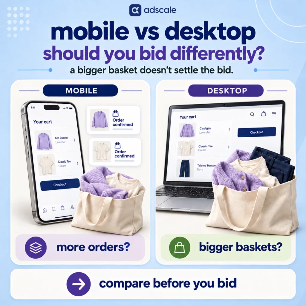

Mobile vs Desktop AOV: Should Apparel Brands Bid Differently?

Bigger desktop baskets and more mobile orders can coexist. What matters for your ad budget is what each device earns after costs.

Desktop customers often spend more per order. Mobile customers often place more of them. Which device deserves more of your advertising budget?

Neither number answers that question on its own. Apparel brands should not raise desktop bids simply because desktop AOV is higher. Compare conversion performance, acquisition costs, margins, and returns within your own store, then check which device controls your campaigns actually support.

The public evidence gives you context. Metorik’s WooCommerce analysis shows larger desktop baskets alongside a mobile-heavy order mix. Adobe reports that smartphones drove a majority of U.S. online holiday spending in 2025. Neither finding establishes the most profitable device for your clothing store.

Before changing a bid, separate two questions: what is happening to your orders, and what are you paying to acquire them?

Key takeaways

  • A higher desktop AOV does not automatically justify a higher desktop bid. Acquisition costs, margins, and returns can change the decision.
  • A falling storewide AOV can reflect a growing share of smaller mobile orders even when basket sizes on each device remain unchanged.
  • Benchmarks describe specific markets, platforms, and time periods. A WooCommerce device average is not an apparel industry standard.
  • Revenue per session helps compare sales performance. Profitability requires costs as well.
  • Google Smart Bidding generally does not support ordinary manual device bid modifiers. Review your campaign type and bid strategy before making adjustments.

Why can blended AOV fall when customers are spending the same amount?

Imagine an apparel store where desktop orders average $200 and mobile orders average $140. Neither figure changes.

The only change is where orders happen:

MetricEarlier periodLater period
Desktop AOV$200$200
Mobile AOV$140$140
Mobile share of orders60%70%
Desktop share of orders40%30%
Blended AOV$164$158

Hypothetical example. Blended AOV is weighted by each device’s share of orders.

Your dashboard shows a $6 decline. But shoppers on each device are spending exactly as much per order as before.

That distinction changes what you investigate. Before adding a discount, raising a free-shipping threshold, or rebuilding your bundles, check whether baskets actually became smaller or whether the mix of orders changed.

It also works in the other direction. A growing mobile order share does not automatically mean mobile deserves more ad spend. You still need to know how those orders were acquired and what they contributed after costs.

For apparel, examine product mix too. If mobile orders contain more accessories and desktop orders contain more outerwear, part of the device gap may reflect the products being purchased. The device report tells you where to look; the product report helps explain what you find.

What do mobile vs desktop eCommerce benchmarks actually show?

Desktop baskets are larger in Metorik’s WooCommerce sample

Metorik’s June 2026 article reports the following split for 2025, drawing on an analysis of more than 65 million orders across 6,000-plus WooCommerce stores:

Device groupShare of ordersAverage order value
Mobile and tablet72%$71
Desktop28%$167

Desktop AOV was approximately 2.35 times the mobile-and-tablet figure. Metorik also reports a smaller U.S. gap: $190 desktop versus $139 mobile, or approximately 1.37 times.

These are platform-specific findings across categories. They do not establish a normal AOV gap for apparel, Shopify stores, or your market. The grouped mobile-and-tablet figure should also stay grouped when you cite it.

Mobile accounted for a majority of U.S. holiday spending

Adobe reports that smartphones drove 56.4% of U.S. online spending during November and December 2025, up from 54.5% in the previous holiday season. Total online spending reached $257.8 billion.

This measures spending share during a specific U.S. retail period. It is not a worldwide apparel order-share benchmark, and it does not tell you mobile AOV.

Conversion performance depends on the comparison

Contentsquare’s 2026 benchmark reports that desktop conversion was 74% higher than mobile across its measured sites. Its broader analysis draws on 99 billion web and app sessions across more than 6,000 sites.

That is useful context, but it is not a prediction for your apparel store. Check whether a benchmark covers purchases or other conversion actions, and whether its denominator is sessions or users, before comparing it with your reports.

Taken together, these sources show why larger desktop baskets and strong mobile sales can coexist. They do not provide a universal percentage by which an apparel brand should increase or decrease bids.

Why higher revenue per session can still mean lower profit

AOV measures revenue per order. It leaves out the visits that never turn into purchases.

Revenue per session brings those visits into the comparison:

Revenue per session = revenue ÷ sessions

Use the same revenue definition and reporting period for each device. You can also calculate it as orders per session multiplied by AOV when those inputs use matching definitions. A user-based conversion rate or a rate covering non-purchase events will not give the same result.

Revenue per session is still only part of the bidding decision. Consider two hypothetical paid-traffic segments:

MetricDesktopMobile
Revenue per session$5.00$3.00
Contribution before ads, assuming 60% remains after variable costs$3.00$1.80
Advertising cost per session$4.00$1.00
Contribution after advertising per session−$1.00$0.80

Illustration only, not a benchmark. Both segments use the same assumed contribution percentage and exclude fixed overhead.

Desktop generates more revenue per visit. Mobile leaves more money after advertising in this example.

In an apparel store, that comparison should account for product cost, discounts, fulfillment, payment fees, and returns where the data allows. Be consistent: do not subtract refunded revenue twice if your revenue figure already reflects it.

Historical profitability also does not guarantee that the next increase in spend will perform the same way. Use it to identify a test, then measure what changes as spend grows.

Do device bid adjustments still work with Google Smart Bidding?

Before recommending a desktop premium, check whether the campaign will use it.

Google says ordinary manual bid adjustments are not supported under Smart Bidding strategies including Target CPA, Target ROAS, Maximize conversions, and Maximize conversion value. Its documentation identifies specific exceptions and distinguishes bid-strategy support from campaign-type eligibility:

Google Ads setupHow to interpret device adjustments
Eligible campaigns using manual bidding or Maximize clicksDevice modifiers can affect bids where supported.
Target CPASupported device adjustments change the CPA target, rather than directly multiplying bids.
Target ROAS, Maximize conversions, or Maximize conversion valueOrdinary positive or negative device modifiers are unsupported. Google’s strategy table lists −100% exclusions, subject to campaign eligibility.

A campaign can have different eligibility from the general strategy table. Check both before applying an exclusion or trying to split campaigns by device.

For automated campaigns, device reports remain useful. They can reveal missing purchase values, a checkout problem, or a product mix that deserves attention even when a manual modifier is unavailable. The Google rules above should not be applied to Meta campaigns; review the controls in each platform separately.

How can cross-device journeys distort the comparison?

A shopper might discover a jacket on a phone and finish the purchase on a laptop. A report grouped by checkout device can show a different picture from an advertising report that attributes the purchase to an earlier ad interaction.

Before comparing exports, establish what “device” means in each one. Is it the device used for the session, the ad interaction, or the purchase? Different answers can produce different device totals without a calculation error.

Google’s enhanced conversions supplement conversion measurement with hashed first-party customer data. They can improve measurement, but enabling them does not make every cross-device journey visible or align all your reporting systems automatically.

Use consistent attribution windows and allow for conversion lag. Where you cannot reconcile device-level advertising costs with store revenue, show the reports separately rather than presenting an uncertain profit estimate as an exact figure.

Six steps to audit device performance before changing spend

1. Choose a period that fits your store

Start with 90 days as a working view, then check whether each device has enough orders to support a useful comparison. Separate major promotions from ordinary trading and examine recent trends. A longer window may add volume but also mix different seasons, prices, or campaigns.

2. Build one consistent device report

Export sessions, orders, revenue, AOV, and purchase conversion rate by device from the same analytics source. Add advertising spend and attributed revenue from your ad platforms, keeping their attribution definitions visible. Calculate cost and contribution per session only where the records can be reconciled.

3. Check what customers actually bought

Split results by product category, price band, market, and new versus returning customers where volume permits. Check channel mix too: a device receiving mostly prospecting traffic should not be judged as if it received the same audience as one dominated by returning customers.

4. Include costs and allow time for returns

Compare contribution after advertising where reliable data is available. For apparel, let the purchase cohort age enough to capture a meaningful portion of returns. If returns cannot be linked to device, use a clearly labeled assumption and check whether a different return rate would change the decision.

5. Test the problem you can observe

If smaller mobile baskets coincide with a difficult bundle selector or an overlooked add-on, test that specific element. Options include clearer complete-the-outfit suggestions, larger size-selection controls, or a visible free-shipping progress indicator. Treat them as hypotheses and measure conversion, basket value, and returns together.

6. Change supported campaign controls and measure the result

Where device adjustments are available, test a measured change based on your own economics. With automation, prioritize accurate conversion values and clearly defined goals. Avoid changing bids, checkout, and promotions at the same time if you want to understand what drove the result. Evaluate once conversion lag, returns, and order volume make the result useful, rather than treating 30 days as a universal rule.

Frequently asked questions

Is mobile AOV higher than desktop AOV for apparel?

The sources reviewed here do not establish that mobile AOV has overtaken desktop across apparel. Metorik’s broader WooCommerce sample shows larger desktop orders, but that is not an apparel-only result. Compare your own devices using the same period, revenue definition, and product segments before drawing a conclusion.

Should apparel brands bid more for desktop traffic?

Only when their own performance supports it and the campaign allows the adjustment. Higher desktop AOV is insufficient evidence. Review acquisition costs, purchase conversion, margins, returns, and attribution. Then test the change, because historical averages do not guarantee that additional desktop spend will deliver the same return.

Why can storewide AOV fall while device AOV stays unchanged?

Storewide AOV is weighted by each device’s share of orders. If mobile has a lower AOV and its order share increases, the blended average falls even when mobile and desktop basket values remain constant. Check order mix before concluding that customers are buying less per order.

Is revenue per session enough to decide where to spend?

No. Revenue per session measures sales generated per visit, but excludes the cost of acquiring that visit and fulfilling the resulting orders. Use it alongside acquisition costs, margins, and returns. Where the data supports it, contribution after advertising is a more useful measure of historical profitability.

How much data do I need before changing device bids?

There is no universal conversion count or reporting period that makes every device comparison reliable. The answer depends on order-value variation, return timing, seasonality, and the size of the difference you are evaluating. Use comparable periods and check whether a few unusually large orders are driving the result.

What should change in your next device review?

Start with the blended-AOV example. A falling average might reflect a changing order mix. A larger desktop basket might come with a higher acquisition cost. More mobile orders might still contribute less after returns. Each calls for a different response.

Put device, product mix, and costs in the same review. Use benchmarks to prompt questions, then use your own evidence to decide what to test.

The device with the biggest basket does not automatically deserve the biggest budget.

Can Breed-Based Size Guides Improve Pet Ecommerce Conversion?

Your shopper recognizes their dog. Your size guide should help them recognize the right fit.

A French Bulldog owner and a Border Collie owner open the same harness page. Both pause at “Medium”. One pictures a compact, barrel-chested dog. The other pictures a lean, athletic dog. The label gives neither much help.

Breed-based size guides may help shoppers choose more confidently. Pair familiar breed examples with clear measurements, then check whether more customers buy the right size and keep it. The research reviewed here does not establish a specific conversion lift from breed labels.

There is, however, a strong reason to investigate fit. In Galaxus’s 2025 Swiss data, pet supplies had a 1.2% return rate. Dog clothing reached 11%, roughly nine times higher. Sizing accounted for 80% of dog-clothing returns. These are one retailer’s results, reported by GlobalPETS and available in a published reproduction.

A healthy category average can hide a costly problem in the products that have to fit.

Pet sizing returns benchmark

Return rates for Galaxus in Switzerland, 2025. Source: GlobalPETS reporting, linked above. The clothing figure describes a subcategory within pet supplies.

Key takeaways

  • Examine harnesses, coats, and other fitted products separately from the rest of your catalog.
  • Use breed examples to make measurements easier to interpret, with an equally clear route for mixed-breed owners.
  • Build recommendations from the actual product and customer fit evidence.
  • Measure purchases, wrong-fit returns, and the money left after those returns.

Why can a size label cost a pet store sales?

The ad earned the click. The shopper likes the product. Now a small dropdown has to answer a much bigger question: “Will this work for my dog?”

If the chart is hidden, the measurements are unexplained, or the only photo shows a completely different body type, the shopper has to fill in the gaps. They might ask support, order two sizes, guess, or leave.

That is the ambiguity tax: the potential cost of unclear fit information before and after checkout. Returns reveal the orders that went wrong. They miss the people who never felt confident enough to order.

This is also where the promise in your advertising meets the product page. If an ad presents a harness for broad-chested dogs, the page should explain how that design fits them. AdScale’s guidance on connecting ads and landing pages addresses that same need for a consistent buying journey.

The useful question is where the shopper becomes uncertain, and what information would resolve it.

What benchmarks should pet merchants use?

Alongside the returns data, two sources provide context for evaluating conversion and sizing:

BenchmarkReported figureWhat it measures
Pets & Animals conversion2.39%Triple Whale industry reporting, August 2025 to July 2026, within its paid-ad analysis
Overall paid-ad conversion1.69%Triple Whale median across its broader dataset for the same period
Apparel sites with insufficient sizing information83% desktop; 87% mobileBaymard’s apparel research, published July 2022

Sources: Triple Whale’s eCommerce benchmarks and Baymard’s sizing research.

The first two figures help frame performance, but the pet result blends product types. Compare it with similarly measured traffic, then investigate your own wearable products separately. A whole-store conversion rate includes shoppers arriving through other channels and for other reasons.

Baymard’s finding concerns human apparel. Its usability testing also observed shoppers abandoning products when they were unsure about sizing. That makes clearer fit information a reasonable hypothesis for pet wearables, without turning an apparel finding into a measured pet result.

Use benchmarks to locate questions worth asking. Your store’s data should determine what needs changing.

How should breed names work alongside measurements?

S/M/L is a code. A breed name gives the shopper a reference point.

“Labrador” may make a size easier to picture. It cannot tell you whether a particular Labrador fits a particular harness. The dog’s proportions and the product’s cut still matter.

Several retailers make that distinction visible. Euro-Dog groups breeds with neck measurement ranges and asks owners to measure to confirm. Bell & Beau provides typical breed measurements while directing shoppers to each product’s own guide.

Ruffwear emphasizes how to measure for its gear, including using a growing dog’s current measurements. These pages show ways to explain fit; they do not publish conversion results for breed labels.

For a merchant, the practical sequence is simple: recognize a possible fit, measure, confirm. Keep those steps beside the selector, especially on mobile.

Mixed-breed owners should be able to follow the same process without choosing a breed. Where relevant, explain body shapes such as a broad chest or long back, and provide help for measurements that fall between sizes.

How can you improve a pet product size guide?

Start with one popular product that generates repeated fit questions. Four changes can make the page more useful.

1. Find the question customers keep asking

Review recent support conversations, fit reviews, exchanges, and return reasons by product and size. Look for something specific: a coat that fits the chest but is too short, straps that do not adjust enough, or confusion between two sizes.

Use breed-to-size patterns only when customers have supplied that information. An order export usually tells you the purchased size, not the dog’s breed. If the detail is missing, collect it through optional review questions or support follow-ups.

Also separate first-time and returning shoppers. Replacing a familiar harness is a different decision from buying one for the first time. This is a useful application of customer segmentation.

2. Make the measurements easy to use

Check dimensions and adjustment ranges against the actual product. Explain where to measure, provide the units your customers use, and show a simple measurement illustration.

Give product-specific advice for dogs between sizes. A blanket “size up” instruction can create a new fit problem. Keep the chart and help link close enough to use while selecting a size.

3. Add breed examples you can support

Use manufacturer guidance, fit checks, or customer evidence for that item. If a breed spans several sizes, say so. Keep the numeric range prominent and add this short note:

Breed examples are a starting point. Measure your dog and check this product’s size chart before ordering.

Avoid copying the same breed list across every harness, collar, and coat. Each product needs its own fit guidance.

4. Make photos and reviews answer fit questions

Caption real product photos with the dog’s breed or mix, relevant measurements, and size worn when those details are available. Ask reviewers for the same information and whether the fit worked.

Include useful reports of awkward fits as well as successful ones. A shopper whose dog has unusual proportions may learn more from an honest explanation of a poor fit than from another five-star review saying “great quality.”

How can you test whether the change works?

Run a comparison on the same product pages, randomly assigning shoppers to a consistent experience:

  • Control: size labels, complete measurements, and measurement instructions.
  • Variant: the same content, with validated breed or body-shape examples added.

Keep prices, promotions, photos, and available sizes consistent. If you change photos and reviews too, evaluate the whole sizing update; you will not know the effect of the breed cue alone.

Before launch, agree on a conversion definition, the smallest improvement worth detecting, and the required sample. AdScale’s introduction to A/B testing explains the basic comparison and why changing settings mid-test undermines it.

Focus the decision on three outcomes:

  1. Purchases: Do more exposed shoppers buy the tested products?
  2. Fit: Do wrong-fit returns and size exchanges improve?
  3. Economics: Does contribution after returns increase per exposed shopper?

For the third measure, account for discounts, refunds, product costs, fulfillment, return handling, and stock that cannot be resold. Add-to-cart behavior and orders containing multiple sizes can help explain the result.

Reach the planned sample, then allow both groups’ final orders to complete delivery and the return window. A week might be enough to prepare the experiment. It does not automatically provide enough evidence to judge it.

With limited traffic, use customer feedback to fix clear problems and treat sales changes as directional findings.

What could a small conversion improvement mean?

Here is a hypothetical calculation, using equal traffic and an unchanged average order value:

MetricBaselineExample result
Eligible product-page sessions20,00020,000
Purchase conversion2.0%2.2%
Orders400440
Average order value$60$60
Revenue before returns$24,000$26,400

That change is a 10% relative improvement, or 0.2 percentage points. It produces 40 additional orders and $2,400 in additional revenue before returns. It illustrates how to value an observed result, rather than predicting what breed cues will deliver.

Then follow the orders. If more shoppers buy the wrong size, the revenue increase can overstate the benefit. If conversion stays flat but exchanges and returns fall, the update may still be worthwhile.

A faster purchase is valuable when the fit holds up after delivery.

Frequently asked questions

Do breed-based size guides increase pet eCommerce conversion?

They may make sizing easier to interpret, but the research reviewed here does not isolate a conversion lift from breed labels. Test accurate breed references alongside product measurements, and evaluate purchases together with wrong-fit returns. The benefit depends on whether the guidance resolves a real customer problem.

What is a useful conversion benchmark for pet eCommerce?

Triple Whale reports 2.39% for Pets & Animals in its August 2025 to July 2026 industry table, within paid-ad reporting. Use it as context, then compare your own results using consistent channel, product, device, and customer definitions. It is not a universal store target. Source.

Should breed names replace measurements in a dog size chart?

No. Breed names provide a reference point; the product’s measurements and adjustment range guide the size choice. Individual dogs vary, and products fit differently. Keep the chart visible, explain how to measure, and offer a clear route for mixed breeds and dogs between sizes.

How should stores measure wrong-fit returns?

Divide units returned for incorrect fit by fulfilled units of the tested products, using orders with completed return windows. Track size exchanges separately. This measures how often purchases lead to fit returns. The share of returns caused by fit answers a different question about return reasons.

How long should a size-guide test run?

Run it until the planned sample is reached and both groups’ orders have completed delivery and the return window. Duration depends on traffic and the improvement you want to detect. Avoid judging success from an early conversion increase while exchanges and returns are still arriving.

Make the right size easier to keep

The French Bulldog owner and the Border Collie owner already want to know whether your harness is right for their dogs. Help them answer that question with a familiar reference, clear measurements, and evidence of how the product fits.

Start with the item that generates the most fit questions. Improve the guidance and follow the results through delivery and returns.

Make the right size easier to recognize, easier to check, and easier to keep.

Keep reading

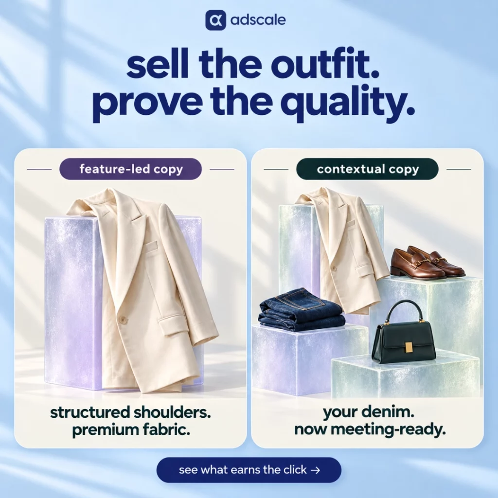
Why Does Styling-Context Fashion Ad Copy Outperform Feature Lists?

Write the outfit first. Use the product details to prove the promise.

A shopper scrolling past a clothing ad is not counting stitches. They are asking a quieter question: How would I wear this?

That is why styling-context fashion ad copy earns more attention than copy that opens with fabric, material, or construction details. Styling context places the garment inside a recognizable life: the office, the weekend, a summer wedding, a cold commute, or the jeans already hanging in the shopper’s closet. A feature list describes the product. Styling context helps the shopper picture owning it.

AdScale’s analysis of Facebook ad copy from 263 apparel and clothing advertisers found that styling-context ads earned a click-through rate roughly 42% higher than attribute-led ads. But that is only half the result. Once a shopper clicked, attribute-led copy produced a click-to-purchase rate roughly 45% higher.

The lesson is not that fashion brands should stop talking about fabric and construction. It is that one ad has two different jobs: earn attention, then justify the purchase. The data suggests a sequence worth testing. Lead with the wearing context. Follow with the product proof.

Key Takeaways

  • Styling-context ads recorded a 1.62% click-through rate, compared with 1.14% for attribute-led ads in AdScale’s database.
  • Attribute-led ads converted 2.11% of clicks into purchases, compared with 1.45% for styling-context ads.
  • Cost per conversion was close, with attribute-led copy approximately 3% cheaper, so neither approach won the whole funnel by itself.
  • Only about 12% of the analyzed creatives clearly committed to either approach, leaving most apparel ads stuck between vague lifestyle language and vague quality claims.
  • The practical move is to test a Wear It With Sequence: show the occasion, pairing, or wardrobe role first, then tell the shopper which product attribute makes that promise credible.

Why Do Feature Lists Struggle to Win the Click?

Most apparel ad copy still reads like a wholesale hangtag:

100% organic cotton. Breathable fabric. Durable construction.

The statements may be accurate. In a crowded feed, they are also almost invisible.

The problem is mental effort. When an ad says “breathable fabric,” the shopper has to invent the situation in which breathability matters. A humid commute. A summer event. An office where the temperature never makes sense. Then they have to decide whether this specific garment solves the problem.

The shopper has to finish the ad for you. Most will not.

That is what styling-context copy changes. It completes the scene:

Light enough for the commute. Polished enough for the meeting.

The product benefit is no longer abstract. The shopper can see where the garment fits before deciding whether to click.

This is also why words such as “premium,” “timeless,” “must-have,” and “high-quality” rarely carry an apparel ad on their own. They make claims without creating a picture. In AdScale’s separate analysis of high-performing apparel ad copy, the strongest language leaned toward concrete nouns rather than decorative adjectives. Linen, loafers, office, and weekend give the brain something to work with. “Premium” asks the shopper to take the advertiser’s word for it.

Material information still matters. It simply answers a later question. At the scroll stage, the shopper is asking, “Does this fit my life?” After the click, they are more likely to ask, “Will it fit, feel good, last, and justify the price?”

Different moments need different information.

What Are Fashion Shoppers Actually Trying to Solve?

Fashion discovery has become easier. Getting dressed has not.

Research commissioned by ASOS and conducted with Attest among 1,952 UK consumers in July and August 2026 found that 68% believed knowing what to buy was easier than knowing how to wear it. One-third had abandoned a purchase because they could not picture how they would wear the item. Another 46% said help integrating a new purchase into their existing wardrobe would improve their fashion decisions. ASOS published the complete methodology and findings.

Those findings identify the same gap visible in the ad data. Shoppers do not lack products. They lack context.

That changes the job of fashion ad copy. The copy should not merely announce that a blazer exists. It should reduce uncertainty around the role that blazer can play:

  • Where would I wear it?
  • What would I wear it with?
  • What does it add to the wardrobe I already own?

This is more than a creative preference. Context can act as a decision aid. It helps the shopper move from “I like that” to “I know what I would do with that.”

There is a commercial opportunity inside that shift. The same ASOS research found that 55% of respondents had bought additional items to complete a look. “Complete the look” is not only a merchandising module. It solves the outfit puzzle while giving the shopper a reason to consider the second item.

The ad starts that process. The product page, cart, and post-purchase communication should continue it.

How Did AdScale Compare Styling-Context and Attribute-Led Ad Copy?

AdScale analyzed Facebook ad body copy from merchants in its Apparel & Accessories and Clothing verticals. The database included:

  • 263 active advertisers
  • 119,670 individual ad creatives containing body text
  • More than one billion combined impressions
  • Campaign data spanning late 2022 through September 8, 2026

The creatives were checked against two language patterns.

Styling-context copy included pairings, occasions, transitions, silhouettes, climate, and fit utility. Examples include “wear it with,” “pairs with,” “tuck it into,” and specific references to where or when the product would be worn.

Attribute-led copy emphasized fabric, material, origin, construction, weight, durability, and quality claims.

The analysis compared performance at three different points: click-through rate, click-to-purchase rate, and cost per completed conversion. This distinction matters because a single conversion metric can hide the different work each copy style performs.

This was an observational analysis across many advertisers, products, audiences, offers, and creative formats. It was not a randomized experiment using one product and one controlled visual. The results show a strong pattern across the database, not a promise that changing one sentence will produce the same lift for every apparel brand.

What Did the Apparel Ad Data Show?

Comparison of click-through and click-to-purchase rates for styling-context and attribute-led apparel ad copy

Styling-context copy generated more clicks, while attribute-led copy converted more of those clicks into purchases. Source: AdScale apparel creative analysis, late 2022 to September 8, 2026.

MetricStyling-context copyAttribute-led copy
Click-through rate1.62%1.14%
Click-to-purchase rate1.45%2.11%
Cost per conversionApproximately 3% higherBaseline

Styling context was stronger at earning the click

Ads using styling-context language recorded an average click-through rate of 1.62%. Attribute-led ads recorded 1.14%.

That makes the styling-context rate roughly 42% higher. In the feed, showing the shopper where the garment belongs was more effective than opening with what the garment was made from.

Attribute language was stronger after the click

Once someone clicked, the result reversed. Attribute-led ads converted 2.11% of clicks into purchases, compared with 1.45% for styling-context ads.

The attribute-led click-to-purchase rate was therefore roughly 45% higher. After showing initial interest, shoppers appeared more responsive to concrete reassurance about the product itself.

Cost per conversion finished close

Despite the differences at each stage, the final cost per conversion was similar. Attribute-led copy came in approximately 3% cheaper.

That result prevents an easy but misleading conclusion. Styling context was not the universal winner. Neither was attribute copy. One was better at attracting attention. The other was better at turning the resulting attention into a purchase.

Most fashion ads were doing neither job clearly

Only about 12% of all analyzed apparel creatives clearly committed to one of the two approaches. The remaining 88% mixed generic lifestyle statements with generic quality claims.

That is the real whitespace. Most brands are not choosing between a sharp styling hook and persuasive product proof. They are running copy that offers neither.

What Is the Wear It With Sequence?

The data did not directly test a hybrid format that combined styling context and attribute proof inside the same ad. It therefore cannot prove that a combined sequence will outperform both categories.

It does, however, reveal two complementary strengths. That leads to a practical hypothesis apparel brands can test: show the wearing context first, then tell the shopper why the product can deliver it.

The pattern is worth naming: the Wear It With Sequence

Step 1: Show the garment in the shopper’s life

The opening should answer at least one of three questions:

  1. Where am I wearing this?
  2. What am I wearing it with?
  3. How does it improve what I already own?

The first line does the work of a stylist standing beside the shopper’s closet. It gives the garment a role, a pairing, or a moment.

Step 2: Tell the shopper why the promise holds up

The next line introduces the relevant attribute as evidence. Fabric, construction, weight, stretch, and care information are no longer disconnected specifications. They explain why the opening promise is credible.

Consider the difference:

Attribute only:
Heavyweight 400GSM cotton.

Styling context only:
The sweatshirt that still looks structured at dinner.

Wear It With Sequence:
The sweatshirt that holds its shape from the flight to dinner. Cut from heavyweight 400GSM cotton for a structured drape that lasts through the day.

The same product detail is present. It now has a job.

How Can You Rewrite Attribute-Led Fashion Ads?

The goal is not to hide the features. It is to translate them into a wearing benefit, then keep the original attribute as proof.

Example 1: Linen shirt

Before:
100% premium linen. Lightweight and breathable.

After:
Made for the humid commute and the meeting after it. Woven from lightweight linen that lets air move without losing its shape.

Example 2: Blazer

Before:
Structured shoulders. High-quality construction. Timeless design.

After:
The blazer that turns last year’s denim into a meeting outfit. A structured shoulder keeps the silhouette sharp without making it feel formal.

Example 3: Basic T-shirt

Before:
Soft organic cotton. An everyday essential.

After:
Clean under a blazer. Easy with denim on the weekend. Soft organic cotton keeps it comfortable enough to stay in rotation.

Example 4: Occasion dress

Before:
Flattering fit. Elegant fabric. Premium finish.

After:
For the wedding that starts in the sun and ends on the dance floor. A fluid, crease-resistant fabric keeps the line clean through both.

The strongest rewrites are product-specific. “Style it your way for every occasion” is not styling context. It is a vague claim wearing lifestyle language. If the line could be pasted onto every product in the catalog, it has not done enough work.

Does Attribute Copy Still Matter for Luxury and High-Price Products?

Yes. The higher the price, the more proof the shopper may need. The question is where that proof appears.

For prospecting ads, context can create recognition and desire. For retargeting ads and product pages, detailed attributes can reduce risk and justify the price. Fiber origin, fabric weight, construction, care, certifications, and manufacturing details all belong in the journey.

They work harder once the shopper understands the benefit they support.

“Italian merino” is useful information. “The knit that holds its shape from the morning meeting through dinner” gives that information a reason to matter. Together, they answer both sides of the decision: why the shopper wants the garment and why this particular version is worth buying.

The sequence should continue after the ad. If the hook promises an office-to-dinner transition, the landing page should show that transition in its imagery and repeat it near the top of the product description. A contextual hook attached to a disconnected product page earns a click the site may immediately lose.

The same principle can continue after checkout. Specific confirmation-email product tips can reinforce how the product fits, layers, or pairs before the package arrives.

How Should Apparel Brands Test the Wear It With Sequence?

1. Classify the current ad library

Sort active ad copy into three groups: styling-context, attribute-led, and neither. Do this before looking at the performance columns. Most brands will discover that “neither” is their largest category.

2. Start with high-spend ads, not favorite ads

Prioritize the copy receiving the most budget. If the highest-spend line could run unchanged for any mid-market clothing brand, the account is paying to be generic.

3. Rewrite only the opening line

Use one occasion, pairing, transition, silhouette cue, or real-life problem. Keep the image, audience, product, and offer unchanged for the first test. Isolating the hook makes the result easier to interpret.

4. Turn the attribute into evidence

Move fabric and construction details into the second sentence. Connect each attribute directly to the opening benefit. Do not attach an unrelated list underneath the hook.

5. Match the visual to the copy

If the line says “loafers for the office,” the creative should show the pairing or make the office logic clear. Styling-context copy over a product-only cutout creates a gap the shopper has to repair.

AdScale’s related analysis of lifestyle images versus product cutouts found the same contextual advantage on the visual side. The image and copy should finish the same thought.

6. Measure the full journey

Track click-through rate, landing-page engagement, add-to-cart rate, click-to-purchase rate, and cost per conversion. CTR alone could make the styling hook look like a complete success even if the landing page fails to close the sale.

7. Confirm the pattern in your own category

Basics, outerwear, occasion wear, luxury products, and activewear do not behave identically. Test the sequence against your own products and audience before reallocating meaningful budget. The broader database supplies the hypothesis. Your account supplies the decision.

Frequently Asked Questions

What is styling-context fashion ad copy?

Styling-context fashion ad copy describes how, where, or with what a garment can be worn. It leads with an occasion, outfit pairing, wardrobe role, silhouette, or practical situation instead of opening with fabric and construction details. Its first job is to help the shopper picture the product inside their life.

Why does styling-context copy earn more clicks than feature lists?

Styling-context copy reduces the mental work required to understand the benefit. Instead of asking shoppers to translate “breathable fabric” into a relevant situation, it shows them the commute, occasion, outfit, or problem directly. In AdScale’s database, this approach recorded a 1.62% CTR versus 1.14% for attribute-led copy.

Should apparel brands stop mentioning fabric and construction?

No. Attribute information remains valuable, especially after the shopper has shown interest. AdScale’s analysis found that attribute-led ads converted clicks into purchases at a higher rate. Use styling context to establish relevance, then present fabric, construction, origin, or care information as proof that the promised benefit is credible.

What is the Wear It With Sequence?

The Wear It With Sequence is a testable ad-copy structure based on two steps. First, show where the garment fits by naming an occasion, pairing, or wardrobe role. Second, tell the shopper which product attribute makes that promise believable. It combines a contextual hook with concrete product proof.

How should fashion brands measure a styling-context copy test?

Hold the product, visual, audience, and offer constant while changing the copy structure. Measure click-through rate and post-click outcomes, including landing-page engagement, add-to-cart rate, click-to-purchase rate, and cost per conversion. The test succeeds only if it improves the business result, not merely the number of clicks.

The Bottom Line

A clothing ad has a few seconds to finish a sentence the shopper started before seeing the brand: I need something I will actually wear.

Feature lists often answer the wrong question first. They explain the garment before the shopper has decided that it belongs in their life. Styling context reverses that order. It shows the office, the weekend, the weather, the silhouette, or the pieces already in the closet.

Then the product details can do what they do best. They can prove the garment will hold its shape, feel comfortable, survive the day, and justify the price.

The data does not say to choose style over substance. It shows that they solve different problems at different moments. Test them in the order the shopper experiences them: recognition first, reassurance second.

Write the outfit first. Let the fabric prove it.

Keep Learning

About AdScale

AdScale is an AI advertising platform for eCommerce brands running Google and Meta campaigns. It uses first-party store data to help teams understand customers, manage campaigns and optimize budgets around the economics of the business.

Do Bestseller and Trending Emails Increase Repeat Purchases?

Public benchmarks show that automated flows are far more efficient than campaigns. AdScale’s order data suggests bestseller engagement is associated with stronger repeat purchasing, but it does not prove that a weekly email caused the difference.

A store can run a strong welcome series, cart recovery flow, and post-purchase sequence and still go quiet between customer triggers. That creates a reasonable question: could a recurring bestseller or “what’s trending” email bring customers back sooner?

The honest answer is: possibly, but the available evidence does not prove it yet.

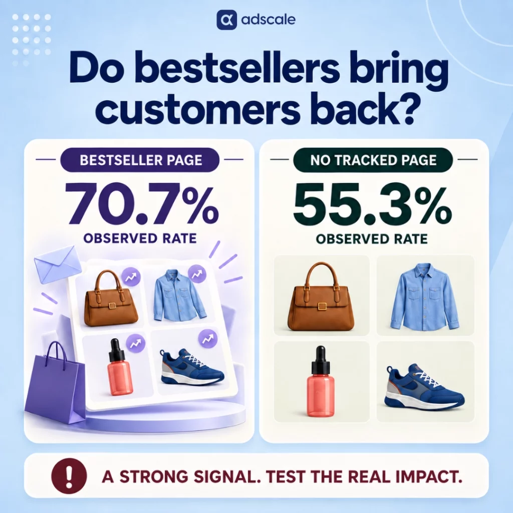
In AdScale’s database, customers whose tracked order journey was associated with a bestseller or trending collection page placed repeat orders at a higher rate than customers without that tracked association. That is a meaningful signal. It is not evidence that a weekly email caused the increase, because the analysis did not randomly assign customers to receive or not receive such an email.

Public email benchmarks establish something different, and much more firmly. Automated lifecycle flows outperform one-off campaigns by a wide margin on revenue efficiency. A weekly trend email is a campaign, so it should not replace welcome, browse abandonment, cart, post-purchase, or win-back automation.

The strongest conclusion supported by the evidence is narrower: current product-demand signals are worth testing in email, especially inside lifecycle flows that already perform well. If a brand also tests a recurring trend campaign, it should measure the incremental effect against a holdout group rather than assume the format works.

Key Takeaways

  • Klaviyo’s 2026 benchmarks show that flows generate nearly 18 times more revenue per recipient than campaigns, so weekly trend emails should not replace lifecycle automation.
  • In AdScale’s observational data, customers associated with bestseller or trending pages had a 70.7% repeat-purchase rate versus 55.3% for the comparison group, a difference of 15.4 percentage points.
  • The AdScale result shows correlation, not causation. More engaged customers may be more likely both to browse bestseller pages and to buy again.
  • Trending information is a merchandising signal, not an email format. It can be tested in campaigns, flows, ads, and on-site recommendations.
  • The right way to evaluate a weekly trend email is with a randomized holdout and revenue, repeat-purchase, and unsubscribe metrics measured over a defined period.

What Do Published Benchmarks Say About Flows Versus Campaigns?

The public evidence is clear on one point: automated flows are more efficient than scheduled email campaigns.

Klaviyo’s 2026 email benchmarks, based on more than 183,000 customers, report that campaigns account for 94.7% of email volume while flows generate nearly 41% of total email revenue from only 5.3% of sends. Average revenue per recipient is nearly 18 times higher for flows. Flow emails also produce more than three times the click rate and 13 times the placed-order rate of campaigns.

Omnisend’s 2025 eCommerce marketing report, based on roughly 24 billion emails sent in 2024, found a similar pattern. Automated emails generated 37% of email-driven sales from 2% of email volume. Abandoned cart, welcome, and browse abandonment messages produced 87% of automated orders.

These comparisons do not tell us whether a particular weekly trend campaign will succeed. Triggered flows reach customers after a relevant action, while campaigns reach broader audiences on a schedule. The audiences, timing, and intent are different. Comparing their averages does not create a fair head-to-head experiment.

It does tell us what not to do: do not remove effective flows to make room for a newsletter. If trending-product information adds value, it should strengthen the existing lifecycle program or fill a separate campaign role that the flows do not cover.

What Did AdScale’s Data Actually Measure?

AdScale analyzed approximately 27 million orders across 240 merchants during a trailing 12-month period reviewed in September 2026.

The analysis identified customers whose recorded order-source URL matched common bestseller, top-seller, or trending collection-page patterns, such as /collections/best-sellers or /collections/trending. Approximately 2,300 customers had at least one order associated with one of those tracked URL patterns.

Their behavior was compared with customers in the same order-history dataset who did not have a matching source URL recorded.

The result:

  • 70.7% of customers in the tracked bestseller or trending group placed more than one order within the 12-month observation window.
  • 55.3% of customers in the comparison group placed more than one order within the same type of window.
  • The difference was 15.4 percentage points, or approximately 27.8% higher in relative terms.
  • Orders associated with a bestseller or trending page had an average order value of approximately $129, compared with $122 for other tracked-channel orders, a relative difference of about 5.7%.

This is an interesting association, but it has important limits.

First, the analysis is observational. Customers who reach a bestseller page may already be more familiar with the brand, more active on the site, or more motivated to buy. Any of those characteristics could also make them more likely to return.

Second, an order-source URL is not the same as a complete record of every page a customer viewed. The analysis identifies a tracked association with a URL pattern, not definitive exposure to a particular email or merchandising treatment.

Third, the approximately 2,300 identified customers are a small subset of the much larger order database. That may reflect how rarely merchants use consistent collection-page naming and source tracking. It also means the result should be treated as directional until the analysis is repeated with stricter tracking eligibility, category controls, exact group sizes, and statistical confidence intervals.

The data supports a testable hypothesis: customers who engage with current bestseller or trending assortments may be more likely to purchase again. It does not support the claim that sending a weekly trend email will increase repeat revenue by a specific percentage.

Is This an Email Finding or a Merchandising Finding?

It is primarily a merchandising finding.

In the AdScale data, email accounted for approximately one quarter of orders associated with bestseller or trending pages. Social contributed a similar share. Direct visits, organic search, and on-site browsing accounted for just over half.

That channel mix matters. If most associated orders did not originate from email, the analysis cannot be used as proof of email performance. What it suggests is that visible popularity may help customers navigate a catalog across several touchpoints.

This leads to the most useful reframe in both versions of this article:

Treat “what’s trending” as a data feed, not as a campaign format.

A demand signal can appear in a weekly broadcast, but it can also improve a browse-abandonment flow, a post-purchase cross-sell, a win-back message, an ad, or an on-site collection. The signal and the delivery mechanism should be evaluated separately.

The benchmark data does not measure this combination directly, but it gives brands a logical place to begin testing.

Flows perform well because timing and customer context make them relevant. Trending data can add a second form of context: what other shoppers are buying now.

For example:

  • A browse-abandonment flow can show the browsed item alongside two currently popular alternatives from the same category.
  • A post-purchase flow can introduce complementary products that are selling quickly, rather than relying on an evergreen recommendation block.
  • A win-back flow can show what has become popular since the customer’s previous order.
  • A welcome flow can help a new subscriber navigate the catalog through a short, current bestseller list.

These are plausible applications, not proven outcomes. Each should be tested against the brand’s existing flow rather than treated as an automatic improvement.

The distinction is important. A personalized recommendation says, “Based on your behavior, you may like this.” A trending recommendation says, “Based on recent store-wide demand, customers are buying this.” Neither message is universally better. They answer different questions, and a controlled test is the only reliable way to determine which one works for a particular audience.

There is no universal evidence-based number.

A well-known experiment by Sheena Iyengar and Mark Lepper compared consumer behavior around displays offering 24 jam varieties and six varieties. More people stopped at the larger display, but a higher share purchased from the smaller one. The study is often summarized as a 30% purchase rate for the limited-choice display versus 3% for the extensive-choice display. Read the original study.

That experiment supports the general idea that too much choice can reduce action in some contexts. It does not prove that five, seven, or ten products is the ideal number for an eCommerce email.

For an initial test, a short ranked list of five to ten products is a practical starting point because it is easy to scan and compare. But the number should remain a test variable. A store with a narrow catalog may need fewer products, while a marketplace with distinct customer segments may need separate category-specific versions.

Will a Weekly Trend Email Cause List Fatigue?

No external benchmark can answer that question for an individual brand.

Aggregate unsubscribe rates mix companies with different audiences, acquisition sources, sending histories, segmentation rules, and attribution settings. They are useful for context, but they cannot prove that a weekly cadence is safe for every list.

The correct benchmark is the brand’s own recent campaign performance. Compare the trend campaign with other campaigns sent to a similar audience and measure:

  • Unsubscribe rate per delivered email
  • Spam-complaint rate
  • Revenue per recipient
  • Click rate, while recognizing that clicks alone do not prove incremental sales
  • Repeat-purchase rate over a defined 30-, 60-, or 90-day window
  • Total campaign pressure on each recipient across campaigns and flows

A weekly send should also replace or compete against another campaign in the test calendar. Adding it on top of every existing message makes it impossible to separate the value of the format from the effect of simply sending more email.

How to Test a Weekly Trend Email Without Fooling Yourself

Choose a rule that can be repeated, such as units sold during the previous seven days, growth in unit sales compared with the prior seven days, or sell-through rate. Do not manually select products after seeing which story looks best.

2. Separate bestsellers from fast movers

A bestseller may lead lifetime or monthly sales without gaining momentum now. A trending product should reflect a recent change in demand. Label each list honestly so customers and analysts know what the ranking means.

3. Create a randomized holdout group

Randomly assign eligible recipients to receive the trend email or remain in a no-send control group. Keep normal lifecycle flows active for both groups. Randomization reduces the engagement bias that affects observational page-visit data.

4. Keep the first test simple

Use a short ranked product list with images, prices, and one factual proof point where available. Avoid combining the first trend-email test with a new discount, major design change, or different audience. Too many changes make the result difficult to interpret.

5. Measure incremental business results

Compare revenue per eligible recipient and repeat-purchase rate between the test and control groups. Also monitor unsubscribes and complaints. Report absolute and relative differences, and include the number of recipients and orders in each group.

6. Run the test long enough to match the purchase cycle

An eight-week test may be sufficient for a frequently purchased category, but it may be too short for furniture, jewelry, or other considered purchases. Choose the evaluation window from the store’s actual time-to-second-order distribution.

7. Test the signal inside an existing flow

After evaluating the campaign, test a dynamic trending block against the current recommendation block in browse, post-purchase, or win-back automation. This separates the value of the product signal from the value of adding another scheduled send.

Frequently Asked Questions

Do bestseller emails increase repeat purchases?

AdScale’s observational data found higher repeat purchasing among customers whose tracked order journey was associated with bestseller or trending pages. It does not prove that an email caused the difference. A randomized email test with a holdout group is required to estimate the campaign’s incremental effect.

Are weekly trend emails better than lifecycle flows?

No evidence reviewed here supports that conclusion. Klaviyo and Omnisend both show that automated flows generate far more revenue relative to their send volume than scheduled campaigns. A trend email should be tested as an additional campaign role or as content inside existing flows, not as their replacement.

Should trending products replace personalized recommendations?

Not without testing. Personalized recommendations use an individual’s behavior, while trending recommendations use recent store-wide demand. They provide different kinds of relevance. Brands can compare them directly inside the same flow, or combine them by showing trending products within the customer’s preferred category.

How often should a brand send a trending-products email?

There is no proven universal cadence. Frequency should reflect how quickly the product ranking changes, how often customers normally buy, and how much email the audience already receives. Start with a controlled test that replaces an existing campaign rather than automatically adding more messages.

Which metric should decide whether the test worked?

Use incremental revenue per eligible recipient and repeat-purchase rate over a predefined window. Include the control group, sample sizes, orders, unsubscribes, and complaints. Open rate should not be the deciding metric because privacy features and inbox behavior can make it an unreliable measure of commercial impact.

What Should a Growth Lead Do Next?

Do not start by promising that a weekly trend email will produce a particular lift. Start with a clean question:

Does showing current product demand generate incremental repeat revenue for this store, from this audience, at this cadence?

Pull recent order data. Define the ranking rule. Select a short list of products. Randomly hold back part of the eligible audience. Send the same treatment consistently for a period that matches the store’s purchase cycle. Then compare revenue, repeat orders, and list-health outcomes.

At the same time, test the same demand signal inside a lifecycle flow. That is where strong public benchmark performance and the bestseller hypothesis meet most naturally.

The evidence does not justify declaring weekly trend emails a proven retention engine. It does justify testing current product demand as a merchandising signal.

That conclusion is less dramatic than a viral percentage. It is also something a serious growth team can act on without pretending the answer is already known.

Keep Learning

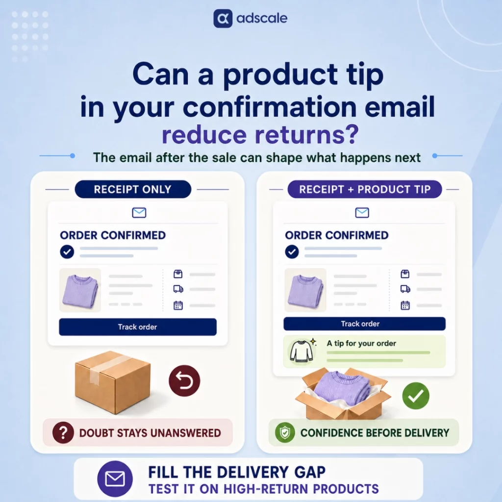
Can Product Tips in Order Confirmation Emails Reduce Ecommerce Returns?

A relevant tip can reduce the confusion and doubt behind some returns, but it is not a universal fix. Here is what the evidence supports, where the tactic works, and how to test it without compromising the receipt.

Buyer’s remorse does not wait for the box. It can start the second the “Place Order” button is clicked.

The payment is real, but the product is still an abstraction. In the days before delivery, the customer has time to wonder whether the jacket will fit, whether the device will be difficult to set up, or whether the serum belongs in their routine at all.

So, can a product tip in an order confirmation email reduce eCommerce returns? It can help with returns driven by uncertainty, incorrect use, or a lack of confidence in the purchase. Research connects post-purchase dissonance and unmet expectations with return intention, while eCommerce guidance consistently points to product onboarding as a way to reduce confusion. What the evidence does not prove is that adding one sentence to a confirmation email will cut every store’s return rate by a fixed percentage.

That distinction is the point. This is not a guaranteed return-reduction hack. It is a focused intervention for the products and return reasons it can actually influence.

Key Takeaways

  • A SKU-specific tip can address doubt, setup confusion, and incorrect use during the gap between checkout and delivery.
  • No verified study isolates one confirmation-email tip and proves a universal percentage reduction in returns.
  • The tactic is most relevant for confusion-driven returns and least relevant for defects, damage, deliberate bracket buying, or a genuine product mismatch.
  • Order confirmations are valuable space: Omnisend reports an average open rate of 53.99% for these emails.
  • The safest approach is to test tips on high-volume, high-return SKUs while monitoring return requests, tracking-link clicks, and support tickets.

Why Does the Gap Between Checkout and Delivery Matter?

Most order confirmation emails do one job: prove the transaction happened. They show the order number, payment details, shipping address, and perhaps a tracking link. Then they stop.

Operationally, that makes sense. Psychologically, it leaves an empty space.

The customer has made a decision but has not yet experienced the product. The benefits that convinced them to buy are no longer in front of them. The price is. This is the post-purchase void, the period between payment and first successful use when a purchase has been completed but not yet reinforced.

A study published in Electronic Commerce Research found that negative expectation disconfirmation and post-purchase dissonance independently predict consumers’ intention to return products. In plain language, people become more likely to consider a return when reality appears unlikely to match what they expected or when they start questioning the choice they made. The study does not test confirmation-email tips specifically, but it establishes the problem such a tip is meant to address: doubt after the purchase can influence return intention.

The scale of the wider returns problem makes even a narrow intervention worth testing. The National Retail Federation’s 2025 Retail Returns Landscape estimated that 19.3% of online sales would be returned during the year, representing part of an expected $849.9 billion in total retail returns.

Not every one of those returns begins in the post-purchase void. Many are caused by fit, damage, defects, delivery problems, or products that simply do not meet expectations. But when the problem is uncertainty about how an item should fit, work, or be used, silence gives the customer nothing that could resolve it.

A useful confirmation email does not merely confirm the transaction. It begins confirming the choice.

Why Is the Order Confirmation Email Worth Testing?

The confirmation email is one of the few messages customers actively look for. They have just spent money and want proof that the order went through.

According to Omnisend’s 2026 order-confirmation benchmarks, order confirmation emails averaged a 53.99% open rate in 2025, higher than any other automation type in its report. That attention makes the confirmation email valuable, but it does not make every use of the space a good one.

The receipt still has a primary job:

  1. Confirm the order.
  2. Show exactly what was purchased.
  3. Explain what happens next.
  4. Make tracking and support easy to find.

A product tip belongs after those elements, not above them. If it hides the tracking link, delays essential information, or turns the receipt into a newsletter, it creates friction instead of removing it.

This is also why the tip should provide utility rather than promotion. A cross-sell asks the customer to spend again. A contextual tip helps them succeed with what they already bought.

What Does the Evidence Actually Support?

There is good evidence for the mechanisms around this tactic, but not for a universal result from the tactic itself.

What the evidence supportsWhat it does not establish
Post-purchase dissonance and unmet expectations can increase return intention.One sentence in an order confirmation reduces returns by a fixed percentage.
Clear product onboarding can reduce confusion that leads to return requests.Every product or category benefits equally from a tip.
Confirmation emails receive unusually high customer attention.More content automatically produces a better customer experience.
Product-specific guidance is more relevant than a generic thank-you message.Styling inspiration can solve defects, damage, poor fit, or deliberate bracket buying.

Salesforce’s guidance on the post-purchase experience identifies accurate product information and helpful onboarding as ways to reduce the confusion behind return requests. It recommends guidance on setup, first use, and what customers should expect, particularly for products with a learning curve.

Klaviyo’s 2026 benchmarks offer another useful clue about relevance and timing. Across more than 183,000 customers, automated flows generated over three times the click rate of campaigns, despite accounting for a much smaller share of sends. That does not prove a return-rate effect, but it supports the broader principle that timely, relevant automated messages earn more engagement than generic broadcasts.

The responsible conclusion is not “confirmation tips reduce returns by X%.” It is this:

Product-specific guidance in the post-purchase window addresses known causes of some returns, and the confirmation email is a high-attention place to deliver it. The size of the effect must be measured by each store.

Which Returns Can a Product Tip Influence?

The fastest way to misuse this tactic is to apply it to every returned product.

It works best when the customer’s problem can still be changed with information. It is far less useful when the cause is physical, logistical, or intentional.

Return driverCan a confirmation tip help?Better response
Uncertainty about first useYesGive one clear setup or usage instruction.
Confusion about fit or intended silhouetteSometimesReinforce the intended fit, while improving PDP sizing information.
Uncertainty about how to style the itemSometimesOffer one specific outfit formula tied to the purchased SKU.
Product used incorrectlyYesExplain the first use, dosage, sequence, or common mistake.
Deliberate bracket buyingNoImprove size tools and fit information before checkout.
Defect, damage, or wrong itemNoFix quality control, fulfillment, and support.
Product differs from its descriptionNoCorrect the product page, imagery, and expectations before purchase.

AdScale’s apparel analysis illustrates the limitation. In its database, refund rates rose from 6.6% on single-item clothing orders to 10.2% on orders containing four or more items. The pattern is consistent with risks such as size hedging and multi-item uncertainty, but a confirmation email cannot reverse a decision to order several sizes on purpose. That problem begins before checkout and needs a pre-purchase solution such as clearer fit guidance.

The confirmation tip should be selected from the actual return reason, not invented from the product category.

Why Does Utility Beat a Generic “Thank You”?

Gratitude is polite. Utility gives the customer a reason to keep paying attention.

Compare these two messages:

Thank you for your order. We appreciate your business.

And:

Your linen blazer is designed with a structured shoulder. Wear your usual size for the intended fit, or size down if you prefer a closer silhouette.

The first message is about the store. The second answers a question the customer may already be asking.

Before delivery, the relevant mechanism is reassurance and dissonance reduction. The customer does not physically possess the product yet, so it is too early to claim that the classic endowment effect has taken hold. The tip instead makes the purchase easier to understand and picture in real life.

After delivery, the goal changes from reassurance to successful first use. A customer who knows how to set up the device, apply the serum, or style the blazer is less likely to abandon the product because of avoidable confusion.

This creates a simple two-stage model:

  • Before delivery: reinforce the customer’s understanding of what they bought.
  • After delivery: help the customer experience the product correctly.

One short confirmation tip can start the process. For products that require real onboarding, it should lead into a second message after delivery rather than trying to carry the entire education journey alone.

What Should the Tip Actually Say?

The strongest tip is specific enough that it could not be pasted onto a different product.

Fashion

Weak: “Style it your way for any occasion.”

Better: “The shoulder on this linen blazer is designed to look structured. Pair it with dark denim for a clean everyday look, or wear it over a slip dress for contrast.”

Electronics

Weak: “Get ready to enjoy your new device.”

Better: “Charge the device for 30 minutes before setup. In the app, open Settings → Devices and hold the button on the underside until the light flashes.”

Beauty

Weak: “Your best skin starts here.”

Better: “Use two pumps on damp skin after cleansing and before moisturizer. If the product pills, wait 30 seconds before applying the next layer.”

Each example answers a likely point of uncertainty. None makes a new sales pitch.

Keep the tip to two or three sentences. If the customer needs a full tutorial, link to a product-specific guide or schedule a short onboarding email for after delivery.

How Should You Test Confirmation Tips?

This is where a plausible idea becomes evidence for your store.

1. Start with return volume, not the entire catalog

Export the 20 SKUs generating the largest number of returns during the past 90 days. A bestseller with an 18% return rate may matter more financially than a slow seller with a 40% rate.

2. Separate the return reasons

Tag the returns as fit, expectation mismatch, incorrect use, damage, defect, wrong item, bracket buying, or another reason your data supports. Only continue with causes that better information could realistically change.

3. Write one SKU-specific tip

Use the product name and address one genuine uncertainty. Avoid vague phrases such as “elevate your look,” “unlock the benefits,” or “perfect for every occasion.”

4. Protect the receipt’s main job

Keep the order summary and next-step information first. Put the tip below them. On mobile, the customer should not have to scroll through advice to find essential order information.

5. Run a controlled test

Randomly divide eligible orders into a control group receiving the current confirmation and a test group receiving the same email plus the tip. Keep everything else, including subject line, layout, and timing, unchanged.

6. Measure the metric that matches the mechanism

Use return authorization rate for the tested SKUs as the primary metric. Break results out by return reason and by new versus returning customers. Storewide return rate can move because of product mix, seasonality, promotions, or operational problems unrelated to the email.

7. Track the guardrails

Watch tracking-link clicks, support tickets per 100 orders, and “where is my order?” contacts. If returns fall but customer-service contacts rise, the email may have solved one problem while creating another.

Do not declare a winner after a handful of orders. Run the test long enough to capture the normal return window and enough eligible orders to make the comparison meaningful.

Frequently Asked Questions

Do product tips in order confirmation emails reduce eCommerce returns?

They can reduce returns caused by uncertainty, setup confusion, or incorrect use. Research supports the underlying role of post-purchase dissonance and product onboarding, but no verified study proves that one confirmation-email tip produces a universal percentage reduction. Treat it as a focused tactic that requires a controlled test.

What should an eCommerce order confirmation email include?

Lead with the order number, purchased items, payment and shipping information, expected next steps, and a clear route to support or tracking. Add a short product-specific tip only after those essentials. The email should remain primarily transactional and easy to scan on a mobile screen.

What kind of product tip works best?

The best tip answers one likely question about the exact SKU purchased. Use fit clarification for apparel, first-run setup for electronics, or sequence and dosage guidance for beauty. Avoid broad inspiration, brand slogans, and advice that could be copied into any product’s confirmation email.

Will extra content increase support tickets or hide the tracking link?

It can if the email is poorly structured. Keep operational details and the primary action first, then place the tip in a short secondary module. Monitor tracking-link clicks and support contacts during the test so a possible reduction in returns does not come at the cost of more customer confusion.

Can confirmation tips stop customers from ordering several sizes?

No. Deliberate bracket buying happens before the confirmation email is sent. Address it on the product page with clearer measurements, garment-specific fit information, customer reviews, and sizing tools. A post-purchase tip may reinforce fit expectations, but it cannot undo an intentional multi-size order.

The Confirmation Email Was Never Just a Receipt

The confirmation email is the one message nearly every buyer expects. Most stores use that moment to repeat the transaction and disappear.

The receipt must remain a receipt. But once the customer knows the order went through and what happens next, two useful sentences can do more than another generic thank-you. They can answer the question that often appears after checkout: “How will this fit into my life?”

That will not prevent a return caused by a damaged product. It will not fix an inaccurate product page or stop someone who intentionally ordered three sizes. But for the customer who is uncertain about fit, setup, or first use, the right information may prevent confusion from becoming a return request.

Do not begin with a universal reduction claim. Do not copy the same tip across the catalog. Start with the products customers already struggle with, test one change, and let your own return data give you the answer.

If you leave the post-purchase void empty, the customer will fill it with questions.

You Might Also Like

About AdScale

AdScale is an AI advertising platform for eCommerce brands running Google and Meta campaigns. It uses first-party store data to help teams understand customers, manage campaigns and optimize budgets around the economics of the business.

Sources Used

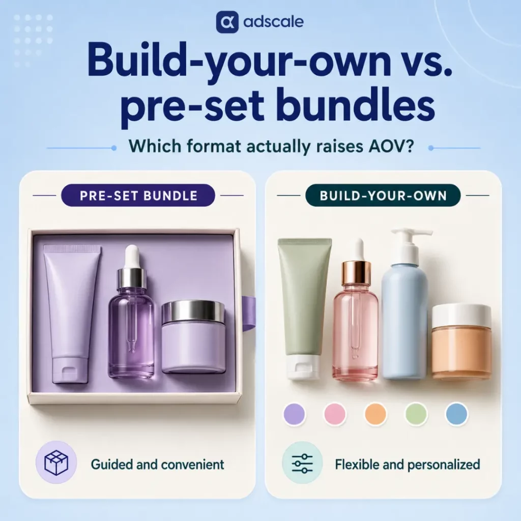
Build-Your-Own vs. Pre-Set Bundles: Which Raises AOV More?

Build-your-own bundles can produce a richer basket, but pre-set bundles often convert better when shoppers want guidance. Here is how to choose, structure and test the right format without mistaking bundle AOV for storewide growth.

Picture two versions of the same skincare offer.

In the first, the brand has already chosen the cleanser, serum and moisturizer. One set. One price. One click.

In the second, the shopper chooses three products from a short menu, watches the bundle fill and sees the discount unlock. Same product category. Same discount. A completely different buying experience.

Which one raises average order value more?

The direct answer is that a well-designed build-your-own bundle can produce a higher-value basket among shoppers who use it, especially when products are interchangeable and customers already know what they like. A pre-set bundle can perform better when shoppers are new, buying a gift or looking for expert guidance.

There is no reliable universal percentage proving that one format always wins. The useful question is not which bundle has the most impressive case study. It is which format increases contribution after discounts and returns across all the shoppers who see the offer, not only the minority who accept it.

That distinction changes the entire bundle strategy.

Key Takeaways

  • Build-your-own bundles work best when customers value control and can complete the bundle through a few simple, bounded choices.
  • Pre-set bundles are usually better for first-time customers, gifts and products that require expert curation.
  • AdScale data shows that larger baskets carry much higher order values, but selling more items does not automatically raise a store’s overall AOV.
  • More products can also mean more returns. In AdScale’s apparel data, refund rates rose from 6.6% on single-item orders to 10.2% on orders containing four or more items.
  • Measure bundle take rate, storewide AOV and contribution after returns together. Bundle-order AOV alone can make a weak test look successful.

Why Do Pre-Set Bundles Feel Like the Obvious Choice?

Pre-set bundles are operationally clean.

The merchandising team chooses the products. Engineering creates one offer. Ads can point to one landing page. The shopper sees one price and makes one decision.

For many buying situations, that simplicity is the value.

A first-time skincare customer may not know which serum belongs with which cleanser. A gift buyer does not want to study a catalog. Someone shopping for a starter kit often wants the brand to say, “Start here.”

But the simplicity creates a ceiling. If one item in a four-product bundle feels wrong, the perceived value of the entire set drops. The shopper may reject the offer because of a single scent, shade, flavor or accessory.

Some shoppers buy it anyway and return the unwanted item. Others leave because the brand’s ideal bundle is not their ideal bundle.

That is the problem hiding behind the clean conversion dashboard. The brand optimized the offer for easy acceptance, but not necessarily for the basket the customer would have chosen.

What Does AdScale’s Order Data Say About Basket Size and AOV?

Bundle performance only makes sense when you separate two questions:

  1. Does adding items raise the value of this order?
  2. Does selling more items raise AOV across the entire store?

They sound similar. The data says they are not.

In Q2 2026, AdScale analyzed 451,705 verified orders from 77 active apparel stores running on Shopify and WooCommerce. Orders were divided by item count:

Items in the orderOrder value vs. single-itemShare of orders
One itemBaseline38.5%
Two items+54%27.6%
Three or more items+164%33.9%

Inside an individual order, the relationship is clear. A basket with three or more items had a median value more than two and a half times that of a single-item order.

Call this the Basket Composition Effect: adding products can dramatically change the economics of a specific checkout.

Then the analysis moved from orders to stores. Across the 69 stores with enough volume, the correlation between average items per order and shop-level AOV was -0.18, which is effectively no useful relationship. Some of the highest-AOV stores sold fewer items per order because product price, not basket size, did the work.

This is the store-level illusion behind many bundle success stories. A bundle can raise the AOV of orders containing the bundle while barely moving the store’s headline AOV if only a small share of shoppers accept it.

The full methodology and category breakdown appear in AdScale’s analysis of apparel AOV by item count.

What Is the Return-Rate Catch?

A larger basket is not automatically a more profitable basket.

AdScale’s analysis of more than 7,000 apparel stores found that refund rates increased with the number of items purchased:

Items in the orderRefund rate
One item6.6%
Two items9.3%
Three items10.0%
Four or more items10.2%

In apparel, a large order can reflect enthusiasm. It can also reflect bracket buying, such as ordering two sizes with the intention of returning one.

A build-your-own bundle may reduce one specific type of waste because the shopper selected every item. It does not solve poor fit, unclear sizing or weak product information. If the builder pushes more units into the box without increasing confidence in each choice, the store can trade a higher AOV for a heavier return bill.

That is why bundle tests should end at contribution after refunds, not at gross order value. AdScale’s multi-item return-rate analysis provides the full benchmark.

Why Can Build-Your-Own Bundles Produce a Richer Basket?

The appeal of a build-your-own bundle is not simply “more choice.” It is the feeling that the shopper created something and finished it.

Researchers Michael Norton, Daniel Mochon and Dan Ariely explored this behavior in a series of experiments involving IKEA boxes, origami and Lego sets. Participants valued products they had assembled more highly than comparable products assembled by someone else. Crucially, the effect weakened when people failed to complete the task or saw their work undone.

The researchers called this the IKEA effect.

In eCommerce, the same mechanism can appear when a shopper chooses a base product, adds a preferred variant and completes a set. The labor is small, but the sense of ownership is real.

For bundle design, the important part is not labor alone. It is labor with a visible finish line.

That gives us a useful merchandising concept: the Completion Effect.

The Completion Effect happens when a shopper:

  1. Starts assembling a clearly defined set.
  2. Sees exactly what remains to complete it.
  3. Reaches a visible reward, such as a discount or free-shipping threshold.
  4. Finishes with a bundle that reflects personal preferences.

Once a shopper has selected two of three required products, the third item no longer feels like a completely separate purchase decision. It feels like the final piece of something already started.

That is where BYO bundles can increase attach rate without relying only on a deeper discount.

Can Too Much Choice Hurt Bundle Conversion?

Yes. A build-your-own bundle fails when personalization turns into homework.

In the well-known jam experiment by Sheena Iyengar and Mark Lepper, a display of 24 jams attracted more attention than a display of six. But nearly 30% of shoppers exposed to the limited selection later purchased, compared with only 3% of shoppers exposed to the larger selection. The research showed that extensive choice can look attractive while making a final decision less likely. The study was published in the Journal of Personality and Social Psychology.

This does not mean merchants should avoid build-your-own bundles. It means they should avoid presenting the entire catalog as one giant selection grid.

A good BYO experience creates bounded choice:

  • Choose one base product from three to five options.
  • Choose one meaningful variant, such as scent, shade or flavor.
  • Choose a complement from a short curated list.
  • Add an optional extra to reach the next reward.

The shopper still gets control, but every decision is small enough to complete quickly.

One merchant example illustrates the principle. In a vendor-published case study, sustainable candle brand Arbor Made used a clear multi-step bundle flow that let shoppers choose jars and scents. The vendor reported a 20% conversion-rate increase and a 10% AOV increase after implementation. Because the brand introduced multiple bundle formats and the case study was published by the bundle provider, it should be treated as an example rather than proof that BYO caused the entire lift. What matters is the design choice: a short, structured builder instead of an open catalog.

Build-Your-Own vs. Pre-Set Bundles: Which Should You Use?

Choose the format based on the customer’s job, not the latest bundling trend.

SituationBest starting formatWhy
First-time customerPre-set bundleReduces uncertainty and teaches the product range
Gift purchasePre-set bundleRemoves decisions and creates a complete presentation
Starter routinePre-set bundleLets the brand provide expert guidance
Repeat customerBuild-your-ownThe shopper already knows personal preferences
Interchangeable productsBuild-your-ownFlavors, scents, shades and refills benefit from control
Fit-sensitive apparelPre-set or tightly bounded BYOToo many variants can increase uncertainty and returns
Slow-moving inventoryBuild-your-own optionA slower SKU can appear as a choice instead of being forced into every set
Mixed trafficOffer bothNew shoppers get guidance; returning shoppers get control

There is nothing wrong with running both formats.

Holiday gift traffic may respond better to a ready-made set. Replenishment customers in January may prefer to choose their own flavors or refills. A high-AOV returning customer should not necessarily see the same offer as a first-session gift buyer.

That is where first-party segmentation becomes useful. The bundle is not only a merchandising decision. It can also be matched to the customer segment, purchase history and traffic source. AdScale’s guide to eCommerce customer segmentation explains how to build those groups from store data.

How Should You Structure a Build-Your-Own Bundle?

The strongest builder is rarely the one with the most options. It is the one that gets the shopper to completion with the least uncertainty.

1. Start with a bounded product pool

Choose six to ten eligible products rather than opening the full catalog. Products should feel interchangeable enough to create control but related enough to form a coherent set.

2. Break the bundle into two to four steps

Use steps such as “choose your base,” “pick your scent” and “add an extra.” Do not make the customer decode one page containing 40 products.

3. Show progress and the finish line

Display empty bundle slots, completed steps and the exact reward still available. “Add one more item to save $15” is clearer than making the shopper calculate the offer.

4. Consider a shallower BYO discount

Autonomy has value. Test whether a 15% BYO discount can compete with a 20% pre-set discount before giving away the same margin on both formats.

5. Give every product enough information

The builder should show the details needed to select each item confidently, including sizing, compatibility, ingredients or variant differences. The hero product cannot carry the explanation for the entire box.

6. Place the bundle in the decision zone

Show it on relevant product and collection pages or after the first cart addition. A bundle hidden in a separate collection will not affect most paid sessions.

What Should You Measure So the Bundle Does Not Fake the Win?

Bundle-order AOV is the vanity version of this test. Measure these numbers together:

  1. Bundle take rate. Divide accepted bundle offers by the sessions or product views where the offer appeared. A large AOV lift at a 1% take rate may barely affect store revenue.
  2. Bundle AOV, non-bundle AOV and storewide AOV. If only bundle AOV moves, you created a high-value subset of orders. That can still be worthwhile, but report it accurately.
  3. Attach above the threshold. Track how many products shoppers add beyond the minimum needed to unlock the discount. This shows whether BYO creates genuine top-off behavior.
  4. Conversion rate by format. A richer basket on substantially fewer completed checkouts is not automatically a win.
  5. Contribution after discount. Revenue does not tell you whether the extra units paid for the offer.
  6. Refund rate by bundle type. Wait long enough for returns to arrive before declaring a winner.
  7. Incremental product attachment. Check whether bundled products were already commonly purchased together at full price. Otherwise, the test may simply discount a basket that would have happened anyway.

Paid acquisition makes this especially important. Customer acquisition cost is fixed per order in the short term. A $40 CPA attached to a $60 order has very different economics from the same $40 CPA attached to a $90 order. A stronger bundle can improve the return on those acquired orders without changing the ad account, but only if the margin survives the discount and returns.

How Do You Test Build-Your-Own vs. Pre-Set Bundles?

Run the test on one product collection before applying it across the store.

1. Pull 90 days of order-line data. Identify products frequently purchased together and products that rarely attach. Do not start with a merchandising mood board. Start with actual baskets.

2. Build both offers from the same product pool. Create one pre-set bundle and one short, stepped BYO experience using comparable products and discount depth.

3. Split shoppers intentionally. Show the pre-set version to new customers or gift-intent traffic. Show the builder to returning customers where possible. If you want a clean format comparison, run a randomized test within the same audience segment.

4. Read early behavior after approximately two weeks. Compare exposure, take rate, conversion, bundle completion and attach above the threshold. Use this checkpoint to identify interface friction, not to declare the final winner.

5. Read contribution after the return window. Recheck the result once refunds have landed. The winning format is the one that produces more retained contribution per exposed session, not the one that shipped the most discounted units.

Frequently Asked Questions

Do build-your-own bundles raise AOV more than pre-set bundles?

Build-your-own bundles can produce a higher AOV among shoppers who complete them, especially for interchangeable products and repeat customers. Pre-set bundles may convert better for new customers, gifts and guided routines. No universal benchmark proves that BYO always wins, so compare retained contribution per exposed session.

Can a build-your-own bundle hurt conversion rate?

Yes. Conversion can fall when shoppers face too many options, unclear steps or an unfamiliar product category. Use a bounded product pool, two to four short decisions, sensible defaults and a visible completion reward. Measure conversion alongside bundle AOV and take rate.

Do product bundles automatically increase storewide AOV?

No. AdScale data shows that multi-item orders have much higher values than single-item orders, but items per order and AOV had a -0.18 correlation across the stores analyzed. Storewide AOV may barely move if only a small percentage of shoppers use the bundle.

Which products work best in a build-your-own bundle?

BYO works best when products are related but interchangeable, such as flavors, scents, shades, refills or accessories. It is less suitable when customers need expert guidance or when compatibility, fit and product knowledge make every choice difficult. Those cases often favor pre-set bundles.

What discount should a build-your-own bundle offer?

There is no single ideal discount. Start with the smallest incentive that creates meaningful take rate and profitable attachment. Test a slightly shallower BYO discount against a pre-set offer because personalization itself adds value. Judge the result using contribution after discounts and refunds, not AOV alone.

The Format Is Not the Strategy

Return to the two skincare offers.

The pre-set box tells the shopper, “We chose the right routine for you.” The builder says, “Choose what belongs in yours.”

Neither promise is automatically stronger.

The pre-set version wins when guidance is the product. The build-your-own version wins when control is the product. When a store serves both kinds of shoppers, the smartest answer may be to offer both and decide who sees each one.

The most important lesson sits beneath the format. A higher bundle AOV does not prove the store made more money. A larger box does not prove the margin survived. And more choice does not prove that shoppers felt more confident.

Design the bundle around a real buying job. Keep the work small and the finish line visible. Then score the test on contribution after returns.

The best bundle is not the one your team assembled or the one the customer assembled. It is the one your data proves they wanted.

Keep Learning

About AdScale

AdScale is an AI advertising platform for eCommerce brands running Google and Meta campaigns. It uses first-party store data to help teams understand customers, manage campaigns and optimize budgets around the economics of the business.

    Why Is the Conversion Rate for Furniture Ads So Low?

    Furniture ads out-click almost every other ecommerce category. They still convert at less than a third of the average rate, and it isn’t a creative problem.

    Quick answer: Furniture ads convert at roughly 2.25%, less than a third of the 7.42% blended average across all ecommerce verticals, even though furniture’s click-through rate (2.67%) is above average too. The gap exists because furniture is a slow, multi-visit purchase decision, not a single-session sale. A bigger basket size narrows the gap. It doesn’t close it.

    If you sell furniture and you’ve been staring at a click-through rate that looks great next to a conversion rate that looks broken, you’re not doing anything wrong. That combination is the norm for this category, not the exception. This isn’t something a better product photo fixes. It’s a buying-cycle problem, and once you see it that way, the whole media plan starts to make more sense.

    Key Takeaways

    • Furniture ads pull a 2.67% click-through rate, above the 1.99% blended average across every vertical we track.
    • The same furniture cohort converts at 2.25%, less than a third of the 7.42% blended average.
    • Furniture’s average order value runs close to double the blended average, but that lift isn’t enough to fully offset the lower conversion rate.
    • Google and Facebook play distinct roles for furniture: Facebook drives cheaper, higher-volume clicks; Google converts at roughly four times the rate.
    • The fix isn’t more clicks. It’s building a funnel that assumes a longer, multi-visit decision instead of a single-session sale.

    Why Do Furniture Shoppers Click So Often But Take So Long to Buy?

    I’ve watched a lot of merchants open their ads dashboard, see a strong click-through rate, and assume the campaign is working. Then they check the conversion rate a few days later and start questioning the creative, the landing page, the offer, sometimes the whole strategy.

    For most categories, that instinct is right. A high CTR paired with a low CVR usually means something between the ad and the checkout is broken. Furniture behaves differently, and if you manage paid media for a furniture brand without knowing that, you’ll spend a lot of budget chasing a problem that isn’t there.

    A sofa is not a phone case. Nobody buys a dining set on a lunch break between meetings. The purchase involves a partner’s opinion, a tape measure, a scroll through three competitors’ websites, and usually more than one visit to the product page before a card comes out. The click is easy. The decision is not.

    What Is a Good Conversion Rate for Furniture Ads?

    In our database, furniture ads convert at 2.25% on average, well under a third of the 7.42% blended rate across every ecommerce vertical we track. That’s the benchmark to measure your own furniture store against, not the general ecommerce average most benchmarking guides quote.

    Here’s the full picture, pulled from the furniture brands active in our database over a recent 90-day stretch: roughly 38 million ad impressions and over a million clicks across 20 furniture merchants running paid social and paid search.

    MetricFurniture (cohort average)Blended ecommerce average
    Click-through rate (CTR)2.67%1.99%
    Conversion rate (CVR)2.25%7.42%
    Average order value (AOV)~$852~$449
    Return on ad spend (ROAS)8.7x10.1x

    Furniture doesn’t struggle to earn attention. It earns more of it than most categories. What it doesn’t do is convert that attention into a same-visit sale at anywhere near the typical ecommerce rate. Average order value helps offset the gap (furniture orders run close to double the blended average), but it isn’t enough on its own: furniture’s blended ROAS still lands a shade under the ecommerce-wide average.

    The channel split tells its own story:

    Channel (furniture)CTRCVRAOVROAS
    Google1.82%4.36%~$9138.0x
    Facebook3.61%1.07%~$71511.5x

    Google converts furniture shoppers at close to four times the rate Facebook does, and carries a higher basket size too. Facebook pulls double the click volume at a lower cost per click, which is why it still posts a stronger ROAS despite the weaker conversion rate and smaller basket. Neither channel is “better.” They’re doing different jobs in the same funnel, whether you’ve planned for that or not.

    What Is the High-Ticket Click Trap?

    The High-Ticket Click Trap is what happens when a strong click-through rate on a high-consideration product gets mistaken for buying intent, when it usually just signals early-stage curiosity instead.

    A high CTR on a $40 product usually means the ad is doing its job end to end. A high CTR on a $900 sectional usually means the ad found someone in the early, curious part of a long decision, and curiosity is not the same currency as intent. Treat every furniture click like a hot lead and you’ll burn budget nurturing browsers who were never going to buy on visit one. Treat every furniture click like a cold, unqualified visitor and you’ll under-invest in the retargeting and content that actually closes a sale that takes weeks to happen.

    The trap isn’t the click-through rate itself. It’s judging a considered purchase by an impulse-purchase scorecard.

    How Do You Fix a Low Furniture Ad Conversion Rate?

    Once you accept that the first click was never supposed to convert on its own, the whole media plan shifts from “get more clicks” to “manage the gap between click and decision.”

    In practice, that means re-weighting where the budget goes rather than chasing a bigger top-of-funnel number. Facebook earns its keep as a discovery engine: cheap, high-volume clicks that introduce the brand and the product to people who are just starting to look. Google search earns its keep at the other end, capturing people who already know roughly what they want and are close to ready, which is exactly why its conversion rate and basket size both run higher.

    The mistake I see most often is treating both channels the same way and judging them against one shared CVR target. A furniture brand that expects Facebook to convert like Google will cut the exact channel that’s feeding its search retargeting pool. A brand that expects Google to deliver Facebook’s click volume will underfund the channel that’s actually closing the sale.

    How Can You Improve Furniture Ad Performance? (7 Steps)

    1. Benchmark against your own category, not blended ecommerce averages. A 2.25% CVR isn’t a red flag in furniture. Compare this month’s furniture conversion rate to last month’s furniture conversion rate, not to a generic ecommerce number.
    2. Split your channel goals by funnel role, not by a single shared KPI. Set a discovery-and-reach target for Facebook and a capture-and-convert target for Google, and stop measuring both against the same CVR benchmark.
    3. Build a retargeting sequence long enough for the actual decision window. If your retargeting window closes at 7 days, you’re dropping people mid-decision. Extend the window and layer in content that answers the objections furniture buyers raise late, like delivery timelines, return policy, and room fit, rather than just re-showing the product.
    4. Give the undecided visitor something to do besides “buy now.” A saved-item list, a room-planning tool, or an email capture for a measurement guide gives you a second touchpoint with someone who isn’t ready to check out on the first visit.
    5. Watch average order value alongside conversion rate, never alone. A campaign with a lower CVR but a meaningfully higher AOV can still be your best performer. Judge the full path, not one metric in isolation.
    6. Protect the discovery channel even when its CVR looks weak. If Facebook is feeding people into a Google search retargeting pool that eventually converts, cutting Facebook because its standalone CVR looks soft can quietly starve your best-converting channel of the audience it depends on.
    7. Re-check these numbers every quarter. Furniture buying cycles shift with the season (moving season, holidays, new-home purchases), and a benchmark from one quarter won’t hold in the next.

    Frequently Asked Questions

    Is a 2 to 3% conversion rate normal for furniture ecommerce?

    Yes. Across the furniture brands in our database, conversion rates cluster well below the typical ecommerce benchmark, closer to a third of the blended average across all verticals. Furniture is a high-consideration purchase, so a lower single-visit conversion rate reflects the buying cycle, not a broken funnel.

    Why does my furniture store get clicks but not sales?

    Furniture ads tend to earn attention easily because the products are visually engaging and aspirational, but the purchase decision usually takes multiple visits, other people’s input, and comparison shopping. The click reflects interest, not readiness to buy.

    Should I spend more on Google or Facebook for furniture ads?

    Neither channel should be cut in favor of the other. In our database, Facebook drove cheaper, higher-volume clicks that build awareness, while Google converted at roughly four times the rate for buyers closer to a decision. They serve different stages of the same funnel.

    Does a higher average order value make up for a low conversion rate?

    Partially. Furniture’s average order value in our database ran close to double the blended ecommerce average, which helped close some of the gap left by a lower conversion rate, but the category’s overall ROAS still landed slightly below the blended average across all verticals.

    How long does it actually take a furniture shopper to buy after their first ad click?

    We don’t track exact time-to-purchase at the individual level, but the multi-visit pattern in the channel data, heavy Facebook discovery clicks paired with higher-converting Google search visits, points to a decision window measured in days or weeks rather than a single session.

    The Number That Matters Isn’t the One You’re Watching

    If you sell furniture and you’ve been chasing a better click-through rate, stop. You already have one. What you’re missing is the system that catches the person after they click and walks them through the weeks it actually takes them to decide.

    The merchants who win in this category aren’t the ones with the flashiest ad. They’re the ones who accepted, early, that the click was never the finish line, and built their entire funnel around the wait.

    Why Is Pet Supplies Customer Acquisition Cost Rising Even as Repeat Purchases Increase?

    In AdScale’s database, pet supplies CAC climbed 32% year over year. Revenue per customer in the same window fell 10%, even though repeat purchase rates rose 14 points.

    Pet Supplies CAC Is Rising Faster Than LTV Can Offset It

    Yes, customer acquisition cost is genuinely rising in pet supplies ecommerce. And no, rising LTV is not offsetting it the way most growth teams assume. Across the pet supply shops in AdScale’s database with a connected ad account, CAC rose from about $8.70 to $11.48. That’s the change between Q1 last year and Q1 this year, a 32% increase. Over the same stretch, the amount of revenue a new customer generated in their first 90 days actually dropped by roughly 10%, from $170.73 to $153.48. Meanwhile, the share of customers placing a second order within 90 days climbed from about 81% to 95%.

    Put plainly: pet brands are paying more to acquire a customer who orders more often but is worth less in the short term. That’s a different, more complicated story than “CAC is up but LTV is up more,” and it’s the one the numbers actually support.

    Key Takeaways

    • Pet supplies CAC rose 32% year over year in AdScale’s database, from about $8.70 to about $11.48 per new customer.
    • 90-day revenue per new customer fell about 10% over the same period, from $170.73 to $153.48.
    • The share of customers who placed a second order within 90 days rose from roughly 81% to 95%, a 14-point jump.
    • The 90-day LTV to CAC ratio compressed from roughly 19.6x to 13.4x. It is still healthy, but the direction matters.
    • Average order value actually rose across the same two quarters, from $65.95 to $74.11, so the drop in revenue per customer is not a story of smaller carts. If anything, rising AOV should have pushed cohort revenue up, not down.

    Is Rising CAC Actually a Problem for Pet Supplies Brands?

    When CAC climbs, the instinct in most growth teams is to reach for a reassuring explanation before an uncomfortable one. “We’re just buying higher-intent customers.” “LTV is rising to match.” “The auction is more competitive, but so is the payoff.” Sometimes that is true. Sometimes it is a story a team tells itself because checking the actual cohort data is more work than repeating the narrative.

    Pet supplies looked, on the surface, like a good candidate for the reassuring version. It is a category with real repeat-purchase logic built in: food runs out, litter runs out, treats run out. A brand should be able to point to rising order frequency as proof that a pricier customer today is a more valuable customer over time.

    The trouble is that when you actually compare the cohorts quarter over quarter using AdScale’s database, the frequency did rise, sharply. The revenue did not follow it up. That gap between “buying more often” and “worth more” is the part worth sitting with. It is exactly the kind of pattern that a CAC-only or LTV-only dashboard will not surface. It is the same kind of blended-average blind spot that turned up in AdScale’s fashion return rate research. There, a single average masked a structural pattern underneath it.

    What Do AdScale’s Pet Supplies CAC and LTV Benchmarks Show?

    Here is what that comparison shows, drawn from active pet supplies shops (Animals & Pet Supplies, Pet Supplies, Pet Training Aids, and related sub-categories) with a connected Google or Meta ad account in AdScale’s database.

    MetricQ1 2025 cohortQ1 2026 cohortChange
    Customer acquisition cost$8.70$11.48+32%
    90-day revenue per customer$170.73$153.48-10%
    Repeat purchase rate (2+ orders in 90 days)80.9%95.0%+14 points
    90-day LTV to CAC ratio19.6x13.4xCompressing
    Average order value (Q1 to Q1)$65.95$74.11+12.4%

    Customer Acquisition Cost Rose Every Quarter of the Comparison

    Spend divided by new customers acquired moved from $8.70 in Q1 2025 to $11.48 in Q1 2026, a 32% increase. That climb was not a straight line. CAC actually dipped in Q4 2025, the busiest acquisition quarter of the year by new-customer volume. That dip lines up with what most ecommerce operators already know about holiday-season efficiency.

    Ninety-Day Revenue Per New Customer Fell, Not Rose

    The Q1 2025 cohort generated $170.73 in revenue per customer in its first 90 days. The Q1 2026 cohort generated $153.48 in the same window, a 10% decline. That’s the same direction CAC moved, but the wrong direction for the “rising CAC is fine because LTV is rising too” story to hold.

    Repeat Purchase Behavior Genuinely Improved

    The share of new customers placing a second order within 90 days rose sharply. It went from about 81% in the 2025 cohort to about 95% in the 2026 cohort, a 14-point increase. This is a real behavioral shift, and on its own it looks like exactly the kind of signal a subscription-adjacent category should be happy to see.

    Average Order Value Moved the Wrong Direction to Explain the Gap

    Quarterly AOV for the pet vertical actually rose across the same two quarters, from $65.95 in Q1 2025 to $74.11 in Q1 2026. That’s about a 12% increase. That happened even as 90-day revenue per customer fell. Rising AOV should, if anything, push cohort revenue up, not down. That makes the decline harder to explain away as smaller carts. It points instead toward a shift in order composition inside that 90-day window. That’s a similar composition question to the one that surfaced in AdScale’s look at desktop versus mobile AOV in German apparel shops.

    The LTV to CAC Ratio Compressed

    Dividing 90-day revenue per customer by CAC gives roughly 19.6x for the 2025 cohort and roughly 13.4x for the 2026 cohort. Both numbers are, by most operator benchmarks, still comfortable. The direction of travel is the part that deserves attention before it becomes uncomfortable.

    What Is the Frequency-Value Gap in Pet Supplies eCommerce?

    Call this pattern the frequency-value gap: purchase frequency rising while per-customer revenue in the same window falls. It is easy to miss because most reporting tracks these two metrics on separate dashboards, one for retention or repeat-rate, one for revenue or LTV. Looked at separately, both trends can appear to be good news. Repeat rate up: customers love the product. Revenue per customer eventually stabilizing: normal cohort maturation. It is only when the two are placed side by side, on the same cohort, over the same window, that the story changes.

    A rising repeat rate is not the same claim as a rising LTV, even though the two get used interchangeably in a lot of growth reporting. A customer who orders four small top-up purchases in 90 days can show up as a loyal repeat buyer while contributing less total revenue than a customer who placed two larger orders. Frequency is visible in almost every analytics tool by default. Value per customer requires someone to actually do the division. That asymmetry in what is easy to see versus what is easy to miss is most of why this pattern goes unnoticed until CAC forces the question.

    How Can Pet Brands Track CAC and LTV Together?

    The fix is not complicated, but it does require changing what gets reported. Instead of a CAC trend line and a separate repeat-rate trend line, pet brands need a single view that puts acquisition cost and per-customer revenue on the same chart, for the same cohort, over the same fixed window. That is the only way a frequency-value gap becomes visible before it becomes a margin problem.

    In this analysis, building that view meant deliberately rejecting the tempting shortcut of comparing a fully mature 12-month cohort against a five-month-old one. Matching both cohorts to the same 90-day window is what surfaced the gap, the same matched-window discipline behind AdScale’s ROAS benchmark research. A brand doing this internally does not need AdScale’s specific numbers to apply the same discipline: pick a fixed window that both the newest and oldest cohort you want to compare have actually lived through, and hold every comparison to that same window.

    What Should Pet Supplies Merchants Do About Rising CAC?

    1. Build a cohort table with CAC and per-customer revenue side by side. Pull new customers by acquisition month, spend for that month, and revenue generated by that cohort in a fixed window like 30, 60, or 90 days. Seeing both numbers on one row is what makes a gap like this visible.
    2. Pick one comparison window and stick to it. Do not compare a 12-month LTV for an old cohort against a 90-day figure for a new one. If the newest cohort you care about is three months old, every cohort in the comparison gets measured at three months.
    3. Break repeat orders down by size, not just count. A repeat-rate number alone cannot tell you whether the second and third orders are meaningfully sized or small top-ups. Pull average order value specifically for second and third orders within the window, separate from first orders.
    4. Recalculate your CAC ceiling from the ratio, not the dollar figure. A rising CAC in isolation says nothing. A shrinking LTV to CAC ratio, even from a comfortable starting point, is the number that should trigger a conversation about targeting or offer changes.
    5. Segment new customers by acquisition channel and audience type before drawing conclusions. A blended CAC and blended per-customer revenue figure can hide two very different populations, for example a smaller number of high-value customers and a larger number of low-value ones arriving through broader targeting.
    6. Re-run the comparison every quarter, on a rolling basis. A single snapshot cannot tell you whether a gap like this is a one-quarter blip or a sustained trend. The value of this kind of analysis compounds the more consistently it gets repeated.
    7. Treat a rising repeat rate as a question, not an answer. When repeat purchases climb, ask what is actually being repeated, at what size, before treating it as proof that acquisition spend is paying off. AdScale’s research on retaining new customers after their first purchase is a useful starting point for that deeper look.

    Frequently Asked Questions

    What is a good LTV to CAC ratio for pet supplies eCommerce?

    Most eCommerce operators treat 3x as a workable floor and anything above 5x as strong. In AdScale’s database, pet supplies shops sit well above both benchmarks even after compression, at roughly 13.4x on a 90-day basis. The number to watch is the direction of the ratio over time, not just its current level.

    Could this CAC increase be a seasonal blip rather than a real trend?

    No. CAC actually dipped in Q4 2025, the busiest acquisition quarter of the year, which is the seasonal pattern you would expect from holiday volume. The comparison in this analysis holds the season constant by comparing Q1 to Q1, a year apart, which is what confirms this is a real year-over-year trend rather than noise.

    Does this pattern apply to categories besides pet supplies?

    Likely, in any category built on consumables with a natural replenishment cycle, such as food, beauty, or supplements. The specific numbers in this analysis are pet supplies only, but the method, comparing acquisition cost and per-customer revenue over the same fixed window, applies to any vertical where repeat purchases are common.

    Is a 95% repeat purchase rate within 90 days realistic for eCommerce?

    It is high relative to general eCommerce benchmarks, but plausible for pet supplies specifically, since food, litter, and treats run out on a predictable schedule that naturally drives a second order. The figure should not be assumed to transfer to categories without that built-in replenishment cycle.

    Frequency and Value Are Not the Same Claim

    A rising repeat rate feels like good news, and in a category built on consumables, it is tempting to stop reading the moment that number goes up. The two pet supplies cohorts compared here are a reminder that frequency and value are not the same claim, and that a dashboard built to celebrate one can quietly miss the other slipping. The brands that will handle rising acquisition costs well in this category are not the ones with the lowest CAC. They are the ones who noticed the gap between how often a customer buys and what that customer is actually worth, before the auction forced the question.


    Keep Learning

    Is Email Marketing Dying for Fashion Brands, or Just the Blast Campaign?

    Fashion brands are shifting budget from email to SMS. The data says they’re solving the wrong problem.

    Email isn’t dying. The Tuesday-afternoon blast to your entire list is.

    That distinction matters more than any channel debate. Right now, a lot of fashion brands are reading their email numbers, panicking, and shifting budget to SMS. They’re treating SMS like a different, healthier species of marketing. It isn’t. A triggered message beats a scheduled blast almost every time, in both channels. It reaches the right person, at the right moment, based on something they actually did. Not by a little, either. By 8 to 18 times, depending on which platform’s benchmark data you’re reading.

    So the real question isn’t “email or SMS.” It’s “blast or trigger.” Get that right and the channel mix mostly sorts itself out.

    Key Takeaways

    • Email isn’t declining as a channel. Broadcast campaigns are, relative to automated flows. Flows generate 18 times more revenue per recipient, per Klaviyo’s 2026 email benchmark data.
    • SMS shows the identical pattern. Automated flows generate roughly 8 times more revenue per recipient than SMS campaigns. They drive 45% of SMS revenue from just 7.6% of sends, per Klaviyo’s 2026 SMS benchmark data.
    • Apple’s Mail Privacy Protection has been live since 2021. It now affects roughly 64% of B2C subscribers and has made open rate an unreliable metric. Click rate and revenue per recipient are what to trust instead.
    • Fashion shopping has gone mobile enough to change which channel reaches a customer first. It hasn’t changed which strategy wins. Intent-based sending beats blast sending on both channels.
    • Cutting email budget to fund SMS blasts just moves the same mistake to a more expensive channel.

    Why Are Fashion Brands Cutting Email Budget for SMS?

    You’ve seen the graph. Open rates climbing, revenue per email sliding. Somewhere in a Monday marketing meeting, someone says “email is dead, we should be all-in on SMS.” The budget starts moving before anyone checks whether that’s actually the right read of the data.

    I get the instinct. Inbox competition for fashion brands is brutal, especially around big sale windows. A text message feels like it lands with more certainty than an email sitting in a Promotions tab. The same platform-hopping reflex shows up on the paid acquisition side. A channel underperforms for a quarter, and the whole budget swings to whatever looks hot, rather than to what the underlying return-on-spend data actually supports. But “feels more certain” and “is more profitable” are different claims. The brands that skip straight to the second one usually end up disappointed. They pour spend into SMS and treat it the same way they treated email: a list to blast on a schedule. The same decay shows up in the new channel. It just happens faster, and at a higher per-message cost.

    Most of that decay traces back to one habit. Brands treat a list like a broadcast audience, instead of a set of people who each did something different to get on it.

    What Does the 2026 Benchmark Data Show About Email vs SMS Revenue?

    Start with email. Klaviyo’s 2026 benchmark data, drawn from more than 183,000 eCommerce brands, shows a stark split between two things that get lumped into one “email performance” number: campaigns and flows. Campaigns are the scheduled sends: promotions, new arrivals, sale announcements. Flows are the automated, behavior-triggered messages: welcome series, cart abandonment, back-in-stock alerts, post-purchase follow-ups.

    Campaigns average about $0.11 in revenue per recipient. Flows average about $1.94. That’s an 18x gap, and it holds even though flows make up only about 5% of total email sends. The other 95% of sends (the campaigns) generate less than 60% of the revenue. Omnisend’s 2026 eCommerce report, built from 150,000 brands and over 27 billion emails sent in 2025, found the same shape from a different data set: automated emails made up just 2% of sends but drove 30% of revenue, earning roughly 16 times more per send than scheduled campaigns.

    SMS follows the identical curve. Klaviyo’s SMS benchmarks show flows account for only 7.6% of SMS sends, yet generate 45.2% of total SMS revenue, with flows averaging about 8 times the revenue per recipient of SMS campaigns. The top 10% of SMS flows clear more than $5 in revenue per recipient. Omnisend’s data lines up here too: automated SMS earned about $0.74 per send in 2025, versus $0.15 for scheduled SMS campaigns, a fivefold gap.

    Why Is Open Rate No Longer a Reliable Metric?

    Now, the open rate problem. Apple’s Mail Privacy Protection has been live since iOS 15 in September 2021, not a recent change. What is recent is how many subscribers it now covers: roughly 64% of B2C email subscribers read mail through an MPP-capable client, which means the majority of “opens” reported by most email platforms are the app pre-loading a tracking pixel, not a person actually reading the message. That inflation has been building for four years. It’s why click rate and revenue per recipient, not open rate, are the metrics worth building a strategy around.

    The underlying lesson isn’t new to retention marketing specifically. AdScale found the same pattern on the paid media side: ad spend that ignores timing data leaves real return on the table, because budgets tend to move evenly across a day (or a channel) while the actual returns concentrate in specific windows. Blast email and blast SMS make the identical mistake: they spend attention evenly across a list instead of concentrating it where intent is highest.

    Why Does Intent Matter More Than Channel in Retention Marketing?

    Call it the Intent Premium: the revenue difference between a triggered message and a broadcast message, and it shows up at nearly identical magnitude in email and SMS. That’s the tell. If email itself were the failing channel, SMS flows and SMS campaigns wouldn’t show the same 8x gap that email flows and email campaigns show. Two different channels, same underlying pattern. The variable isn’t the pipe the message travels through. It’s whether the send was earned by something the customer did.

    This is where AdScale’s own order data adds a piece the platform benchmarks can’t: where fashion shoppers actually are when they buy. Across active Apparel & Accessories and Clothing stores in AdScale’s network, mobile accounted for 60.4% of orders in the second quarter of 2026, up slightly from 59.6% in the first quarter. That’s not a blip; it’s held steady across two consecutive quarters, and it’s exactly the terrain SMS is built for. A text lands on the device someone is already holding. An email competes with a crowded inbox they may only open on desktop once a day.

    But that doesn’t make mobile the whole story either. AdScale’s data on German apparel shoppers found desktop orders running about 24% higher in average order value than mobile, even though mobile drives the majority of traffic there too. Mobile wins on reach. Desktop, where it holds share, often wins on basket size. It’s the same reason blended AOV comparisons between markets like the UK and US fall apart once you look at what’s actually driving the gap. The lesson isn’t “go all-in on the mobile-native channel.” It’s “match the channel and the moment to what the customer is actually doing,” which is the same discipline that makes flows outperform blasts in the first place.

    How Should Fashion Brands Rebuild Their Email and SMS Strategy?

    If your email revenue is sliding, the fix almost never starts with the subject line. It starts with an audit of what’s actually sending: how much of your volume is scheduled campaigns versus behavior-triggered flows, and how much revenue each side is producing per recipient. Most fashion brands are heavier on campaigns than they realize, because campaigns are easy to plan on a content calendar and flows require setup work up front. That audit is worth the same rigor brands already apply to paid spend efficiency: it’s a retention-side version of the ROAS math most teams only run on ad budgets.

    The same audit applies before any SMS budget increase. SMS earns its premium reputation almost entirely through flows: cart abandonment at a real dollar threshold, back-in-stock alerts for a genuinely popular size, shipping updates that save a customer a support ticket. Post-purchase flows deserve particular attention in fashion specifically, since multi-item baskets carry a meaningfully higher return risk, and a well-timed post-purchase message (sizing guidance, a fit-confidence nudge) can catch that risk before the return window opens rather than after. Blast SMS on a promotional schedule runs into the same fatigue and unsubscribe pressure email blasts do, just with a lower tolerance, because a text message is a more personal space than an inbox and customers punish overuse faster.

    None of this means email is safe to ignore or that open rate deserves a quiet retirement without a plan. It means the plan should be built around the metric that actually tracks revenue, and the message type that has already proven, in two independent 2026 industry data sets, to carry nearly all the value.

    How Do You Fix Your Email and SMS Mix?

    1. Pull your flow-versus-campaign revenue split for the last 90 days. Most platforms report this natively. If you can’t find the number, that’s the first gap to close before touching your SMS budget.
    2. Stop reporting open rate as your primary email health metric. Track it for A/B test comparisons only, where both variants are affected equally by Apple MPP. For everything else, use click rate and revenue per recipient.
    3. Build or audit your five core flows before adding SMS spend: welcome series, cart abandonment, back-in-stock, post-purchase, and win-back. These are where the 18x revenue gap lives.
    4. Reserve SMS for genuinely high-intent triggers, not weekly promotions. Cart abandonment above a meaningful dollar threshold and back-in-stock alerts for items with real waitlists are the two highest-converting SMS use cases across the industry data.
    5. Clean your SMS list before scaling send volume. Unlike email, SMS carries a real per-message cost, so an unengaged subscriber is a direct expense every time you send, not just a deliverability risk.
    6. Segment by device behavior where you can. If mobile drives most of your traffic but desktop drives a disproportionate share of your highest-value orders, your highest-AOV flows deserve a desktop-optimized experience too.
    7. Set a quarterly retention audit that reports flow revenue share, campaign revenue share, and SMS revenue share side by side, so budget conversations start from the same three numbers every time.

    Frequently Asked Questions

    Is email marketing dying for eCommerce brands?

    No. Automated email flows generate roughly 18 times more revenue per recipient than scheduled campaigns, according to Klaviyo’s 2026 data. What’s declining is the effectiveness of broadcast campaigns specifically, not email as a channel.

    What is Apple Mail Privacy Protection and how does it affect email metrics?

    Mail Privacy Protection launched with iOS 15 in September 2021 and now covers roughly 64% of B2C email subscribers. It pre-loads tracking pixels regardless of whether someone actually reads the email, inflating open rates and making them unreliable as a performance metric.

    What is revenue per recipient and why does it matter more than open rate?

    Revenue per recipient (RPR) is total attributed revenue divided by the number of people a message was sent to. Unlike open rate, it isn’t distorted by pixel pre-loading, and it ties directly to what a marketing program is actually meant to do: generate revenue.

    Should fashion brands move their entire budget from email to SMS?

    No. SMS shows the same blast-versus-flow gap email does. Automated SMS generates roughly 8 times more revenue per recipient than scheduled SMS campaigns, per Klaviyo’s 2026 SMS benchmarks. Moving budget without shifting strategy just repeats the same mistake, on a channel that costs more per message.

    How much of fashion eCommerce activity now happens on mobile?

    Across AdScale’s network of active apparel and clothing stores, mobile accounted for 60.4% of orders in Q2 2026, consistent with 59.6% the prior quarter. Desktop still carries a meaningfully higher average order value in some markets, so mobile share alone shouldn’t dictate channel strategy.

    What’s the Bottom Line on Email vs SMS for Fashion Brands?

    Every few years, a channel gets declared dead, and every time, the postmortem turns out to be premature. Email isn’t dying. The habit of sending the same message to everyone on the same day, and calling it a strategy, is dying, and it’s dying in SMS just as fast as it died in email. The brands winning retention in 2026 aren’t the ones that picked a side in the email-versus-SMS argument. They’re the ones that stopped asking which channel to use and started asking which moment earned a message at all.


    Keep Learning

    Does Selling More Items Per Order Really Raise Your Store’s Average Order Value?

    Yes, within a single order. No, as a catalog-wide strategy. The two are not the same thing, and mixing them up is where most bundling advice falls apart.

    Pull up your store’s AOV report and you’ll see one number. What that number hides is which orders are doing the work. In the second quarter of 2026, AdScale pulled every verified order from 77 active apparel shops on Shopify and WooCommerce in its database, all 451,705 of them, and split them by how many items were in the basket. The gap between a one-item order and a three-item order isn’t a rounding error, but the difference between a store that’s surviving and one that’s compounding.

    Here’s the direct answer: apparel orders with three or more items carry a median value of $149.92. Two-item orders sit at $87.28. Single-item orders land at $56.70. So yes, items per order and AOV move together, hard. But when AdScale checked whether shops that push more items per order are the same shops posting higher AOV overall, the relationship nearly disappears. That second finding is the one worth sitting with.

    Key Takeaways

    • Median apparel AOV across 77 verified Shopify and WooCommerce shops in Q2 2026 was $87.77, well above the $60 median across all verticals in the same database.
    • Single-item orders carried a median of $56.70. Two-item orders jumped to $87.28. Three-plus-item orders reached $149.92.
    • This pattern held steady when the same analysis was re-run against Q1 2026, so it’s not a one-quarter blip.
    • At the shop level, though, average items per order barely correlates with average AOV (correlation of -0.18 across 69 shops). Bundling more doesn’t automatically move a store’s headline number.
    • The real lever is basket composition at the point of purchase, what this piece calls the Basket Composition Effect, not a blanket “add more upsells” policy across your catalog.

    Why Do Merchants Keep Chasing the Wrong AOV Number?

    Most merchants treat AOV as a single dial. Raise prices, add an upsell app, and wait for the number to climb. It shows up every quarter across the apparel shops in AdScale’s database: someone reads a benchmark, sees they’re under it, and starts stacking cart-drawer suggestions or discount-triggered bundles without checking whether their own order data supports that move.

    The instinct isn’t unreasonable. AOV is one of the few numbers that ties directly to ad efficiency. If your customer acquisition cost is fixed and your AOV climbs, your contribution margin per customer climbs with it, which means you can bid higher in the Meta and Google auctions and still come out ahead. That part of the logic is sound.

    Where it breaks down is the assumption that every apparel store’s path to a higher AOV looks the same. A denim brand selling $140 jackets and a basics brand selling $18 tees are not going to hit $85 the same way, and treating “add more items to the cart” as a universal fix ignores what a store is actually selling and to whom. The same trap shows up in other apparel cuts of this database: UK clothing shoppers spend over 50% more per order than US shoppers, and German apparel orders run higher on desktop than mobile. Neither gap closes by copying a tactic across markets. It closes by understanding what’s actually different about the shopper on the other end.

    What’s a Realistic Average Order Value for Apparel Stores in 2026?

    AdScale looked at every apparel order in its database for Q2 2026 (April 1 through June 30), filtered to active Shopify and WooCommerce shops with real order volume, and excluded zero-item and clearly incomplete order records.

    The headline numbers:

    • 77 shops, 451,705 orders
    • Median AOV: $87.77 (versus a $60 median across every vertical in the database for the same period)
    • 38.5% of orders contained a single item, with a median value of $56.70
    • 27.6% of orders contained two items, with a median value of $87.28
    • 33.9% of orders contained three or more items, with a median value of $149.92

    This was checked against Q1 2026 before trusting it. Single-item orders that quarter came in at $59.64, two-item at $92.73, three-plus at $149.55. Close enough across two separate quarters to be confident this isn’t seasonal noise.

    Then came the harder question: is this an order-level pattern or a shop-level strategy? Orders were grouped by shop, each shop’s items-per-order and AOV were averaged, and a correlation was run across the 69 shops with enough volume to be reliable. The result was -0.18. Practically no relationship. A handful of the highest-AOV shops in AdScale’s database run lower average items per order than shops sitting well below the median, because their price point does the work instead.

    Is Bundling a Catalog Strategy, or Just a Basket Decision?

    Here’s where the popular version of this story oversimplifies things. It’s tempting to say “bundle more and your AOV goes up,” and package that as a universal rule. The data says something more specific, worth naming so it’s easy to reach for later: call it the Basket Composition Effect. Within any given shop, a customer who leaves with two items instead of one is worth more, consistently, order after order. But that effect lives inside a single checkout. It doesn’t scale up into a shop-wide law, because the shops with the highest AOV in AdScale’s database aren’t winning by stacking items. Some are winning on price point alone.

    The Basket Composition Effect explains why a cart-drawer suggestion can lift AOV for one shop and do nothing for another selling the same category. It’s a property of a specific basket at a specific moment, not a lever every catalog responds to the same way.

    So the useful question isn’t “how do I get my catalog-wide AOV to $85.” It’s “where in my own order data is the single-item-to-two-item gap, and what’s stopping that customer from adding a second thing.” That’s a checkout and merchandising question specific to your store, not a benchmark you copy from someone else’s blog post.

    How Do You Apply the Basket Composition Effect to Your Own Store?

    Start with your own segmentation before you touch your cart drawer. Split your last full quarter of orders by item count the same way this piece did, and look at where your biggest gap sits. For some shops it’s single-item to two-item. For others, the real opportunity is getting two-item shoppers to a third item, since the data shows that jump ($87.28 to $149.92) is actually larger than the first one ($56.70 to $87.28).

    Once you know where your gap lives, the fix is narrower than “add an upsell app.” If most of your single-item orders are a hero product with no obvious pairing, a generic “customers also bought” widget won’t move much. If your single-item orders are already close to a natural pair (a top with no bottom, a dress with no accessory), that’s where a cart-drawer suggestion has something real to work with.

    This also feeds back into ad targeting, which is where the AOV conversation usually starts in the first place. If you know your two-item basket is worth 54% more than your one-item basket, that’s a number you can use to justify a slightly higher bid on audiences that historically convert into multi-item purchases, rather than optimizing every campaign toward raw purchase volume regardless of basket size. It’s the same logic behind diagnosing weak ROAS before blaming the platform: the number on the dashboard is downstream of decisions made earlier in the funnel, not a knob you turn directly.

    One thing worth flagging directly: a bigger basket isn’t free money. AdScale checked its own database on this and apparel refund rates climb with item count too, from 6.6% on single-item orders up to 10.2% on orders with four or more items. That’s real, and it’s a large enough gap to eat into the margin story if you ignore it. But it’s not a reason to sit on your hands. It’s a reason to pair basket-building with the fit and sizing fixes that actually reduce those returns, so the second item you add is one the customer keeps.

    Practical Steps

    1. Pull your last full quarter of order data and split it by item count. Don’t estimate this. Export orders, count line items per order, and get the actual median AOV for one-item, two-item, and three-plus-item baskets.
    2. Find your biggest gap, not just your lowest bucket. The data shows the jump from two items to three can be larger than the jump from one to two. Check both before deciding where to focus.
    3. Look at what’s actually missing from your single-item orders. Pull ten recent single-item orders and ask what a customer buying that exact product would realistically want next. Generic bundling logic misses this; your own product catalog knowledge doesn’t.
    4. Test one complementary pairing at a time. Add a specific suggested pairing to product pages or cart drawers for your highest-volume single-item product, then measure whether basket size for that product actually changes before rolling it out store-wide.
    5. Track items-per-order as its own KPI, next to AOV, not folded into it. A rising AOV from a price increase looks the same on a dashboard as a rising AOV from more items per order. They call for completely different actions.
    6. Feed your basket data into campaign structure. If certain audiences consistently produce multi-item orders, that’s worth knowing before you set bid strategy, not after.
    7. Re-run this analysis every quarter. This finding held from Q1 to Q2 2026, but retail patterns shift with seasonality and promotions. Treat this as a recurring check, not a one-time report.

    Frequently Asked Questions

    What’s a good average order value for an apparel eCommerce store?

    In AdScale’s database, the median apparel AOV for Q2 2026 was $87.77, well above the $60 median across all verticals. Treat this as a directional benchmark, not a universal target. Your own store’s price point and category will shift where a realistic number sits.

    Does adding more items to a cart actually increase AOV?

    Within a single store, yes. The data shows a clear step up from single-item to two-item to three-plus-item orders. But across shops, having a strategy built around more items per order doesn’t reliably predict a higher AOV. It’s an order-level pattern, not a shop-wide guarantee.

    How many items should be in an average apparel order?

    There’s no fixed target, but the gap in the data is informative: single-item orders median $56.70, two-item orders $87.28, and three-plus $149.92. This is the Basket Composition Effect at work. The size of each jump tells you where the opportunity sits for a given store, not a universal item count to aim for.

    Is a higher price point the same thing as a higher AOV?

    Not automatically, but they’re related. Some of the highest-AOV shops in AdScale’s database aren’t selling more items per order, they’re selling at a higher price point. Price and item count both contribute, and one doesn’t substitute cleanly for the other.

    How often should I re-check my store’s AOV benchmarks?

    Quarterly, at minimum. This pattern was verified from Q1 to Q2 2026, but retail behavior shifts with seasonality, promotions, and channel mix, so a benchmark that was accurate two quarters ago may already be stale. Treat the Basket Composition Effect as something to re-measure on your own store’s data each quarter, not a fact to file away permanently.

    Keep Learning