- But First, The 5 Parts Of A Facebook Ad In Order Of Importance:
- 1. Soylent: Create A Narrative
- 2. Microsoft: Highlight Your Value – Address Your Competition
- 3. Edible Blooms: Holiday Offers
- 4. Asana: Highlight Benefits
- 5. Try The World: Make It Real
- 6. Blue Apron: Before and After
- 7. Nike: Simple Contrast – Simple Messaging
- 8. MVMT: Proven Quality
- 9. Chubbies: Holidays In Action
- 10. tentree: Added Value
- Remember To Advertise
Here we will analyze Facebook ad examples to understand why they are proven to convert traffic into sales.
But First, The 5 Parts Of A Facebook Ad In Order Of Importance:
- Images & Video: The most impactful part of your ad is its video or image. The more eye-catching it is, the more likely potential customers are to read your headline.
- Headline: After images and video, the headline is the second most viewed part. It should get and hold customer attention. Clearly state exactly what your customers want using numbers, benefits and or a call to action.
- Post Text: Above your image is the post text. Here you can add more details, but the more concise and to the point it is, the better.
- Description: Description text appears below the headline and above the CTA. It is the least noticeable ad text.
- Call To Action: Call to Action buttons are pre-created buttons that you can add to any advertisement. These are essential so clients never miss what you want them to do.
1. Soylent: Create A Narrative
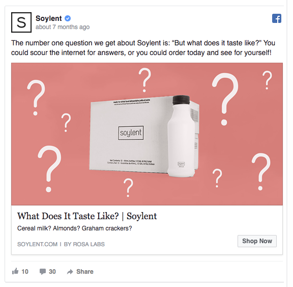
Ad Breakdown:
Soylent’s eye-catching Image connects with the Headline Post Text and Description. This creates a consistent narrative throughout the ad. It also encourages curiosity by stating “Cereal milk? Almonds? Graham crackers?”, as a way of challenging people to taste Soylent.
The ad then has a clear CTA as the only option to know the answer.
2. Microsoft: Highlight Your Value – Address Your Competition
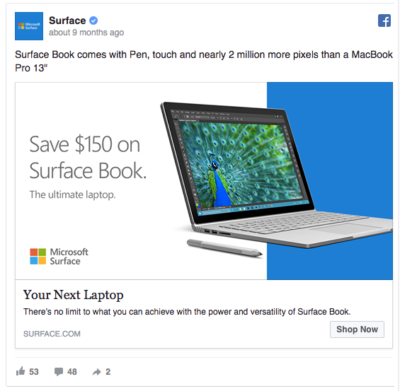
Ad Breakdown:
Microsoft’s Ad Picture will grab your attention by clearly showing their new product and stating you will save money on the “ultimate laptop”. Then, the Headline encourages customers to think about what they want next. But, the real genius here is how these parts connect with the Post Text and Description, by stating how the surface compares to a MacBook.
Now, when potential customers click the CTA, they already know they are making the best choice. In fact, it’s the “ultimate” choice that saves money, for their “next laptop”, that beats out the competition, and removes any “limit to what you can achieve”.
3. Edible Blooms: Holiday Offers
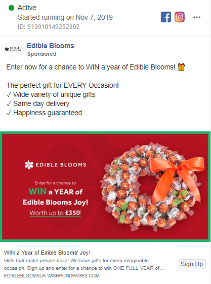
Ad Breakdown:
Edible Blooms use of holiday-themed Pictures and promotions are worth noting for how they relate to their targeted customers. The picture is an original twist on a classic image, and it accompanies an opportunity, which is restated in the Headline that encourages customers to click through to “Sign Up” and learn more.
In the Post Text, even more value is added by stating their delivery and guarantee, which is sure to encourage people who might have forgotten that “special someone” to make a last-minute impulse purchase.
4. Asana: Highlight Benefits
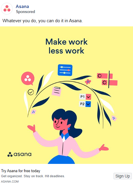
Ad Breakdown:
Asana’s Ad Picture is bright and eye-catching. Moreover, it simply states the benefits of their service to simplify your life, to “Make work less work”. Sound too good to be true? Well, in their Headline, they say customers can “Try Asana for free today”.
If this wasn’t enough, the Post Text and Description correspond by stating what you can do and where you can do it if you sign up. The CTA then gives you a way to “Sign Up” in order to “get organized” with “whatever you do”.
5. Try The World: Make It Real
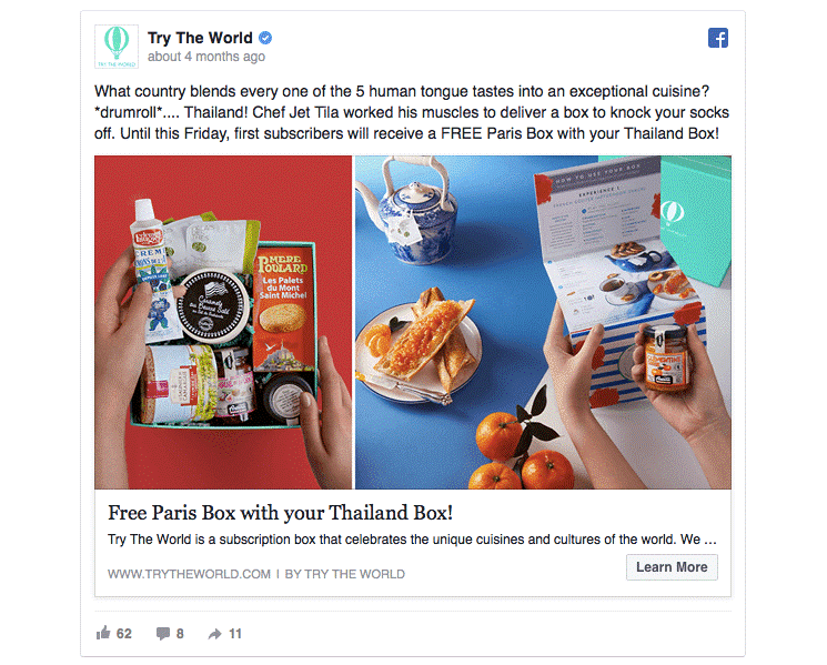
Ad Breakdown:
Try The World’s Ad might have written a lengthy Post Text, but their Picture grabs viewers by placing 2 colorful, interesting photos side-by-side The Headline steps in to grab wandering eyes with a promise of a “Free Paris Box with your Thailand Box”. Keep in mind, the word Free, will always cause people to take a pause.
Next, the Post Text length is now justified as you learn even more about this offer. And those details make the CTA of Learn More even more enticing. This ad starts strong and delivers every step of the way by making potential customers really consider what they are looking at.
6. Blue Apron: Before And After
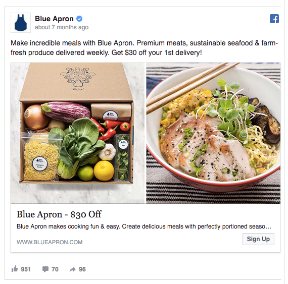
Ad Breakdown:
By presenting two versions of their product, Blue Apron displays an enticing before and after, sans the work. This catchy Picture will grab an audience and get them thinking. The Headline then presents an offer that would make a potential customer overlook the prep work.
Next, the Post Text encourages potential customers even more by using keywords that their target audience would respond to, “premium meats, sustainable seafood & farm-fresh produce delivered weekly”. This all wraps up with a clear Description about making “cooking fun & easy” before the CTA steps in to guide customers to their site.
7. Nike: Simple Contrast – Simple Messaging
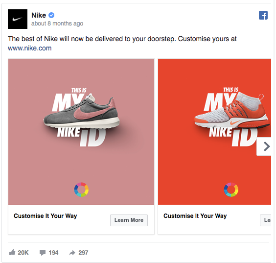
Ad Breakdown:
Nike’s Ad Picture will grab your attention by using contrasting colors in their carousel. Use a color wheel to help you pick the best combination. This adds value as it connects to their eye-catching Headline that would entice most targeted users to click their CTA to learn more about customizing their shoes.
By including a link in their Post Text even more value is added to this clear and simple carousel ad.
8. MVMT: Proven Quality
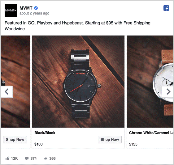
Ad Breakdown:
MVMT’s carousel ad is filled with high-quality Pictures that clearly display their products. Product titles and pricing are clearly displayed, encouraging impulse buyers to move directly to the CTA of this well-known brand.
And, to avoid targeted customers from slipping through the cracks, the Post Text adds trust by not only stating where they have been featured but also offering free shipping.
9. Chubbies: Holidays In Action
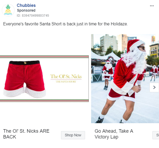
Ad Breakdown:
Chubbies make season-themed carousel ads that show quality Pictures of products in use. This can really help inspire people to imagine if they were the person in the picture. Each picture is titled in a way to connect the season being back with the product, the product being used, and victory, as well as a feeling of what you probably missed out on but now have permission to celebrate.
The Post text then reinforces these ideas further encouraging people to hit that CTA of “Shop Now”.
10. tentree: Added Value
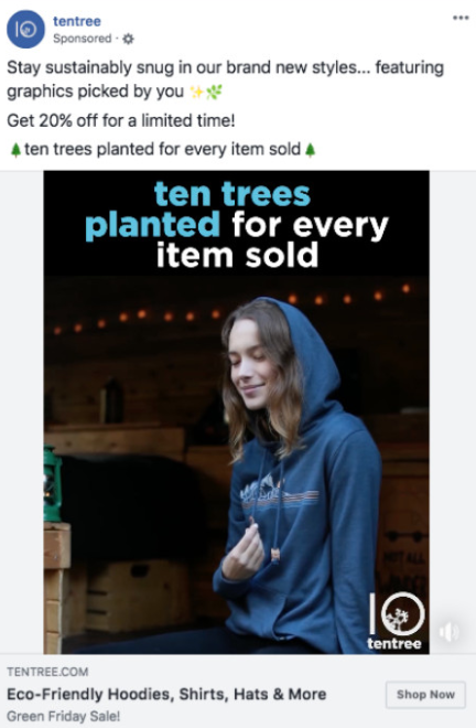
Ad Breakdown:
tentree advertises with simple Pictures achieve two goals. First, they show their products in use which allows potential customers to see how they actually look. Second, they allow space for a text that clearly states an added value
The Headline then explains their products, which is then reinforced in their Post Text. As you move from point to point in this ad, it is easy to see how they reinforce their primary focus on sustainability, encouraging a consistent message that holds the attention of potential customers all the way to their CTA.
Remember To Advertise
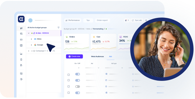
Even with the best A/B Test Design & Ad Copy, you are still going to need to reach your audience. That’s where AI-driven advertising for e-commerce Stores steps in to customize and then automate processes for cross-channel advertising as well as bid and budget automation. That means you can rest assured that your ads will reach the potential customers you want most. The Ecommerce marketplace is quickly changing and, by using AI, you’ll know you won’t be left behind. Sign up today and receive a Free 14-Day Trial!






 ,
,